New movie inspired set... (4 Viewers)

Which design - there have been so many - do you mean the one with 'The Grange Club' on it?

Ta
Chris
Regarding the back text, I prefer any of them with the script on it, but that is just a personal preference, go with the no text if that makes the chip cleaner to you.
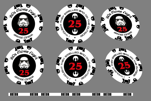
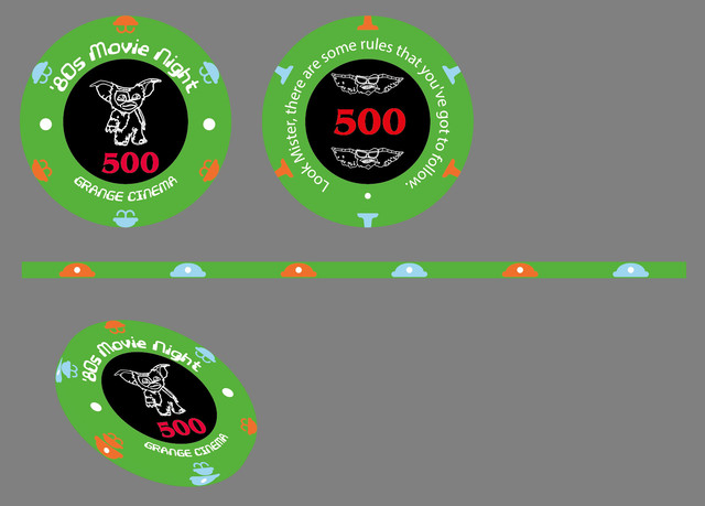
Regarding the edge spots, again whatever design you like, just make sure most of the edge has enough of the primary color to distinguish it easily. I think the three edge spot design was cool, but the size of the spots would just need to be smaller to show more of the primary color.

Regarding the larger sticker, I prefer smaller ones, but again that is just personal preference, so go with what you think looks best.
 
Thanks Jake ......

and Oooooh - just learned how to extrude to check the 3D :)

Chips 24.jpg
 
Loving the idea and the progress so far, but you definitely need to take the apostrophe out of "80s" - I didn't catch the last set of chips that made this (common) grammatical mistake in time, so I am happy to have caught this one before it's too late!

I really like the font you chose for this most recent one, as well as the simplified edgespots.

Finally, now that you have simplified the design so much, I'm not seeing a need for different inlays on the front and back. If you use two iconic images for each movie (one on the inlay, one other repeated twice on the border) and keep all else equal, I think they are going to flow well without doing that.

I'm getting a bit of a "Ready Player One" vibe from this project!
 
Last edited:
Loving the idea and the progress so far, but you definitely need to take the apostrophe out of "80s" - I didn't catch the last set of chips that made this (common) grammatical mistake in time, so I am happy to have caught this one before it's too late!

I really like the font you chose for this most recent one, as well as the simplified edgespots.

Finally, now that you have simplified the design so much, I'm not seeing a need for different inlays on the front and back. If you use two iconic images for each movie (one on the inlay, one other repeated twice on the border) and keep all else equal, I think they are going to flow well without doing that.

I'm getting a bit of a "Ready Player One" vibe from this project!

Like this?
Chips 25.jpg


Sorry for the lack of progress this evening but have been learning all about edge spots and how to match them to the two surfaces. What a lot of fuss to get it right! It does in the end seem to all come down to 'pi' and also use of Polar and rectangular grid tools to lend a hand! After that a bit of '3D Revolve' gets you there. The 2 above are cheats as they simply extrude the top surface!

Chris
 
Last edited:
Like this?

yes, looking good! what do you think of rotating the edgespots so they are centered better w/ the text? like they used to be, but when you went from 3 spots to 2 i guess you didn't adjust.
 
Actually, the apostrophe belongs before the digits, since it represents the missing "19" in 1980s, like this:

'80s Movie Night
 
This is a really cool project, it's been neat to see the iterations of it. I do like the font choice a lot, and the fan art choices seem to make it a more cohesive set in my opinion.
 
Very cool idea for a set. I love watching someone's designs evolve, and this has been no exception.

Not sure if this would work with your design specifically, but the idea of a set based off multiple movies made me think it would be cool if you could incorporate a famous line from the movie onto the chip. Maybe just on the side with the larger denomination
 
Love the way this set is coming along! But two things have really stuck out to me...
1) The current trooper. After looking closely, I can see it's a parody of the "I want you" military poster. But on a small chip? I think it's going to look like "What the hell is wrong with his face?"
2) The bounty chip. At first and second glance may not look like an idol. Or if it does, it may look like a very... stiff... one.

In general, I wasn't a huge fan of the first set you posted. But at the gremlins one, you really turned a corner for me. Love how this is turning out!

Thanks! The other challenge I have is never having used AI before to quite a steep learning curve. Have to agree on the chips. Pleased I can now do the 3D sanity check using symbols + 3D.

I think Gremlins looks the best, Ferris and Star Wars could be really good with a bit of work. ET should maybe make a comeback (perhaps in place of aliens). The others need a lot of work but that's fine - I am not in a hurry!

Chris
 
Very cool idea for a set. I love watching someone's designs evolve, and this has been no exception.

Not sure if this would work with your design specifically, but the idea of a set based off multiple movies made me think it would be cool if you could incorporate a famous line from the movie onto the chip. Maybe just on the side with the larger denomination

Great idea. Working on it now!
 
Wondering what your R2 edgespots would look like if you alternated them.... For example, heads and 12 and 6 and feet at 3 and 9...
 
I was thinking feet/feet at 12 and 6 and head/head at 3 and 9, but they are your chips... I was just thinking it would keep both sides cohesive, at least from an edgespot point of view, as opposed to heads on one side and feet on the other.
 
Cool looking set. I always felt that it would be tough to make a movie themed set work but 80s theme is neat. I feel the colored image looks out of place, like ET's brown head or the Gremlin. If there was a way to make a uniformly designed image that represents each pic like the R2D2 image that's like a low detail silhouette our outline. If they could all have the same design style, it would being the set together a bit more.
 
Very cool to have watched it so far. The first iteration really did just look like getting an idea down on paper.

Personally, I think the best was these:

1591010816516.png
1591010881139.png
1591010917856.png


I know you said the fan art was utilized to better get through the process, but it's hard to imagine you're not able to get the request through when it's just for your personal use. I agree with toning down the edge spots, but like the overall look/design/inlay of these.

Love the inclusion for Aliens. Surprised no Back to the Future. Goonies map for plaque - genius.

I like the new edgespots that you did with R2D2. I'm sure it can be done with all of them, but I don't know if overall having these split icon edge spots on all chips end up looking better than doing theme color specific edge spots for the chips (for me).

We're there any other movies/chip ideas that didn't make the cut? Any thoughts to doing a cash design as well (maybe 80s Television)?

Lastly and most importantly, don't forget to do some samples! If you offer them, people will want to jump on the order for a sample of your set.
 

Create an account or login to comment

You must be a member in order to leave a comment

Create account

Create an account and join our community. It's easy!

Log in

Already have an account? Log in here.

Back
Top Bottom