That would work well too. Your point about the colour not being noticeable that way is absolutely true. From all the Tina’s I’ve seen, it’s only the ones that try to do a faux inlay with colour match that look weird. Small colours inside the inlay look perfectly fine and intentional
Now that I've had a chance to unwrap them all and take some family photos, I think I'll ride with what I have for now.
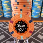
The $1 is closer to “Light Blue” than “Horizon” but that’s fine. I'd definitely go with a brighter orange for the $20 chip colour if I were to do it again. It's probably more Carrot than Arc Yellow on the Paulson scale.
Other than that, they are pretty good. Very happy with these.
Attachments
Staria_20.webp
170.3 KB
· Views: 447
Last edited:
Create an account or login to comment
You must be a member in order to leave a comment
Create account
Create an account and join our community. It's easy!


")