Need help with Edge spots. (1 Viewer)

sgago84

3 of a Kind
Joined
Dec 18, 2019
Messages
604
Reaction score
1,104
Location
New Jersey
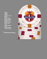
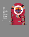
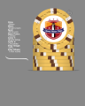
Denominations are .25 Cents, $1 Dollar, $5 Dollars & $20 Dollars

Would like to stick to classic Vegas base colors and don't want anything overly bright.

I already purchased a color sample set from CPC ans seem to like these colors in my home lighting.

Would like to do this right first time as this is a considerable investment. Have a designer working on my inlay pattern. Let me know what you think or what can be better.

Updated colors so they all have reddish brown tone. Hoping there isn't a possibility of dirty stacks but i think I should be ok.

25 Cents.png
1 Dollar.png
5 Dollar.png
20 Dollar.png
 

Attachments

  • 1 Dollar.png
    1 Dollar.png
    273.3 KB · Views: 135
  • 5 Dollar.png
    5 Dollar.png
    264.1 KB · Views: 103
  • 20 Dollar.png
    20 Dollar.png
    275.1 KB · Views: 110
Last edited:
Any details on the overall inlay design? Primarily white/black background? Simple design or something really complex?

I had this loaded in the chip designer last night, my immediate reaction was the quarter and dollar follow a distinctly different color hue than the fiver and twenty - blueish vs redish.

What stakes do you usually play and what's your workhorse chip? I always tell people to focus on that workhorse chip and get it almost perfect, then build the set around that. IMHO designing an awesome $20 chip you love with a dollar you just kind of like is a big waste if you're playing 25c/50c nhle.

I like the spot progression, and personally I really like the colors on the quarter and dollar.

simple design with white 1” round background. Colors on inlay are black, red, yellow with a little blue. It’s a rooster. You can google portuguese rooster. The $1 chips will be workhorse so I may just copy Paulson pharaoh colors to get that reddish tone. I really just need the $20 chips for re-buys. The $5 usually get a decent amount of use as well.

We mostly play .50/$1 blinds but I prefer a quarter of .50 cents as it gives us more options for lower limits if needed.
 
Last edited:
I'm not sure if Butterscotch will show that we'll over Mandarin Red. Maybe DG Tiger?

mill try that out tonight. I did compare it to the color sample in person. Under certain lighting it was easy to notice. But maybe there is a better color.
 
I'm not a fan of the edge spot jump from the $1 chip to the $5 chip.

less complex $5 chip or more complex $1 chip. If I remember this is a similar progression to the PNG chips which I always liked.
 
less complex $5 chip or more complex $1 chip.

I really like the five as a stand alone chip. I think it is too big of a jump from the one. I would lean towards a less complex 5.

If I remember this is a similar progression to the PNG chips which I always liked

This is truly the only thing that matters. If you like the progression the who gives a shit about my opinion. If you look at my custom chips neither have a progression lol. All solids, or all quarter pies!
 
Like the .25 and the $1. Not sure about the $5, might be too dark compared to the rest of the set. Did you try bright white instead of white spots on the $20?
 
I also don't love that the one dollar chip is a three color chip, the five is a 4 color chip, and the twenty is back to a three color chip
 
06A2E942-7A4C-415E-B31A-4C6F1CF85199.png


I would consider slight color matching with the colors on the rooster and the edge spots on the chips?

Story behind the design?
 
Any feedback on inlay.

These are awesome! I have like 4 guys with families from Portugal in one of the groups I play with - I typically don't request samples but would love to buy a few sample sets of these if you're offering!

For the yellow, you could go with the Portuguese flag colors - red & green with the canary chip. Could also go with a black $20 chip.

Some potential options....

1578249995028.png


1578250323783.png
 
These are awesome! I have like 4 guys with families from Portugal in one of the groups I play with - I typically don't request samples but would love to buy a few sample sets of these if you're offering!

For the yellow, you could go with the Portuguese flag colors - red & green with the canary chip. Could also go with a black $20 chip.

Some potential options....

View attachment 388277

View attachment 388278
Holy crap........I really like both of those $20 chips.

I have no problem with sample sets. I only ever play with honest and friendly people. Security isn't an issue.
 
Two more (sorry I enjoy monkeying with the design tool and spending other people's money, I'll stop now lol....)

View attachment 388291

View attachment 388301

what do you think of the light chocolate quarter. Or should I stick with a more traditional peach. I like the color blue but the more I took at it, it just feels out of place from the rest of the set.
 
what do you think of the light chocolate quarter. Or should I stick with a more traditional peach. I like the color blue but the more I took at it, it just feels out of place from the rest of the set.

Ah, just saw your updated lineup on the OP. I think I'd stick with the light blue myself, it ties into the inlay colors (or maybe light green). I would caution against using the current configurations of the $1 and $5 together, both chips are really nice but share essentially the same color shades with nothing to distinguish them. The spot patterns each have a good amount of exposed base color so you may be OK, but I'd be somewhat concerned about dirty stack issues.

1578255850220.png


1578256318991.png
 

Create an account or login to comment

You must be a member in order to leave a comment

Create account

Create an account and join our community. It's easy!

Log in

Already have an account? Log in here.

Back
Top Bottom