One Eyed Dollar
Flush
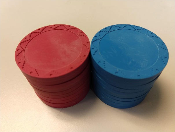
So I recently picked up some of these Aztec mold plastic chips, mostly in the red color:

...with the plan to make tournament seating chips out of them. The blue chips will go on the tables for identification, and the players will draw from the red chips to find their seats.
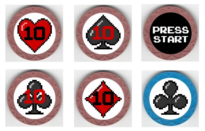
I guess this mold is called Aztec, but the squared-off pyramids also reminded me of an old 8-bit video game. So I decided to go with that theme for the labels. The back side of each chip will say "PRESS START" and the other side will have an 8-bit suit and number on it. The blue chips will have the corresponding suit for each table (no numbers).
Here is what I have mocked up:

(Sorry the red chips look mauve here - my scanner did a crappy job on the color. In the photo above you can see that the chips are actually red.)
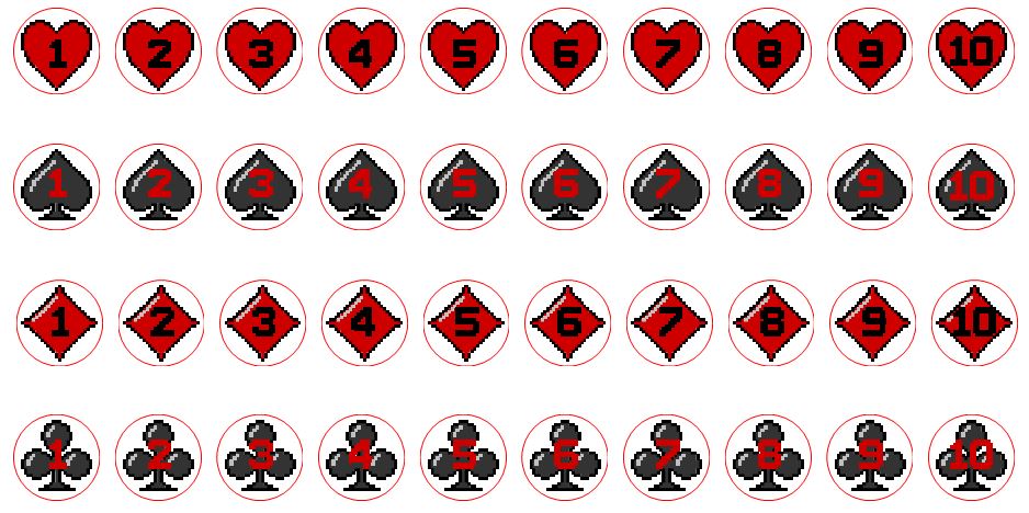
And here's the numbers on all the labels. Putting the numbers over the clubs was the hardest, but I think they are legible.

Let me know what you think! I think they turned out pretty close to what I envisioned when I started. I'm not sure if I want to keep the background around the suits white or change it to a light grey or something.
...with the plan to make tournament seating chips out of them. The blue chips will go on the tables for identification, and the players will draw from the red chips to find their seats.
I guess this mold is called Aztec, but the squared-off pyramids also reminded me of an old 8-bit video game. So I decided to go with that theme for the labels. The back side of each chip will say "PRESS START" and the other side will have an 8-bit suit and number on it. The blue chips will have the corresponding suit for each table (no numbers).
Here is what I have mocked up:
(Sorry the red chips look mauve here - my scanner did a crappy job on the color. In the photo above you can see that the chips are actually red.)
And here's the numbers on all the labels. Putting the numbers over the clubs was the hardest, but I think they are legible.
Let me know what you think! I think they turned out pretty close to what I envisioned when I started. I'm not sure if I want to keep the background around the suits white or change it to a light grey or something.
