Messing around with Inkscape (1 Viewer)

How did you do the edge marks? all of the tutorials that I found for that type of measuring was for illustrator.
I explain how I did it in Inkscape here:

Looks like a lot of the stripes are starting at the top of the chip (12 o'clock) but I definitely see examples where it seems to start elsewhere on the chip.

1635889021823-png.804663

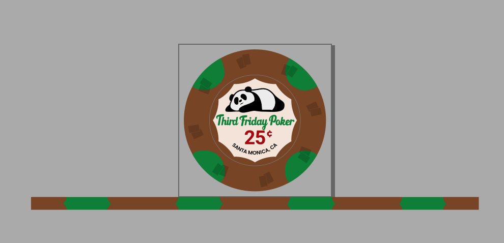
Below is what I did to build my edge stripes in Inkscape, for the 4-moon chip above. I could have probably just used simple math to calculate the edge length of one moon, multiple by 4, subtract from 122.522mm (circumference for 39mm chip), then take the remaining amount and divide that by 4, and then space them out evenly. But I've applied a "Roughen" path effect to some of the shapes, so the elements may vary (probably by less than 1mm), so this is (I think) a more precise but more time consuming method...

Use the Measure tool in Inkscape to find the chord length between two points:

1635889175859-png.804665


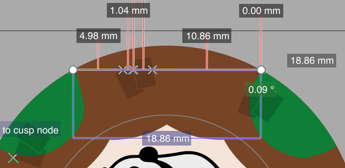
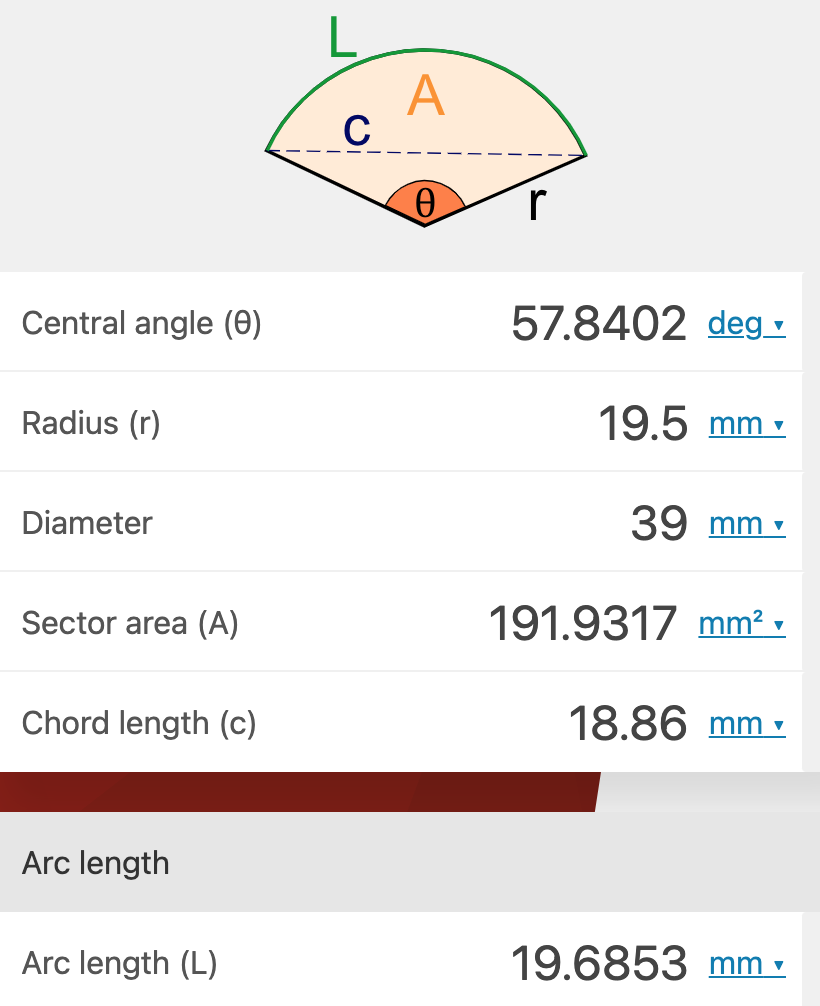
Plug the chord length (18.86mm) into this calculator to get the length of the arc (19.6853mm)

1635889285591-png.804666


Since I'm starting at the top of the chip, I divide the arc length by 2 and get 9.842mm. So I create a 9.842mm x 3.5mm rectangle in the brown.

Then I use the Measure tool again to measure the chord length first green moon, which is 10.75mm:

1635889571902-png.804667


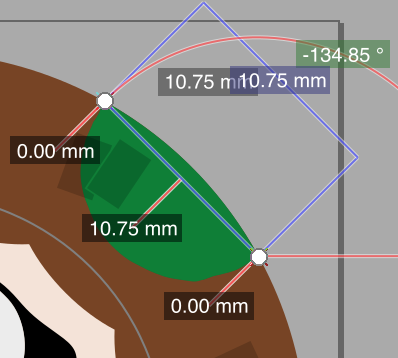
I use the above calculator to figure out the arc length, which is 10.891mm. I create a green rectangle with that width and a height of 3.5mm and grouped it with the brown rectangle. I repeat the process for each segment and added the final half brown stripe at the end.

When I added it all together it was ~122.2mm, which is a little shorter than the 122.522mm circumference for a 39mm circle, so I increased the width of the stripe to match. I added some effects to the edge stripe to make it seem more authentic, like I've seen others do:

1635889968321-png.804670


Edit: Just read more about split spots and since the tri-moons are green, then that's the color that'd get squeezed:

1635892647543-png.804683


Maybe for the quarter pies I'll cheat and just take 122.522 and divide by 4 and make the stripe that way. When we're talking tenths of millimeters I'm not sure if my above method is worth the time. Imaging doing this for bear claws...
Dunno if this is the best or correct way, but it works for me.

I have changed the process a little in that I start at the bottom center and go clockwise. That way the tiny bit of overlapping ink that may occur when the stripe meets itself is at the bottom of the chip when you’re holding/stacking it with the design upright to you.
 
Last edited:
I explain how I did it in Inkscape here:


Dunno if this is the best or correct way, but it works for me.

I have changed the process a little in that I start at the bottom center and go clockwise. That way the tiny bit of overlapping ink that may occur when the stripe meets itself is at the bottom of the chip when you’re holding/stacking it with the design upright to you.
This is amazing. Exactly what I needed. I was having some issues with some of the bosco templates as some of the designs aren’t fully represented.

I had only seen this how to for illustrator with some specific illustrator tools. So this closes the knowledge gaps I had. I may actually dust off my files and try and finish the set that I worked on and gave up. Thanks!
Glad this helps! Like I said, not sure if this is the best way.

Also, realized I made a mistake. I mentioned changing the process; I now start from bottom center and go counter-clockwise, not clockwise as I said above.


1678485874528.png


If you have symmetrical edge spots it doesn't really matter, but for the Flamingo example above, the direction the stripe goes matters since the orange and yellow has to line up.

This Flamingo design actually has different front/back so I specify that the edge stripe starts at the bottom center of the "front" chip:

1678486009353.png


Note if you have non-symmetrical edge spots (with identical "inlay" design on each side for the center), then I believe Tina will do the work to flip the design you provided so the edge spots line up for the "back" side while keeping the inlay correct.
 
Glad this helps! Like I said, not sure if this is the best way.

Also, realized I made a mistake. I mentioned changing the process; I now start from bottom center and go counter-clockwise, not clockwise as I said above.


View attachment 1096812

If you have symmetrical edge spots it doesn't really matter, but for the Flamingo example above, the direction the stripe goes matters since the orange and yellow has to line up.

This Flamingo design actually has different front/back so I specify that the edge stripe starts at the bottom center of the "front" chip:

View attachment 1096813

Note if you have non-symmetrical edge spots (with identical "inlay" design on each side for the center), then I believe Tina will do the work to flip the design you provided so the edge spots line up for the "back" side while keeping the inlay correct.
Awesome, I think mine are symetric so it will make the process a bit easier.
 
Okay, who has tips for roughening the edges of edge spots. I’ve watched tutorials for Inkscape and I do know where the “roughen” tab is located. My issue is it messes the spot up very badly. Not what I want at all. I just want to mimic clay edge spots.
 
Okay, who has tips for roughening the edges of edge spots. I’ve watched tutorials for Inkscape and I do know where the “roughen” tab is located. My issue is it messes the spot up very badly. Not what I want at all. I just want to mimic clay edge spots.
I use illustrator, but each jagged spot is lovingly created by hand. Each and every one. :ROFL: :ROFLMAO:
I initially make the spots squared off, then go in with the pencil tool and give them some jaggies. The rolling edges are done to look like slightly squished spots.
 
I use illustrator, but each jagged spot is lovingly created by hand. Each and every one. :ROFL: :ROFLMAO:
I initially make the spots squared off, then go in with the pencil tool and give them some jaggies. The rolling edges are done to look like slightly squished spots.
Thanks, I was afraid of something like this. Oh well, it will just mean more love gets put in the chips. Lol.
 
Colors. That is what I am trying to wrap my head around. I understand that printers print CMYK and that Tina uses Pantone. I have seen multiple great resources on PCF, such as a chart listing all Pantone colors. How does one know which Pantone colors match the closest to certain Paulson colors. That is what I am struggling with. I get people will say order samples, but that doesn’t make sense to wait 4-5 months just for samples to arrive from China. Who has had success with making Tina chips in the color spectrum of Aurora and Empress Star colors? What Pantone colors were used exactly? As always, thanks for the help.
 
Tina doesn’t print with Pantone colors, it’s still CMYK…but she asks that to you use a Pantone color match in CMYK. It is kind of silly, because in the end, the colors dont always match anyway.
I open the Pantone swatch guide in illustrator and choose the CMYK equivalent. I try to stay away from pastel and washed-out colors, go for saturated and vivid colors, they translate best.

Sadly, it still is a very inexact process, with enormous time between making a change and seeing the result.
 
Can anyone tell me what Pantone colors off of the chart on this thread, https://www.pokerchipforum.com/thre...for-tina-anita-cards-mold.81302/#post-1739226 correspond with the following Paulson colors? I understand that it’s not perfect. I just want it as close as possible.

Tan
Lime Green
Plum
Cherry
Arc Yellow
Off White
Yellow
Blurple
Orchid
Blue Grain
Sherbet Green
Carrot
Indian Blue
Charcoal
Hot Pink
Hawaii Flower
Blaze Orange
Dark Blue
Day Blue
Canary Yellow
Day Green

So when I use the dropper in Inkscape to grab these colors from the chart it will make it in RGB. I then have to use another program to convert it to CMYK, which I believe makes it a PDF. Any issues sending that to Tina?

Thanks again for the help in my understanding.
Instead of doing it that way, there is a thread with all the CMYK equivalents for Paulson colors. While there’s no way for it to be perfect, it’s likely better than trial and error.
In the last link of that 1st post, a Google spreadsheet showing Paulson colors and their CMYK, Hex, etc equivalents:
https://www.pokerchipforum.com/thre...bonus-card-mold-color-wheel-cmyk-codes.76046/
Thanks I’ll check it out. What is Hex? Do you think the “CMYK equivalents” will be accepted by Tina if I didn’t find it off of that chart of Pantone?
 
Does anyone out there have real world experience using that spreadsheet of CMYK to Paulson colors? Were the results good? Any pictures?
 
Thanks I’ll check it out. What is Hex? Do you think the “CMYK equivalents” will be accepted by Tina if I didn’t find it off of that chart of Pantone?
Hex is an RGB value for web colors. Not appropriate here, but could be used if you only have that code to go by.
Tina will print anything you give her. Her team may even change the value, for whatever reason.

Pantone is a universal system, and the equivalent in CMYK is just so all parties are basically looking at the same color. When in doubt, match one of the pantones, but in the end, getting samples (at least photos) of the printed chips will be the only way to really know.

Also when picking colors, better to go with distinct colors (red, pink, blue, yellow,etc). If you choose something a bit more vague like a yellowy-green, it may print more yellow or more green than you had anticipated.
 
I'm waiting for some designs that are part of a GB to be made, but I designed a set for @Dane which he ordered through a German company which apparently has chips made by Anita (a Tina competitor). I think they are a little darker than my original mockups, but I liked how they turned out:

20230221_175052-jpg.1085011

20230221_175048-jpg.1085012

20230221_175117-jpg.1085013


Photos courtesy of @Dane
Now if we could just get Paulsons made from Tina at ceramic prices we’d be set
 
Did you make yourself the tiny fake variations in the spots? I can't decide how I feel about that. One one hand, it is a blurry line that gets more and more blurry, on the other hand… well done, it is pretty cool! :tup:
The roughened spots are an engineering hack. Since some edge prints may be slightly misaligned on a few chips, making the spots jagged reduces the perception of discontinuity.

Okay, who has tips for roughening the edges of edge spots.
I use illustrator, but each jagged spot is lovingly created by hand. Each and every one. :ROFL: :ROFLMAO:
I also use Illustrator but I use the roughen effect to make it a bit more random. Roughen, vectorize with vectorizer.ai, place the roughened vector back into Illustrator, drag anchor points to the original connecting point between face edge and edge edge.

Maybe the pencil is less work though...
 
I also use Illustrator but I use the roughen effect to make it a bit more random. Roughen, vectorize with vectorizer.ai, place the roughened vector back into Illustrator, drag anchor points to the original connecting point between face edge and edge edge.

Maybe the pencil is less work though...
Here's how I do it in Illustrator.
The corner where the edgespot meets the face of the chip is critical. That always needs to remain a constant. If you just draw, that corner could move slightly, and it won't align with the rolling edge when printed.
This is the critical junction:
edge1_howto.jpg


Since we are going to be drawing on it, I dont want that corner to be moved, so I add 2 points, each one just below where the edgespot meets the face:
edge2_howto.jpg


Then, you are free to use the pencil tool to make any shape you like, without fear that the junction where the edgespot meets the face has moved:
edge3_howto.jpg
 
This is exactly how I have been doing it in Inkscape. Works quite well.
 
Help!!!! I’ve finished my design and am ready to order chips. I have saved the file as a .ai by manually typing in that extension when saving. When I email the file as the .ai the person gets this message:
IMG_0952.png

I then try .svg and the color on the chips disappears (along with most of the design) when they open the attachment.

My brother downloaded the attachment and opened it in Inkscape and the text on the chip was not centered and was way off to the right.

These chips look absolutely perfect on my pc in Inkscape. How can this be fixed so I can place an order? Thank you.
 
First off, you definitely can't save as .ai from Inkscape. You need to save as SVG.

Regarding the text, your brother probably does not have the required fonts installed. You can get around this by converting all text to objects/paths.

Not sure what the issue might be with colors.
 
Help!!!! I’ve finished my design and am ready to order chips. I have saved the file as a .ai by manually typing in that extension when saving. When I email the file as the .ai the person gets this message:
View attachment 1198260
I then try .svg and the color on the chips disappears (along with most of the design) when they open the attachment.

My brother downloaded the attachment and opened it in Inkscape and the text on the chip was not centered and was way off to the right.

These chips look absolutely perfect on my pc in Inkscape. How can this be fixed so I can place an order? Thank you.
I started my design in Inkscape as well.

If the vendor needs a .ai file, to minimize back-and-forth, I would save as SVG and open in Illustrator. Fix everything from there and export as .ai (remember to convert text to outline). Illustrator has a free trial.
 
Thanks for the info. I do think the text not being a path was a problem. I have adjusted that. @Colquhoun I used the dropper tool for colors based off of files of chips that have already been printed by Tina, so hoping it will be close. I sent you a PM
 
Thanks for the info. I do think the text not being a path was a problem. I have adjusted that. @Colquhoun I used the dropper tool for colors based off of files of chips that have already been printed by Tina, so hoping it will be close. I sent you a PM
Taking an eye dropper sample from an RGB file is fine, but it will likely be converted at some point.
Tina may still need to convert it printing. I'm not sure the process she uses for color...some dye sub prints are CMYK and some are 6-color.

It's usually not TOO much different, but some blue colors get very dull when converted to CMYK. The problem is, if I convert to CMYK and send it back to you, youre looking at it in RGB again, doh!:confused
I’m okay with a straight conversion. I think I’ll be happy with it. There are no wild colors like neon colors.
 
Okay, those that have used Inkscape to create poker chips. How? Did Tina accept the .svg file? I have used all the files and help that people on here have sent me or posted to create these chips.
 

Create an account or login to comment

You must be a member in order to leave a comment

Create account

Create an account and join our community. It's easy!

Log in

Already have an account? Log in here.

Back
Top Bottom