Here's an update. I ordered a sample set of labels from Gear. I also bought more chips from Apache, green this time, and this batch was by far the worst for the middle ridge.
Representative green chip with ridge. The biggest edge on these actually feels like a sharp edge, not just a light bump like the others:
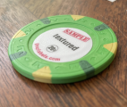
The "Majestic" label sample, I think it's the "matte" finish option. You can both easily see and feel the ridge here. Though, and I'm no expert on recognizing spinners, it doesn't seem to be raised high enough to matter in stacks.
The "Milano" label which seems to be the "textured" finish option. This chip has about the same amount of ridge as the example above, and as you can see it's barely noticeable. And the texture doesn't totally conceal it to the touch, but it's much much fainter of a feeling in your hands. The texture of the ridge mostly blends in with the texture of the label. This also doesn't seem to raise the surface enough to be a spinner issue:
My next question was whether the dark vs light backgrounds make it more prominently visible, or if it's the matte vs textured finish. Here's the default matte and textured labels for comparison. Note: I put these 7/8" labels intentionally off center to maximize the overlap with the ridge under the label.
The matte still shows the ridge visibly with the right light reflection, but the white background is much less obvious than the black "Majestic" label background:
So... final thoughts? I love the look and feel of the textured "Milano" label. I would bet that if you didn't know about this ridge under the label you would never suspect it was there. And I think erring on the side of a lighter background is best if this is a big concern for you.
I'm still very happy with these chips, and I think once I get my labels designed and applied this will be a very enjoyable set to play with. That is, until I pull the trigger on a "real" set. I'm going to need to make a trip to Vegas this winter. You know, for research purposes.