Le Cercle Paris CPC custom project (1 Viewer)

emm4n

Sitting Out
Joined
Apr 3, 2023
Messages
19
Reaction score
40
Location
Paris, France
Hello fellow poker chips addicts! After months of reading the forum as a guest, I finally created an account and am ready to post my very first message.

I am starting a project for a custom CPC micro-stakes cash set to play with my friends (usually around 5-7 players, 5c/10c or 10c/20c blinds and 10/20€ buy-in, rarely over 200€ in chips in front of anyone). We only play cash games.

I used to have a Paulson Le Noir 500 chips set bought in 2009 but I have left them at a friend's place many years ago and I have never managed to get them back (don't mention it, I'm still super mad 8 years later...). I also have a 500-set of Aria high denominations from Tina, so now I'm looking for lower stakes denoms and I have started playing with CPC's custom tool.

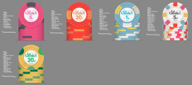
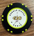
Below is what I have so far, with white and black inlays (I don't know which one I prefer yet):

1.png


2.png


The inlays are not definitive, I have just made them quickly today on Canva and the colors are not exactly the ones I'd like to have, and everything might not be aligned properly yet.

As a proud French, I have to use the fleur de lys mold, no question about it!

My idea for the spots is to use the base colors from the other denominations. The star of the show will be the 5€ chip which will feature all the base colors from the other 4 chips.

I am feeling pretty happy about the 5c, 20c, 1€ and 5€ chips, but for the 20€ I keep changing the spot colors and can't figure out which ones are best looking. See below a few iterations:

3.png


In these iterations, only the #1 and #4 are in line with my concept of only having spot colors that are also the base color of other denominations, but I must confess that #2 is probably my favourite.

I know that 20c denoms might seem very weird for most of you, but quarters do not exist in France and in the Eurozone, we have 20c coins instead.

I have chosen Le Cercle Paris as the name of my set as it is how we are calling card clubs in Paris. And of course I had to add the Eiffel Tower in the logo :)

Pricing should be as follow if I understood CPC's website correctly. I know I don't need that many fracs, but I like having lots of chips in front of me and I sometimes play 20c/40c Limit HE and 2-7 so fracs are useful for these games.

5.PNG


Looking forward to read your feedbacks and suggestions!
 
Congrats on going down the CPC route - it's a very rewarding process! I'm a big fan of bright and colourful chip design, so I like the direction you're going.

A couple of initial thoughts:

1) I like the Eiffel tower idea, but for me, it should be more prominent on the inlay.
2) Whilst I like each of the initial denoms individually, I feel like there's far too many repeating colours. I think using the base colour of the previous denomination can work well, but combining that with repeating edge spot colours is a bit too much imo.

Looking forward to seeing where you end up! Take your time - a custom set is definitely a process, not an event.
 
Welcome!

I think they look very nice, however I see potential dirty stack problems, especially with the three first denoms. Imagine them in a pot together, it might be difficult to tell them a part and when stacking they could easily be mixed up causing dirty stacks.
 
My idea for the spots is to use the base colors from the other denominations. The star of the show will be the 5€ chip which will feature all the base colors from the other 4 chips.
Looking forward to read your feedbacks and suggestions!
While this sounds cool in theory, it is not going to be practical once you get these in play. The extreme overlap in colors you have here is just going to cause confusion for everyone, including yourself, despite the colors working well together in a vacuum. Not many do it, but I would recommend trying to avoid the same exact color in consecutive chips.

Suggestion is to keep your absolute favorite chip here and then go back to the drawing board and start completely from scratch. Sounds harsh but it is likely what most people will be thinking when they drop in this thread.
 
Welcome. I agree with what's been said so far - too many of the same colours and dirty stack issues.

Obviously the FDL mold works very well with your theme, and it gives you the opportunity to use a large inlay. Check out "The Boulevard" set to see a great FDL set.
 
Love the inlay design and color matching!
 
Thank you all for your feedbacks on dirty stacks. I used to be a professional poker dealer and I'm always able to differentiate chips and counting the stacks just by looking at it for a few seconds, but I won't be alone playing with the chips so that's a fair point.

I'll keep trying different things in the coming days/weeks until I make my mind. I've already made a few tries tweaking the colors since yesterday and this is what I have for now, I think it should resolve the dirty stacks issue:

View attachment 1112387

For the 20€ denom I wonder if I should be using Canary or Dg Yellow as base. Just wondering if Canary and Dg Peach might be a bit too close (from this post they might be looking a bit too similar https://www.pokerchipforum.com/threads/first-cpc-cash-set-draft-design.102904/).

My first thought when I saw the thread title was one of the greatest movies of all time:

36BE8E69-2567-4701-99B1-48C71753D197.jpeg

Funny you mention this movie, Bourvil (the actor on the left) was my grandfather's cousin!
 
Nice project. I have always dreamed of creating a "Cercle Eiffel Paris" set with the Eiffel Tower as a watermark
 
You are doing well! there is a lot to like about your mocks, I would suggest using a White base ONLY for a 1 or a 100, definitely NOT a 5. I'm also not a fan of your inserts on the 5.

I really like your base color selection here (obviously not the 5), as @chipinla points out, the insert colors are going to create dirty stacks, and I see you are progressing with changes later in the thread.

I like the 1, and you may be able to keep it and the base colors of the 5c and 20c chip, but you'd have to change the inserts on the them; also I'd do 1/2 moons on the lowest denom only.

I like the 5c and 20c, but most don't do a 20c, I think its BOLD and I like it. Might make selling (if you would ever want to do that) a little more difficult.

1-png.1111797
 
Great and very consistent set design

I vote for for this variation

le circle 4.png
 
Great and very consistent set design

I vote for for this variation

View attachment 1112743
Nice project @emm4n !
In terms of spot progression I will use the 8O14 for the 20€ and find another one for the 5€.
As mentioned already the Eiffel Tower is way too small to be seen correctly on an inlay.
Also be careful on the safe zone of your inlay some parts of your design are really close to the edges.
 
There are some sets that borrow the base color from adjacent chips, not all chips, to limit the confusion. The Gemini, Luckbox Lounge, Metronome are three. The latter uses 1/4” spots, where as the first two use 1/2” spots.

Here’s the Gemini:
1680671391675.jpeg

https://www.pokerchipforum.com/thre...sh-game-poker-chips-custom-accessoiries.8892/

On the tower… if it’s that small, it’s a throw-away element- looks like an after-thought. I’d suggest making it prominent as noted above, and if that doesn’t work, then remove it. Or maybe focus on the C? Here are a few inlays to get the thoughts going.
1680671869798.jpeg
1680671928076.jpeg
1680672031967.jpeg


No need to stop there. Peruse the Chip Guide and these pages, look for inlays that strike your fancy, capture what appeals to them, and then see if you can incorporate those elements into your design.
 
Last edited:
I think I'd like to keep the 5€ spot pattern as it is, my idea for this chip was to sort of making it look like the 5k flag we can see at Aria/Bellagio. Knowing the micro limits this set is going to be played, I can see a similar role for this chip as what we see with the 5k in high stakes TV shows.

I'm playing around with the tower, trying to integrate it differently to make it more prominent and this is something I could see myself using (draft, the alignements are not good) :

1680682484771.png
1680682563163.png
1680682612722.png


I came across @JeepologyOffroad's Moonlight $100 chip last night while browsing the DB and it is very similar to the idea I had for my 5€, using all other base colors (first example above) for the spots. I think Jeep's result looks fantastic and it is comforting me in my opinion.

9bVjGiV.jpg


I'm also debating the base color for the 20c, between Dg Peach and Tiger. I've looked at all the chips in the custom DB and it seems like Tiger gives a more vibrant orangy feel, which is what I am looking for, but some photos from Peach chips sometimes give me the same impression. I guess it depends on the camera, the light, and the monitor so difficult to assess.

1680682275635.png
1680682300227.png


I also find myself debating my initial idea of using the FDL mold, as it might look a bit plain and can't be used with inlay shapes...

Here are a few tests on other molds with shaped inlays:

18.png

19.png


I also have troubles deciding on the yellow base, all photos I'm seeing for Canary, Yellow and Dg Arc Yellow seem to contradict each other, I think I'll have to order a sample set to make up my mind (any idea about the delivery times for samples to Europe?)

Thanks all!
 

Attachments

  • 17.png
    17.png
    237.1 KB · Views: 31
  • 20.png
    20.png
    237.1 KB · Views: 39
I think I'd like to keep the 5€ spot pattern as it is, my idea for this chip was to sort of making it look like the 5k flag we can see at Aria/Bellagio. Knowing the micro limits this set is going to be played, I can see a similar role for this chip as what we see with the 5k in high stakes TV shows.
I totally understand that ;) but then you should upgrade also the spots for the 20€ chip imho
 
You have a lot of Dayglo as base color for your set so personally I will go for a DG yellow for the higher denom of your set. Also you could give a try to DG peacock for your 1€ blue base.
 

Attachments

  • 14A9848C-8053-416E-9DCD-36FEEFE919C0.jpeg
    14A9848C-8053-416E-9DCD-36FEEFE919C0.jpeg
    190.2 KB · Views: 55
  • 37BF8C4E-E072-4085-82E8-D4230CA7FCC6.jpeg
    37BF8C4E-E072-4085-82E8-D4230CA7FCC6.jpeg
    208.7 KB · Views: 59
You have a lot of Dayglo as base color for your set so personally I will go for a DG yellow for the higher denom of your set. Also you could give a try to DG peacock for your 1€ blue base.

Yes I'm still very hesitant on the yellow base I'm going to choose for the 20, the DG Yellow seems a bit "pisseux" as we would say in French, Arc Yellow will be too close to my DG Tiger 20c I think, so I'm hesitating between Yellow, Canary and maybe Saturn. And I still haven't ruled out using Light Green or DG green as a base for this one.

For the 1€ chip I've thought about the DG Peacock that looks beautiful, but I think I prefer the Light Blue and have a chip with several light colors on it for this one.

I'm ordering samples to make up my mind, all the photos I'm seeing give different results and it's messing up with my thought process ahah.

It will be a very nice (and really costly) set :)
Indeed, that's what I want to make it right! I'll take my time and order only when I'll be sure about my choices, if I ever am :ROFL: :ROFLMAO:
 
I'm ordering samples to make up my mind, all the photos I'm seeing give different results and it's messing up with my thought process ahah.
This is definitely needed, otherwise you're basically trying to shoot targets with a blindfold on. Even your poker room lighting and how that interacts with your sample chips will play a factor.

For example, it may not seem like it at all, but DG Tiger and DG Pink next to each other isn't really recommended as they have similar hues. It can work, but a CPC veteran cautioned me on this and was right, whereas it wasn't something I even considered when doing my initial mock-ups.

cw.png
 
For example, it may not seem like it at all, but DG Tiger and DG Pink next to each other isn't really recommended as they have similar hues. It can work, but a CPC veteran cautioned me on this and was right, whereas it wasn't something I even considered when doing my initial mock-ups.
This is good advice, I may have to use DG Peach instead of Tiger then, thank you!
 

Create an account or login to comment

You must be a member in order to leave a comment

Create account

Create an account and join our community. It's easy!

Log in

Already have an account? Log in here.

Back
Top Bottom