Label ideas (2 Viewers)

You could do the background as one color and the liquid in the glass as the other spot color.... IE Green back ground and blue liquid in the glass...

But I have to say, I adore the mountain image more then the glass.
 
honestly i think the Cinci Horseshoe secondary $25 would look great as your 25 but will clash with the color of your $1 inlay actually maybe not. different green
 
honestly i think the Cinci Horseshoe secondary $25 would look great as your 25 but will clash with the color of your $1 inlay actually maybe not. different green
I have a rack of jack 25 primaries that I ended up with, wasn't really seeking them out. Might use those, although they'll never get used.

You could do the background as one color and the liquid in the glass as the other spot color.... IE Green back ground and blue liquid in the glass...

But I have to say, I adore the mountain image more then the glass.
Interesting thought!

And I agree, but I like "The Taphouse" theme a lot and a beer glass made more sense to me :/

I think I like the mountain more too, but the more I look at the design the more I dislike the fact that "Taphouse" and the mountains have no connection :p

Long way from making a decision on these haha

quick try:
$1 Shadow.png
 
I have a rack of jack 25 primaries that I ended up with, wasn't really seeking them out. Might use those, although they'll never get used.


Interesting thought!

And I agree, but I like "The Taphouse" theme a lot and a beer glass made more sense to me :/

I think I like the mountain more too, but the more I look at the design the more I dislike the fact that "Taphouse" and the mountains have no connection :p

Long way from making a decision on these haha
See. I think in my area, we like Mountain shots... So I have an affinity to them. But I get it.....
 
I’m just trying to keep it real and tell you what your players are going to say. They don’t care about aesthetics in the same way that people on this website tend to.
 
Alternative gradient:

I'm liking this a lot actually, sunburst-esque


50c Shadow.png
$1 Shadow (2).png
$5 Shadow.png

Alternative beer color:
50c Shadow (1).png
$1 Shadow (3).png
$5 Shadow (1).png


Played around with making the glass black instead and didnt like it.

Leaning towards my alternative/regular beer color here - wasn't a big fan of colored beer.

I also like the white but option 2 looks better to me
 
How about different level of beer depending on the denomination?
That's a neat idea! I could probably pull that off! I might not try it today but sometime soon!

e/ didn't take me that long - gotta head out soon though :p

ignore that black dot in the 50c, quick fix, little mistake

50c Shadow.png
$1 Shadow.png
$5 Shadow.png
 
Last edited:
Thoughts of the three?

Probably won't do white, I like the beer colored ones.

I like the beer amount variance by denomination, gives the set a very unique characteristic, but I also like uniformity.

I like this gradient much better than my originals
50c Shadow.png
$1 Shadow (2).png
$5 Shadow.png

50c Shadow (1).png
$1 Shadow (3).png
$5 Shadow (1).png


50c Shadow.png
$1 Shadow.png
$5 Shadow.png
 
Any thoughts on inlay replacement vs overlabels?

I've gotten some great feedback from a few people, thanks for the help so far! Looking forward to placing a label order with gear
 
Alternatively fell in love with the stones logo

Just throwing ideas around

Slightly re-created, no border vs original stones labels.

Also working on replacing "Stones Gambling Hall" with something different. But I'm really liking these labels (also on the fence about including the $25 but I already have the chips so figured why not)

50c Shadow 2.png
$1 Shadow 2.png
$5 Shadow 2.png
220877 (1).png


edit/ alternative - I'm having a hard time finding a font to match the stones gambling hall well - this was a quick effort

50c Saloon.png
$1 Saloon.png
$5 Saloon.png
$25 Saloon.png


e/ found a better font
50c Saloon (1).png
$1 Saloon (1).png
$5 Saloon (1).png
$25 Saloon (1).png
 
Last edited:
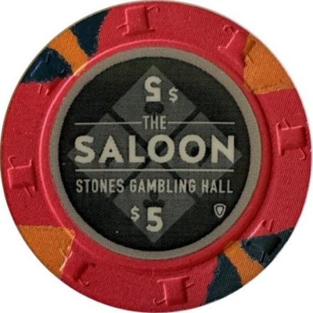
The upside down number is disturbing to me for some reason.o_O
I was considering getting rid of it! I was following the original saloon chips with the upside down denom but I'll post some pics without it in a couple days and see how it looks!
 
Yeah, I would have to agree to ditch the upside down denomination The only way the works is if the entire design is mirrored upside down, so basically, you’d have The Saloon Taphouse and Casino repeated upside down as well, and that’s a bit much. Maybe bring back the colored pilsner full of beer in it’s place? I liked that touch a lot from the previous design. But definitely don’t change how full it is based on the denomination, keep it that same amber fullness throughout.
 
Yeah, I would have to agree to ditch the upside down denomination The only way the works is if the entire design is mirrored upside down, so basically, you’d have The Saloon Taphouse and Casino repeated upside down as well, and that’s a bit much. Maybe bring back the colored pilsner full of beer in it’s place? I liked that touch a lot from the previous design. But definitely don’t change how full it is based on the denomination, keep it that same amber fullness throughout.
I was copying the original saloon chips with the upside down denom, I still don't know if I love it but I don't mind it!
Original saloon chip
132329.jpg

I did think about incorporating the pint glass instead of the denom - I'm glad you mentioned it too! I will throw that in a mockup sometime soon too!

Current hesitation is that I enjoy the squares in the background and a glass would cover it up but I can't say for sure until I try it! Definitely on the list!
 
I totally understand wanting to see the squares. My only concern is that while I’m not digging the denomination there at all, even if it were right side up, without anything else there, you’d most likely have to raise the Saloon text and take it off center to orevent leaving a voided space save for the squares background of course. Maybe toy with the size of the pilsner too?
 
Yeah I plan on experimenting with a few ideas! Maybe using a mug of beer instead of pint glass? Hard to say until I actually try it out
 
$5 Saloon (3).png
$5 Saloon (2).png

Colored images:
$5 Saloon (1).png
$5 Saloon (4).png
$5 Saloon (5).png

Simpler images:
$5 Saloon (6).png
$5 Saloon (7).png
$5 Saloon (8).png
$5 Saloon (9).png


Good thoughts overall - it does look a little off with the upside down denom, but I don't hate it.

It does look empty without anything there.

I don't like the mugs clinking very much - maybe my effort wasn't great! Tried a couple designs.

The single mug doesn't look good either xD I think what makes the Saloon chip look good is it's simplicity - these images look very out of place on the label!

Tried a simple monochromatic beer mug - i like the idea but i don't think I've found a well executed version of it yet.


Another fun idea of changing images vs denom:
50c Saloon.png
$1 Saloon.png
$5 Saloon (8).png
$25 Saloon.png


Give me some feedback! Let me know what you guys like, don't like, other ideas!

Thanks everybody for the feedback so far - this has been a fun process, I'm in no rush to order labels.
 
Wow! I did not expect the colored beers to look that unappetizing! With this particular design, monochromatic is definitely the way to go!

If I had to pick one design, then either just the single monochromatic mug on top, or the 5 beers on top are the ones I like the best. The mug and two bottles is my least favorite. The bottles on either side just feel forced in order to fill space. I have a suggestion for that one with 5 beers too, which, even though I like, still feels the same about just trying to fill space. Instead of the small bottles and bigger bottles on either side of the mug, maybe swap out the bigger bottles for pilsners? So it would go: small bottle, pilsner, mug, pilsner, small bottle. That might make it more of a cohesive design than just a way to fill space.

The varying beers and quantities per denom is not a bad idea at all, either. I’m just wondering if it’s a bit over the top though?
$5 Saloon (10).png
$5 Saloon (11).png
$5 Saloon (12).png
$5 Saloon (13).png


Few edits - i like the suggestion but it does seem a bit busy. Too much going on for a label.

I'm leaning toward just the singular mug up top as well.

5-saloon-6-png.422211


Impossible to make a decision! Haha I need to print samples and see what I like
 

Create an account or login to comment

You must be a member in order to leave a comment

Create account

Create an account and join our community. It's easy!

Log in

Already have an account? Log in here.

Back
Top Bottom