Label ideas (1 Viewer)

PlayerADK

Flush
Joined
Sep 18, 2019
Messages
1,373
Reaction score
3,075
Location
Upstate NY
Thoughts on one vs the other?

Go generic + original Aurora Star:
20180127_165233-jpg.149378


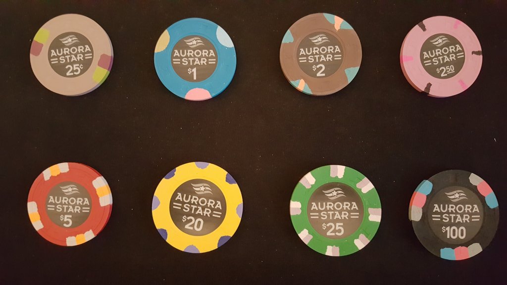
Go this custom aurora star:
Aurora (2).PNG


Or go themed custom "The Taphouse"
Capture.PNG


RHC set, chips TBD

Edit:

The only 3 chips I need for my cash set at the moment - I'm going to pretend that I already own the Caesars 1s even though I have nothing pending at the moment. It will be a white 1 regardless.

Forgive my poor photoshop skills :( I couldn't get rid of that white sliver with my current tools - I should probably get a better image eventually

My initial thoughts include the following:
1. Potentially changing the denom font on the $1 chip, although the more I look at it the more I am starting to like it
2. Edge spot alignments - pretty sure I will keep the first $5 alignment, but I could use feedback on the 50cent chip. I thought I liked 45 degree but the more I look at it, I'm liking horizontal. I won't mix alignments in my set either, I will only pick one or the other :tup: AndI'm pretty confident in the first alignment of the Caesars $1

Thoughts? Not just looking for compliments - real feedback/criticism is appreciated!

Also curious if my black frac will trigger anyone ;)

My 50cent: Jack Detroit Secondary $100
View attachment 390186View attachment 390187
My $1: Caesars Indiana $1
View attachment 390184View attachment 390185
My $5: Aransas $5
View attachment 390188View attachment 390189


Side by side:
View attachment 390186 View attachment 390184 View attachment 390188
 
Last edited:
I was leaning towards the same thing, I will likely edit my label without the water at the bottom
 
Love the artwork and agree about a personalized name. Will the denoms go in the lower water area? That area is a little small.
 
Love the artwork and agree about a personalized name. Will the denoms go in the lower water area? That area is a little small.
I am thinking about getting rid of the water and testing out some denoms down there to see how they look. I should be able to raise the mountains/words slightly higher and make more room for the denoms if they don't fit.

I'll post updates!
 
The only 3 chips I need for my cash set at the moment - I'm going to pretend that I already own the Caesars 1s even though I have nothing pending at the moment. It will be a white 1 regardless.

Forgive my poor photoshop skills :( I couldn't get rid of that white sliver with my current tools - I should probably get a better image eventually

My initial thoughts include the following:
1. Potentially changing the denom font on the $1 chip, although the more I look at it the more I am starting to like it
2. Edge spot alignments - pretty sure I will keep the first $5 alignment, but I could use feedback on the 50cent chip. I thought I liked 45 degree but the more I look at it, I'm liking horizontal. I won't mix alignments in my set either, I will only pick one or the other :tup: AndI'm pretty confident in the first alignment of the Caesars $1

Thoughts? Not just looking for compliments - real feedback/criticism is appreciated!

Also curious if my black frac will trigger anyone ;)

My 50cent: Jack Detroit Secondary $100
220885 (2).png
220885 (3).png

My $1: Caesars Indiana $1
233622 (4).png
233622 (3).png

My $5: Aransas $5
232944 (3).png
232944 (2).png


Side by side:
220885 (2).png
233622 (4).png
232944 (3).png
 
Putting those Aransas 5s to good use! I really like the chips you are using.
Cool, I don’t think you need the water. These look great. My one thought is that you may not be able to actually read “card room” because it may be too small. Personally, I like large and clear denominations and would probably prefer to kick card room out and just make he denom bigger. I would try to test it out by either printing these out to scale or. Asking them 1:1 on your screen and view them at about arm’s length and see how they look.

Good thoughts - thanks for the input!

I really like how the Jack labels have the sub-text under JACK, and that's the design similarity that I am going for.
Background.png


I am hoping that it mimics the "casino" text above, which is readable on the chips I currently have!

I don't want it to be a huge part of the chip, but I definitely want it on there. A part I was struggling with was between "CARD ROOM" OR "POKER ROOM" or potentially even "CASINO" but I am thinking card/poker

I will try and take out card room and make the denom bigger to see if it surprises me, though! Thanks!
 
Good thoughts - thanks for the input!

I really like how the Jack labels have the sub-text under JACK, and that's the design similarity that I am going for.
View attachment 390227

I am hoping that it mimics the "casino" text above, which is readable on the chips I currently have!

I don't want it to be a huge part of the chip, but I definitely want it on there. A part I was struggling with was between "CARD ROOM" OR "POKER ROOM" or potentially even "CASINO" but I am thinking card/poker

I will try and take out card room and make the denom bigger to see if it surprises me, though! Thanks!

Oh yeah I do like the inspiration and think you did a great job. Yeah leave the “card room” in there. I like that the best as well.
 
We play short stack $.50/$1 - No idea why lmao one of those "It's just what we do now" things
I need some "it's just what we do now" players lol

Normally I prefer color matching, but here I like the inlays all the same
 
More ideas:

Also - I officially bought the Caesars one's so these are my definite line-up.

I just need to decide on a design.

Got rid of the mountains, although I love the adirondacks I live about 3hrs+ away so it might not make as much sense. Especially with the "TAPHOUSE" name haha

If I went with an Adriondack label or Saranac, it would work better.

I threw in a pint glass instead!

No gradient/shadow line-up:

50c No Shadow.png
$1 No Shadow.png
$5 No Shadow.png

With gradient/shadow line-up:
50c Shadow.png
$1 Shadow.png
$5 Shadow.png


The only chip I am having a hard time designing is the 5. I don't know if I like either of these choices, but I like both the 50c and $1

Let me know your thoughts!
 
More ideas:

Also - I officially bought the Caesars one's so these are my definite line-up.

I just need to decide on a design.

Got rid of the mountains, although I love the adirondacks I live about 3hrs+ away so it might not make as much sense. Especially with the "TAPHOUSE" name haha

If I went with an Adriondack label or Saranac, it would work better.

I threw in a pint glass instead!

No gradient/shadow line-up:

View attachment 397099View attachment 397100View attachment 397101
With gradient/shadow line-up:
View attachment 397105View attachment 397106View attachment 397107

The only chip I am having a hard time designing is the 5. I don't know if I like either of these choices, but I like both the 50c and $1

Let me know your thoughts!

bottom for sure. love the shadowing. that's an awesome $1!
 
Forgive me - but I had your Havana pr0n open for a side-by-side comparison while flailing at an attempt to semi-recreate hahaha

I hope it's not too obvious/similar!

no that's awesome! im all for it! i love color match inlay's with the 1 matching an edge spot. i think it look's sickkkk :tup:
 

Create an account or login to comment

You must be a member in order to leave a comment

Create account

Create an account and join our community. It's easy!

Log in

Already have an account? Log in here.

Back
Top Bottom