Knollwoods CPC mock-ups (2 Viewers)

72o

4 of a Kind
Joined
Nov 6, 2014
Messages
5,301
Reaction score
10,161
Location
MA
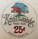
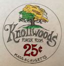
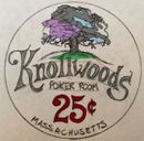
Hey all...well it seems like it's my turn to go custom (mainly due to the rise in Paulson costs). I will be getting a low stakes cash set made of 4 denoms max. ($.25, $1, $5, $20). With my current crew, the $1 chip will be our workhorse chip. The inlay is still a work in progress but will look something like this (just my little hand sketch for now):
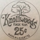
Knollwoods Inlay_compressed.jpg
Quarter_compressed.jpg
Dollar_compressed.jpg
Fiver_compressed.jpg
Twenty_compressed.jpg


Avatar-Knollwoods_reduced.jpg


At this stage though, I just want to try to pin down my chip colors & edgespot patterns and go from there (I may want to throw a little color into the portions of the tree/leaves to match the chip colors later). I will be going with the A-crest mold for sure with 7/8" inlays. I do have a current CPC sample set :p. Thoughts/ideas are always welcome!

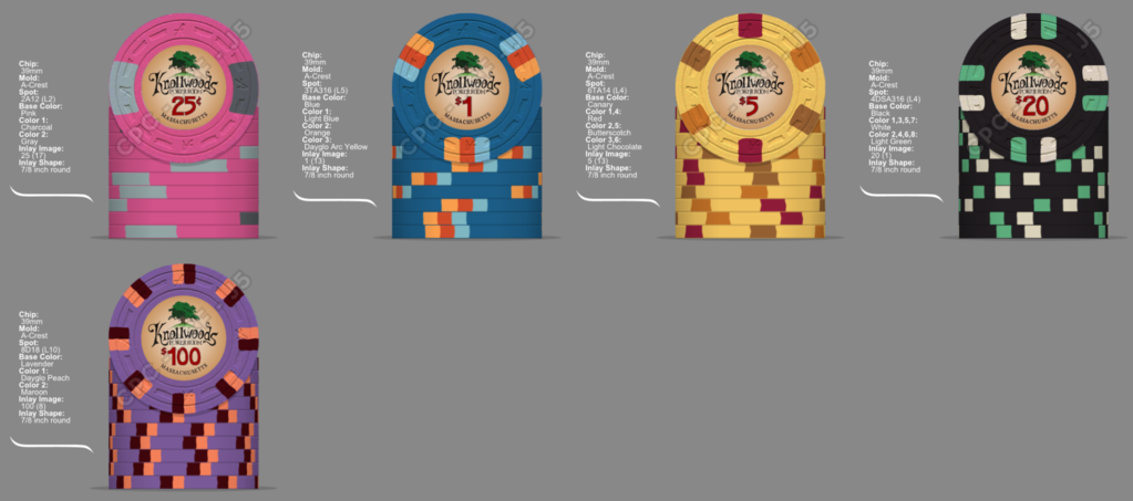
V.1
Knollwoods-01.06.16.png


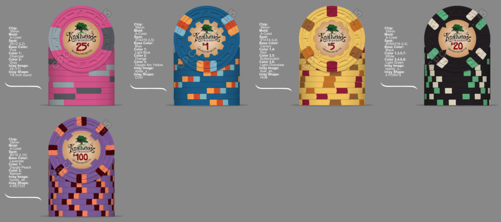
V.2
Knollwoods-01.07.16_inlay.PNG


V.3
Knollwoods-01.13.16.PNG


V.4
Inlay with hundo.png


V.5
Shaped Inlays_reduced inlay size.png


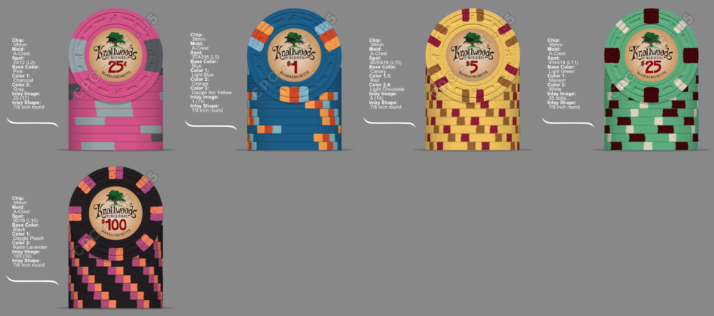
V.6
1.png


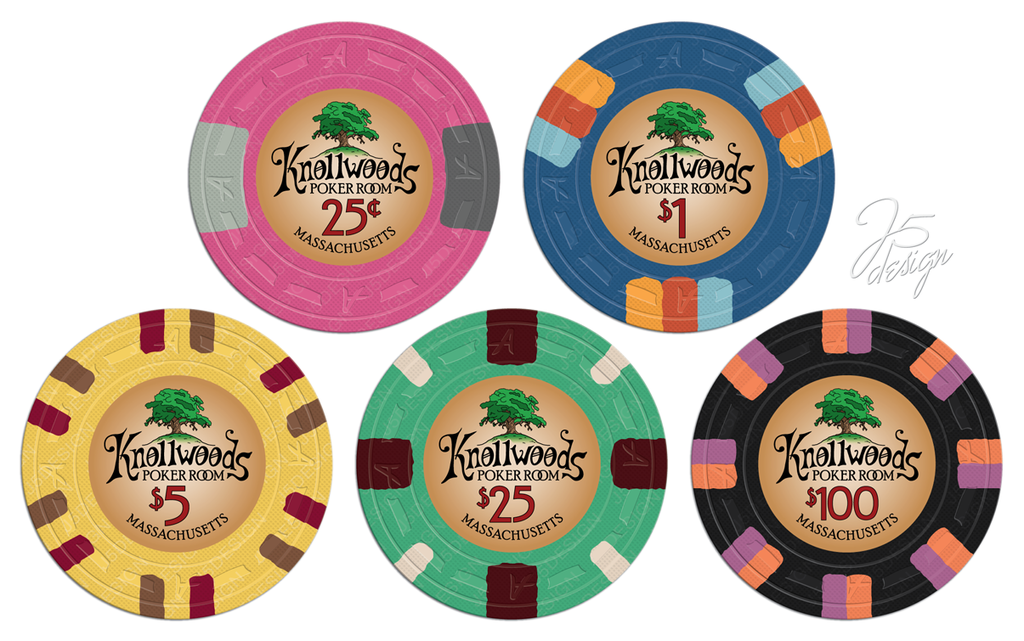
FINAL (big thanks to @Johnny5 )
ac_k1c.png


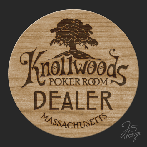
Wood dealer button
image.png
 
Last edited:
I like where your headed with this. Honestly, can't go wrong with the "A" mold. One of my favorites.

I'm not a fan of the quarter. I don't really like pink as a base color. The 1 and 20 are really well done. I don't know if I would change them at all. I like the Canary/light choc. Not the Dayglo Green with it.

Thank you!

What's funny is I made that quarter first and I can't seem to get away from it. I just keep coming back to that particular one and love it. It's probably why I think the Riverboat quarter is one of the nicest looking quarters ever.

In regards to the fiver, do you not like any green in that combo or is it just the dayglo version? I had originally picked light green (I unintentionally chose all weighted colors actually) but once I got the samples, I seemed to like the dayglo green better.


I don't like the quarters in my mock up either. I like green in the mix. Just not dayglo green. Just looks out of place to me. I tried all the green's. I like "green" the best. Followed by Dark Green and retro green.
 
These look pretty good to me. I like chips 1,2, & 4. Something is clashing with the colors for me on #3 though. #2 is my favorite. I also like the use of white on DG Pink, you could toy with that if you're a fan.
 
  • Like
Reactions: 72o
your first shot looks like a winner, would like to see this mockup with the inlay though.
 
  • Like
Reactions: 72o
I like the way this is coming along. Your .25 reminds me of the Mark Twain Terrible's .50.
 
  • Like
Reactions: 72o
Hey all...well it seems like it's my turn to go custom (mainly due to the rise in Paulson costs). I will be getting a low stakes cash set made of 4 denoms max. ($.25, $1, $5, $20). With my current crew, the $1 chip will be our workhorse chip. The inlay is still a work in progress but will look something like this (just my little hand sketch for now):
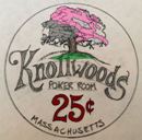
View attachment 27427

At this stage though, I just want to try to pin down my chip colors & edgespot patterns and go from there (I may want to throw a little color into the portions of the tree/leaves to match the chip colors later). I will be going with the A-crest mold for sure with 7/8" inlays. I do have a current CPC sample set :p. Thoughts/ideas are always welcome!

View attachment 27425

View attachment 27426

Heck of a start 72o! I like where you're going man... I for one like the pink quarters for Cali sets...

The only thing that jumps at me is the three color spot on the $1s... I would suggest it follows the two color spots like the other chips...
 
  • Like
Reactions: 72o
Heck of a start 72o! I like where you're going man... I for one like the pink quarters for Cali sets...

The only thing that jumps at me is the three color spot on the $1s... I would suggest it follows the two color spots like the other chips...
Thank you.

Yeah I was trying to get a little sexy with the workhorse (that sounds way to much like beastiality but I think you know what I mean :):sick:).
 
Nice! Great first shot in the OP, and I can relate to what you're going for here. I like your original frac much more than any of the "improvements" suggested, as well as the $5 and $20 (though I do think switching the DG green spot to green or retro green is an improvement.) The $1 is nice but I think the spot colors could use a little work to make it pop - something like this maybe?

436b56da-471a-4d1b-b02a-b3be21cf094a.png
 
Great start. I really like them as is but thought I'd throw something into the mix anyway.

I liked detroits lavender 25¢ so I stole it. Brightened up the $1 slightly and changed up the $5.

I really like your original $20 also but this spot is just to cool.

image.jpg
 
My attempt at some quarters
KNollwoods.png


I don't hate the quarter, but think if you are going to use those colors with pink as the base, I think the 1/4 pie looks the best. I'll digest the one and five later tonight
 
  • Like
Reactions: 72o
@detroitdad I definitely like the darker green spot...thank you
I still need to take a look at the other denom suggestions from everyone...thank you
image.jpg
 
I tried a ton of different options for the pink chip and I couldn't find any that yelled "success" at me. If you love the pink chip. That might be the way to go. It does look cool with gray and charcoal.
 
I tried a ton of different options for the pink chip and I couldn't find any that yelled "success" at me. If you love the pink chip. That might be the way to go. It does look cool with gray and charcoal.
Thank you sir. I appreciate the effort and suggestions.

It's so crazy how changing the hue (or whatever) of a given color can make a chip fit so much better (the fiver). (y) :thumbsup:
 
Nice! Great first shot in the OP, and I can relate to what you're going for here. I like your original frac much more than any of the "improvements" suggested, as well as the $5 and $20 (though I do think switching the DG green spot to green or retro green is an improvement.) The $1 is nice but I think the spot colors could use a little work to make it pop - something like this maybe?

View attachment 27435

Ben was in my head for this one. Pretty much agree with everything he said, including the suggestions on the $1.

Love the inlay, and really looking forward to the final products!
 
The inlay will obviously be done by a professional, but any thoughts on my "CAD" version? Oak tree will be color-matched. I'm in no way tied to this font, but my first attempt yielded this. I think I need to omit the transparency on the tree? It seems a little light?

Quarter-CAD.PNG
Quarter-CAD_no fade.PNG
 
Last edited:

Create an account or login to comment

You must be a member in order to leave a comment

Create account

Create an account and join our community. It's easy!

Log in

Already have an account? Log in here.

Back
Top Bottom