Timmy501
Pair
Hi all,
I'd really like your opinion on a design I've be playing with. First off, a little background. I'm a big Beatles and John Lennon music fan. I also happen to live on Lennon Ln. No, really, just a coincidence.
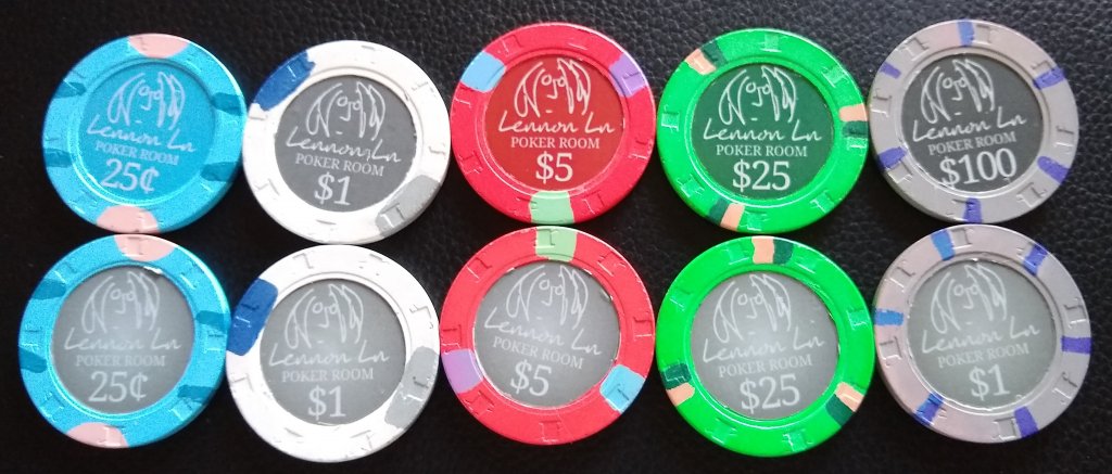
I've got a mixed set of chips and I'm going to relabel them. Doing this myself, so wish me luck. At first I tried a label over the existing inlay, but wasn't really satisfied with the results. Now I've moved on to removing some inlays on testing chips and seeing what it would look like. For these mockup pictures I reused the 1 1/8 inch vinyl stickers that I had originally purchased and then used a utility knife to cut off the edges. Hence, the poor trim. I do plan on buying full sheet labels, a laminate, and a 1" punch for the final product.
The top row is the basic design with different colored backgrounds for each denomination. The second row uses a grey gradient background for all of them. If I use the gradient, I'll probably make the background a little darker.
I'd really like to hear some feedback on the design and colors. Also, is 1" the correct size punch, or do I need to do one just a little smaller?
Thanks!!
Tim


