Is this inlay for a polyclay chip okay? Any recommendations? (1 Viewer)

Centaurii

Sitting Out
Joined
Mar 13, 2021
Messages
12
Reaction score
8
Rewards
0
Location
United States
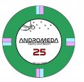
I like space so I made up a casino and resort with the name "Andromeda". I prefer simple neutral color palettes so I went with all black except red for the denomination. Just wanting to know if it looks okay or if something may be off, thanks!

Chip Inlay.jpg
 
I would stick to one theme. Maybe change the palm trees to something more "Andromeda-related". Maybe star of some sort or Planets?
I would also make the size of the "Andromeda" frase larger. Maybe print out the label at the size it will be on the chip to see how the composition works.

Or use the poker chip design tool to see how it looks on a chip. I find that very helpful.

http://www.pokerchipdesigntool.com/
 
agree on ditching the palm trees, they don't make sense. "Andromeda" font should be much bigger. and since you're naming it after a spiral galaxy,it would be cool to work a spiral galaxy graphic into it.

i like space too.
 
You have a lot of room to make all the text bigger, and therefore more legible. I like where your idea is headed. :tup:
 
I would stick to one theme. Maybe change the palm trees to something more "Andromeda-related". Maybe star of some sort or Planets?
I would also make the size of the "Andromeda" frase larger. Maybe print out the label at the size it will be on the chip to see how the composition works.

Or use the poker chip design tool to see how it looks on a chip. I find that very helpful.

http://www.pokerchipdesigntool.com/
Ill make “Andromeda” larger, and I agree about multiple themes. I was having troubles with what I wanted on the ends of the name but Ill definitely try to find something to replace the trees. Thank you :)

agree on ditching the palm trees, they don't make sense. "Andromeda" font should be much bigger. and since you're naming it after a spiral galaxy,it would be cool to work a spiral galaxy graphic into it.

i like space too.
Yeah, Ill admit I wasn’t a fan of the palm trees either, and I did want to incorporate a galaxy. Although, I found it hard to use a galaxy without making the chip overly busy as I was trying to go with a more clean look, so maybe Ill try planets or something :D
 
Love the idea. I agree with what others have said, the font for Andromeda and the palm trees don't jive with the space theme.

When I think of space, I think of NASA and Star Wars. Big Bold fonts.


Just playing around with an idea here.

androm.jpg
 
Love the idea. I agree with what others have said, the font for Andromeda and the palm trees don't jive with the space theme.

When I think of space, I think of NASA and Star Wars. Big Bold fonts.


Just playing around with an idea here.

View attachment 661509
I like this, and it gives me a few ideas as well. If I use something of this variant, is that okay?
 
I think the denomination needs to be much larger. Fill up all the vertical space between "casino and resort" and the bottom. And a not so blocky of a font for the denom would also look good. :tup:
 
Love the idea. I agree with what others have said, the font for Andromeda and the palm trees don't jive with the space theme.

When I think of space, I think of NASA and Star Wars. Big Bold fonts.


Just playing around with an idea here.

View attachment 661509
What program are you using for mock ups like this? I’ve been trying to mess around with some inlay ideas and MS paint just won’t do it for me
 
Inlays always look good at a larger size. To get a good perspective on how a inlay will look print off a test that is actual size 7/8"-1 1/16" and see how it looks at that resolution. IMO there is too much white space, everything needs to be larger.
 
What program are you using for mock ups like this? I’ve been trying to mess around with some inlay ideas and MS paint just won’t do it for me

I use Adobe Illustrator, which I think is $19.99 a month. It takes a bit of time to learn the ins and outs, Youtube has been my friend.
 
agree on ditching the palm trees, they don't make sense. "Andromeda" font should be much bigger. and since you're naming it after a spiral galaxy,it would be cool to work a spiral galaxy graphic into it.

i like space too.
The entirety of the face looks like three graphics stacked together; image, logo, and denom. Why not make the background a spiral galaxy shot?
 
Or maybe....?
I decided to change the font and drop the trees, I chose the same font that NASA uses, and Im thinking about sticking to this. Disregard the color, that was just me messing around when I got a little bored haha

Ill align it and stuff after, thats just the rough draft :)
 

Attachments

  • cpcpost.jpg
    cpcpost.jpg
    47.9 KB · Views: 105
something simple like these would be cool. the first one could be the O

1616531427674.png


1616531499174.png

1616531572407.png
 
Last edited:
i like this a lot. but all the focus on planets is bugging me, andromeda is a galaxy damnit o_O

also funny that OP hasn't responded once and we've redesigned his inlay :ROFL: :ROFLMAO:
Yeah, the idea in my mind is that the casino was the first in the Andromeda, and the inlay is a typical view from whatever planet they are on haha.

Ive been responding, but maybe they arent going through. Although I love the one above, Im more of a clean/simple guy and want minimal design, kind of like the WTHC chips.

I wouldn’t be apposed to making the same inlay as I put above (with the NASA font,) and making it a dark inlay with white font, but Im not too good at this stuff so idk how to do that without making it a pain lmao
 
i like this a lot. but all the focus on planets is bugging me, andromeda is a galaxy damnit o_O

also funny that OP hasn't responded once and we've redesigned his inlay :ROFL: :ROFLMAO:

Good point, it's also the daughter of the King of Aethiopia, but I feel like Greek mythology doesn't fit in to OP's theme

@Centaurii sorry for hijacking your thread! :LOL: :laugh:
 
Good point, it's also the daughter of the King of Aethiopia, but I feel like Greek mythology doesn't fit in to OP's theme

@Centaurii sorry for hijacking your thread! :LOL: :laugh:
Haha nooo its fine!

Its fun reading your ideas and opinions. Im pretty happy with the simple look I put together with the NASA font, although yours are much more artistic than I could ever put together. I tried to take the NASA looking one and make the font white and stuff while using a black inlay but my program isn’t the best and it turned out to be a pain by leaving small white uncolored parts around some of the letters and vectors.
 
Yeah, Ill admit I wasn’t a fan of the palm trees either, and I did want to incorporate a galaxy. Although, I found it hard to use a galaxy without making the chip overly busy as I was trying to go with a more clean look, so maybe Ill try planets or something :D

maybe try one of the little spirals I posted above as the "O" in Andromeda?
 
I like this, and it gives me a few ideas as well. If I use something of this variant, is that okay?

Of course. I was just having some fun playing around with ideas. If you want me to email any of the files or elements send me a PM
 
What program are you using for mock ups like this? I’ve been trying to mess around with some inlay ideas and MS paint just won’t do it for me

As @Pinesol13 mentioned, you can use Adobe Illustrator or you can also use a free tool called Inkscape (https://inkscape.org/). It's probably not as robust as Illustrator but it has helped me visualize a lot of designs and allowed me to quickly work through things. There are a lot of YouTube videos to get you started. Good luck!
 

Create an account or login to comment

You must be a member in order to leave a comment

Create account

Create an account and join our community. It's easy!

Log in

Already have an account? Log in here.

Back
Top Bottom