Ok, just like everyone else that has stumbled on to this site for some other reason and next thing you know, you are spending a ton of money on chips, hot dog rollers, poker mats, and God knows what else, I have purchased various Paulsons for a cash game set and a tourney set. I am working with a designer on the forum on the cash set and we will see how that goes, but in the meantime, I decided that I would try and give the tourney set a go by myself. Now, I have been using Photoshop for years, but I have had zero experience with Illustrator and every time I tried in the past, I felt like someone in a foreign country with no language skills. But with the help of many You Tube videos and a good deal of swearing, I think I have a basic feel for it now.
Here is the basic story for why my Tourney set will be the way it is. I live on a street called Wakefield Court, which is a double cul-de-sac of 41 houses in Southern California. We have a really good poker group on the street and can get a game of 8 to 16 players together on pretty much any weekend. The thing with this street is that it is kinda famous in LA County as it transforms into Wakefield Winter Wonderland (google it) in December and we pretty much have thousands and thousands of visitors, both on foot and in cars, every single night. Yeah, we do a LOT of work in November. We also have a fun little Eastside vs. Westside ribbing in our group, so I had to throw Wakefield East on the chips...
Anyway, my cash game set (which will get the most play) will have nothing to do with Christmas. But I figured I would make a fun Christmas set as my T25 tourney set using various themes from the street in December.
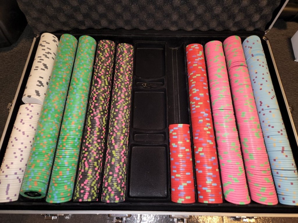
So here are the chips I have acquired for my T25 tourney set. They have not been murdered yet, or washed. So please excuse the hooker juice. That will get taken care of once the inlays are removed. All of the inlays will be removed except on the HSI 1's since it has a 7/8 inlay even though it is an RHC. I will overlabel those since they are bounty chips anyway. Not worried about spinners with that use. All of the chips are RHC except the light blue chips on the right. The Boulder Station 1's are THC and for that chip, I decide to do a front and a back since I have less room to work with. All of the other chips (except the seating chips) will have the same thing on each side.
I tried to acquire "Christmassy" looking chips that fit the themes I had in mind. I think I nailed it.
Please forgive my non-traditional colors for denominations, but I took some liberties based on numbers of chips I had and what I needed for each. Here is the art that I came up with for the labels. I tried to incorporate the colors of the markings on the chips the best I could.
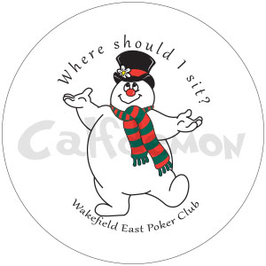
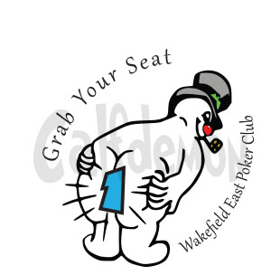
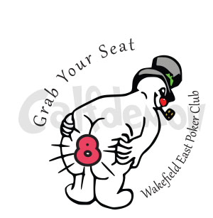
The Seating Chips will be the black and white chips in the upper left. The front of each chip will obviously be the same and then the backs have the numbers from 1-10 in both blue and red for 2 table tournaments. Obviously the watermarks will not be on the chips... lol
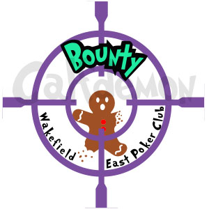
I am using the HSI purples for the bounty chip and incorporated the markings into the scope...
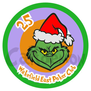
So now we get to the actual tournament chips... At Christmas, my house decor is all Grinch and Whooville. So figured I would start with mine on the 25 chips. The Jack Cinci 25s will be used for these...
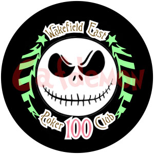
My buddy across the street does Nightmare Before Christmas so Jack had to make an appearance. The 100 Majestic Star chips worked perfectly for this...
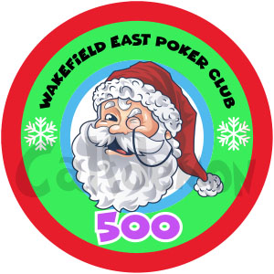
Cant have Christmas without a Santa... The Terrible's $5 chips are being used for the 500s
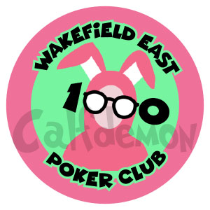
And what is Christmas without A Christmas Story. The pink BestBet $2 chips will be used as the 1000s
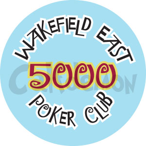
Finally, we get down to the 5000 chip. I originally was going to use the pink at the 5000 and the light blue as the 1000, but decided to use the THC as the last chip since it will be a 2 sided chip. Just seemed to cap off the set better that way. I may rethink this chip, but this is how I have it for now.

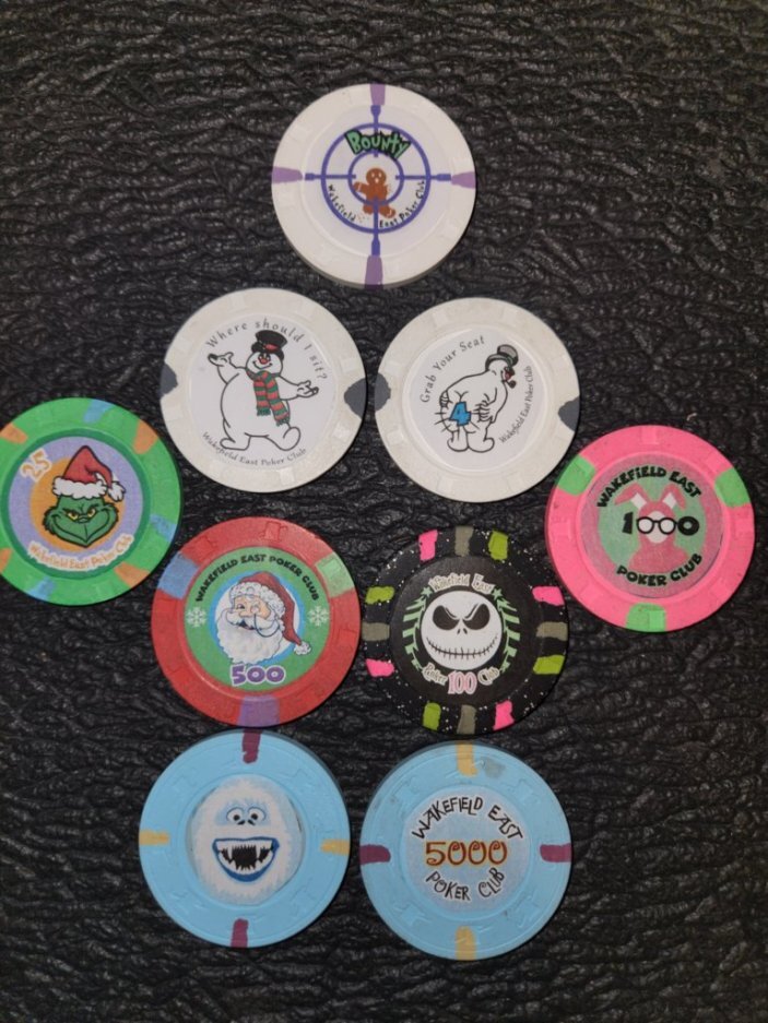
I went ahead and printed them to size on paper and mocked up a set of the chips to see how they look. They will obviously need some color adjustment to match the chips better, but hoping that is something that Gear can help me with once I get ready to print these. Here is how they looked mocked up...
So there it is... I am sure there are plenty of ideas and opinions, but keep in mind, this was my first time trying to figure out Illustrator, so overall, I am pretty happy with what I did. There are a couple of things I might change before it goes to print, and I am curious to hear any ideas or critiques as well.
Thanks!!
Here is the basic story for why my Tourney set will be the way it is. I live on a street called Wakefield Court, which is a double cul-de-sac of 41 houses in Southern California. We have a really good poker group on the street and can get a game of 8 to 16 players together on pretty much any weekend. The thing with this street is that it is kinda famous in LA County as it transforms into Wakefield Winter Wonderland (google it) in December and we pretty much have thousands and thousands of visitors, both on foot and in cars, every single night. Yeah, we do a LOT of work in November. We also have a fun little Eastside vs. Westside ribbing in our group, so I had to throw Wakefield East on the chips...
Anyway, my cash game set (which will get the most play) will have nothing to do with Christmas. But I figured I would make a fun Christmas set as my T25 tourney set using various themes from the street in December.
So here are the chips I have acquired for my T25 tourney set. They have not been murdered yet, or washed. So please excuse the hooker juice. That will get taken care of once the inlays are removed. All of the inlays will be removed except on the HSI 1's since it has a 7/8 inlay even though it is an RHC. I will overlabel those since they are bounty chips anyway. Not worried about spinners with that use. All of the chips are RHC except the light blue chips on the right. The Boulder Station 1's are THC and for that chip, I decide to do a front and a back since I have less room to work with. All of the other chips (except the seating chips) will have the same thing on each side.
I tried to acquire "Christmassy" looking chips that fit the themes I had in mind. I think I nailed it.
Please forgive my non-traditional colors for denominations, but I took some liberties based on numbers of chips I had and what I needed for each. Here is the art that I came up with for the labels. I tried to incorporate the colors of the markings on the chips the best I could.
The Seating Chips will be the black and white chips in the upper left. The front of each chip will obviously be the same and then the backs have the numbers from 1-10 in both blue and red for 2 table tournaments. Obviously the watermarks will not be on the chips... lol
I am using the HSI purples for the bounty chip and incorporated the markings into the scope...
So now we get to the actual tournament chips... At Christmas, my house decor is all Grinch and Whooville. So figured I would start with mine on the 25 chips. The Jack Cinci 25s will be used for these...
My buddy across the street does Nightmare Before Christmas so Jack had to make an appearance. The 100 Majestic Star chips worked perfectly for this...
Cant have Christmas without a Santa... The Terrible's $5 chips are being used for the 500s
And what is Christmas without A Christmas Story. The pink BestBet $2 chips will be used as the 1000s
Finally, we get down to the 5000 chip. I originally was going to use the pink at the 5000 and the light blue as the 1000, but decided to use the THC as the last chip since it will be a 2 sided chip. Just seemed to cap off the set better that way. I may rethink this chip, but this is how I have it for now.
I went ahead and printed them to size on paper and mocked up a set of the chips to see how they look. They will obviously need some color adjustment to match the chips better, but hoping that is something that Gear can help me with once I get ready to print these. Here is how they looked mocked up...
So there it is... I am sure there are plenty of ideas and opinions, but keep in mind, this was my first time trying to figure out Illustrator, so overall, I am pretty happy with what I did. There are a couple of things I might change before it goes to print, and I am curious to hear any ideas or critiques as well.
Thanks!!
