GPI/BCC Spotted Hot Stamps (1 Viewer)

Status
Not open for further replies.
The link to a document on the GPI website was posted at one time in a thread about the Columbani chips. Now, it seems, that whole thread has been deleted? wtf?

Anyone here have the documentation on the Blue Chip line?

All I have is what's in the OP. What is it that you're looking for?
 
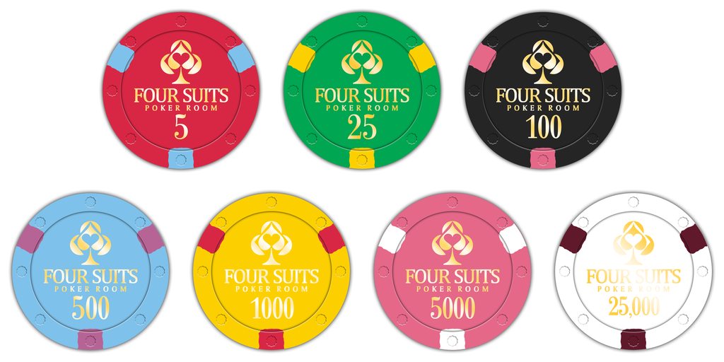
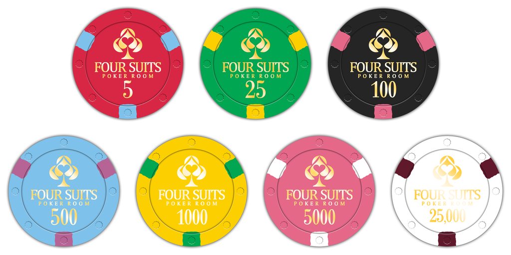
Okay, so after going over this every which way I can think of and doing a bunch of different mock-ups, I really think that this is the best design for the set. I know that there are chip bases that are the same color as edge spots, but with only 10 colors to choose from there was really no way to avoid that. After looking at a ton of different Vegas sets I saw a lot of that anyways. The good thing, I think, is that all of the spots contrast well with the chip bases and we used up all of the available colors except Camel, which I don't much care for.

Please let me know your thoughts because I'm ready to submit these colors to GPI. Thank you everyone for everything.

93EFXwbh.png
 
Last edited:
Okay, so after going over this every which way I can think of and doing a bunch of different mock-ups, I really think that this is the best design for the set. I know that there are chip bases that are the same color as edge spots, but with only 10 colors to choose from there was really no way to avoid that. After looking at a ton of different Vegas sets I saw a lot of that anyways. The good thing, I think, is that all of the spots contrast well with the chip bases and we used up all of the available colors except Camel, which I don't much care for.

Please let me know your thoughts because I'm ready to submit these colors to GPI. Thank you everyone for everything.

V78LmnEh.png

Love it, with a couple of suggestions:

- Prefer the Camel spot on the red chip - that's a classy look

- Prefer the red spot on the yellow chip -- the green spot makes the 1k look like a $25

- Not sure the 5 and 5k would be distinguished in low light, but this may not matter since they will never be on the same table
 
Love it, with a couple of suggestions:

- Prefer the Camel spot on the red chip - that's a classy look

- Prefer the red spot on the yellow chip -- the green spot makes the 1k look like a $25

- Not sure the 5 and 5k would be distinguished in low light, but this may not matter since they will never be on the same table

The T1000 was an accident. I meant to put the one with the red spots in there. Thanks for pointing that out. Also, the T5 and T5000 problem shouldn't matter because I can't imagine them being in play together.

EDIT: Fixed.
 
Last edited:
Just noticed this in my singles collection.. I didn't realize this theme had been done before?

IMG_0414.JPG
 
Edge spot on the 500 is too close to the pink on the 100?
 
Okay, so after going over this every which way I can think of and doing a bunch of different mock-ups, I really think that this is the best design for the set. I know that there are chip bases that are the same color as edge spots, but with only 10 colors to choose from there was really no way to avoid that. After looking at a ton of different Vegas sets I saw a lot of that anyways. The good thing, I think, is that all of the spots contrast well with the chip bases and we used up all of the available colors except Camel, which I don't much care for.

Please let me know your thoughts because I'm ready to submit these colors to GPI. Thank you everyone for everything.
93EFXwbh.png

Edge spot on the 500 is too close to the pink on the 100?

I agree with this, but I think it's because you have three red/pink shades of spots in a row (T100 - T500 - T1000). I honestly think you nailed it with the previous Set A.

Some thoughts
- If you like the above combinations, I would swap the T500 and T5000.
- If you want the sky blue as the T500, then use sky blue/white and lavender/sky blue for the T5000.
- Have white / lavender for the T500 and a sky blue / lavender for the T25000.
 
Last edited:
Yeah I think set A with the red 5000 from B with either white or camel edge spots was right on the money for me.
 
I took another look at the chart in the OP and part of the issue with some of my suggestions is that antique white and sky blue are quite close. Will a sky blue / white combo look like a solid in some lighting conditions? I've been swayed by the mockups, and I wonder if the colours are more distinguishable there.

If so, then swapping the T500 and T5000 is the easiest solution.
 
Last edited:
Some more photos for reference..

I realize that the white on my own 618 BCC chip is a bright white, rather than antique white (see the columbani 25)

IMG_0419.JPG


Also including a photo of these other Columbani color combinations. Personally I think we should go with a lavender base and blue edge spots for the 500

IMG_0420.JPG


Also the Cranberry / Camel combination looks great here
 
If that Colombani T500 is sky blue, can we see the white from the Colombani 25 next to it? I may simply need new eyes.
 
Some more photos for reference..

I realize that the white on my own 618 BCC chip is a bright white, rather than antique white (see the columbani 25)

View attachment 170710

Also including a photo of these other Columbani color combinations. Personally I think we should go with a lavender base and blue edge spots for the 500

View attachment 170711

Also the Cranberry / Camel combination looks great here

The Cranberry/Camel combo does look good here.
 
I really think that @MoscowRadio should go with whatever design he likes best. You’re never going to please everyone and it’s pointless to try. No matter what base, spot, and hotstamp choices you make you’ll likely find some chipper that doesn’t like them and decides not to buy.

I say make your choice and stand by it. All these design threads have gone on long enough.
 
I really think that @MoscowRadio should go with whatever design he likes best. You’re never going to please everyone and it’s pointless to try. No matter what base, spot, and hotstamp choices you make you’ll likely find some chipper that doesn’t like them and decides not to buy.

I say make your choice and stand by it. All these design threads have gone on long enough.

Whoa...hes asked for input. Should we get off your lawn while we’re at it? Ease up there grumpy.
 
Whoa...hes asked for input. Should we get off your lawn while we’re at it? Ease up there grumpy.

???

Thumbs down for reading comprehension, or lack thereof. Although if you find offense in a simple straight forward opinion then yes, I would like you off my lawn.
 
Whoa...hes asked for input. Should we get off your lawn while we’re at it? Ease up there grumpy.
???

Thumbs down for reading comprehension, or lack thereof. Although if you find offense in a simple straight forward opinion then yes, I would like you off my lawn.

I did absolutely ask for input, but I very much understand where @RichMahogany is coming from. Please keep it civil guys.
 
I really think that @MoscowRadio should go with whatever design he likes best. You’re never going to please everyone and it’s pointless to try. No matter what base, spot, and hotstamp choices you make you’ll likely find some chipper that doesn’t like them and decides not to buy.

I say make your choice and stand by it. All these design threads have gone on long enough.

Fair point.
 
This looks awesome!
Might I make the suggestion of making the red chip the 25k and the white chip the 5k? That seperates the red base from the red spot on the 1k, and there is still some presidence of 25k chps being red.

Also, for the purposes of the mocks I compared the Columbani chips to my Paulson samples.

The BCC Day Green is closest to Munzel Green or Dark Green - I wouldn't use Paulson Day Green for mock purposes.
BCC Cranberry is closer to Red.
 
Alright folks! This is the one! Tourney set is finished! Once the cash set is complete I will post a new thread to get an estimate on numbers.

3Vs8YqXl.png
Was hoping to see a 5 included with this. Strongly considering a microstakes/tourney order. Regardless, this is the best 6-chip lineup I’ve seen top to bottom. GB-worthy, IMO.

Well done.
 
Status
Not open for further replies.
Back
Top Bottom