-
PCF is an eBay Partner. If you make a purchase through one of our links, we may earn a commission at no extra cost to you. Thank you for your support!
You are using an out of date browser. It may not display this or other websites correctly.
You should upgrade or use an alternative browser.
You should upgrade or use an alternative browser.
First Try at a Custom Set - Mountain Halls (2 Viewers)
- Thread starter BackAtMatt
- Start date
SeanGecko
4 of a Kind
Go for Black dollar!!!
Sky's the limit with Tina chips. Nearly unlimited colors and spots are available. Just my opinion, but these are pretty bland, especially the colors. But if that's what you are going for, then do it. Maybe you can give us more of a backstory on your theme, otherwise it's pretty hard to critique what you have and make suggestions. Tell us what these mean to you and how you came up with the concept. Are you happy with the somewhat monochromatic colors? Especially the $5 with only shades of brown and the $25 with only shades of green. Personally, I prefer chips that pop with bright and contrasting colors.
This is a set that is a work in progress for me. If the colors and designs make you dizzy and want to throw up, then I'm not who you want to be taking chip design advice from.
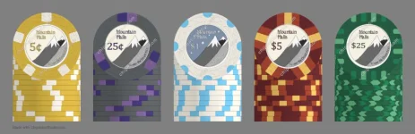
No custom inlay yet, so top row - nickel, quarter, dollar, $5 and $20.
second row - $25, $100, alternate $100 and $500.

This is a set that is a work in progress for me. If the colors and designs make you dizzy and want to throw up, then I'm not who you want to be taking chip design advice from.
No custom inlay yet, so top row - nickel, quarter, dollar, $5 and $20.
second row - $25, $100, alternate $100 and $500.
BackAtMatt
Waiting List
Your words not mine! I was going for more of a classic set matching some of the Vegas/East Coast colors for chips. I agree they're rather plain overall.If the colors and designs make you dizzy and want to throw up
Appreciate the message though! I feel like the inlay for that set is going to have a lot going on to keep up with the rest of the chip!
The inlay/label is my avatar.Your words not mine! I was going for more of a classic set matching some of the Vegas/East Coast colors for chips. I agree they're rather plain overall.
Appreciate the message though! I feel like the inlay for that set is going to have a lot going on to keep up with the rest of the chip!
Colquhoun
Straight Flush
Nice design! The mountain art and that typeface go very well together.
I do recommend avoiding oldstyle numerals though, as the varying heights look a bit odd in chip denominations.
I do recommend avoiding oldstyle numerals though, as the varying heights look a bit odd in chip denominations.
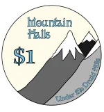
The chip that’s catches my eye the most is your $5 because it’s not often you see the spots run underneath the inlay. It’s creating this really cool star effect the is really popping your inlay design. And I like the red/maroon/yellow combo best of your current options.
While it is rarely the most popular choice, I like your use of muted tones for the base colors. Bright is fun and noticeable, but muted is classic and never goes out of style
I think some things that could use some more consideration are your spot design and color combos for the other chips. If you can find similar feels for the others that gel with your $5, I think you could be onto something. I know spot progression is big around these parts, but I’ve always had a soft spot for the same spot layout on each chip, when done well. And I wonder if your star pattern could stand out in that way.
I’d also suggest considering a different color background for your $1 if you stay with a white chip, especially if you choose spots that don’t to ride under your inlay. It feels really lopsided to me with the white field in the upper left. The whole chip is bottom heavy. Maybe that label shows the night sky with stars and the moon silhouetting the mountains?
I think you’ve got a really good start to something fun. I’m excited to see where it goes!
BackAtMatt
Waiting List
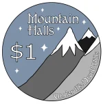
Well now the issue is I really like the night sky on the $1 but I feel like the other chips need "seasons" for the sky on each of them since just having one different feels a bit off and I don't like the blue background on all of the other chipsI’d also suggest considering a different color background for your $1 if you stay with a white chip, especially if you choose spots that don’t to ride under your inlay. It feels really lopsided to me with the white field in the upper left. The whole chip is bottom heavy. Maybe that label shows the night sky with stars and the moon silhouetting the mountains?
I didn't think I'd agree since I really liked the font but changing it to a more even version helpedthe varying heights look a bit odd in chip denominations.
Attachments
BackAtMatt
Waiting List
Ok I added color to the background of each chip and made a few color changes to the pips so the $1 doesn't stand out too much. A bit unsure what to do with the $25 chip now.
.webp")
Kid_Eastwood
4 of a Kind
The small text in the label might not be readable after printing, especially if they are full ceramics. Even on hybrids, printing might not render well.
Pay attention to this during the sampling / validating phase of your project.
I like classic colors for the 1, 5 and 25 but would have used (personal choice) a pink and yellow for the fracs (these colors were quite common in older Vegas chips - ex. pink 50c for the Silver Star, yellow quarters, ...). So I'd have gone with pink 5c and yellow 25c. Again, just my preference, nothing bad with your choice.
Those little changes in the labels make a huge difference.
A thought for the $25: Are there any flowers that grow on the mountain you could represent with the colors of the edge spots?
And I’ll second some of the concerns about text being legible. It’s a small area to start with, so it may take some massaging now or on proofing to ensure everything is there. It may just be the file type, but “under the Druid hills” isn’t very readable in the pictures you’ve got on 2 or 3 of the chips
Last edited:
jEarnhardt
Waiting List
I'm trying to decide what to do with a new custom cash set. I like this more subtle approach, but the one thing I see that pops 'wrong' for me in your design is the gray 25-cent... the inlay gray is too close in tone to the chip background and looks almost connected. Purely a personal aesthetic observation though - repeating others a little here, but your design looks like it would print well on a sticker but maybe not so well on a full ceramic no mold.
RedWolf
Sitting Out
I think these look great, well thought out on the color combos and how they each align with each chip. If you're going for the classic Vegas/East Coast colors I think you nailed it. I may be slightly worried that the text may not come out as legible as you might prefer, but I dig the overall design for sure. My two cents regarding the gray, I personally prefer the thin white outline between the mountain for clearer separation. Rad design and logo!
BackAtMatt
Waiting List
From what I've seen of Hybrid chips the smaller text prints our pretty well. I'm also planning on getting 43mm chips which should give me a bit more room to work with. I appreciate all the advice though so I'll make sure to keep an eye on it. I also went an increased the text sizes just a bit to help out where I could. I also swapped the circles and lines on the 5 cent and $1 chip.
.webp")
I think my biggest question left is still the background on the green chip, green sky looks strange, grey fits the chip the best but kind of blends in the whole inlay, blue feels the most natural for the label but doesn't tie into the chip at all.
I think my biggest question left is still the background on the green chip, green sky looks strange, grey fits the chip the best but kind of blends in the whole inlay, blue feels the most natural for the label but doesn't tie into the chip at all.
Attachments
Similar threads
- Replies
- 15
- Views
- 698
- Replies
- 39
- Views
- 2K
- Replies
- 20
- Views
- 669