Favorite Casino Set That Has One Goat in the Lineup? (1 Viewer)

gopherblue

Straight Flush
Joined
Aug 13, 2013
Messages
8,249
Reaction score
22,871
Location
Fuggedaboudit!
There are many, many threads featuring favorite “GOAT” casino chips or “GOAT” casino sets. What I’m interested in are casino sets that you otherwise love, but that inexplicably contain an actual goat—a chip you hate.

It can be for any reason: terrible colors, terrible spot pattern, terrible inlay. But it has to be a casino set that—but for the ugly duckling—you otherwise love. And it needn’t be a casino set that is available in quantity—sample sets qualify.

I’ll start off. I love the Palace Reno TRK chips—those of you who know me know I adore old-school simplicity. The lower demons, even the snapper, are just gorgeous and pop. But I just can’t abide that hideous $5. It’s a showstopper, alright, but in all the worst ways. A terribly dull shade of orange, bordering on brown, but in a bad way—not a rich brown like the snapper. And with depressingly uninteresting giant black spots. Can you imagine stacks of that as your workhorse chip? Ugh.
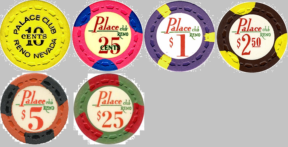
E8DD2CE3-5357-4A5F-9877-81F8D8088839.png


(I’ll update with a proper picture once I’m reunited with my collection this weekend.)

Now...your turn. Any sensational casino sets out there with a goat that grinds your gears?
 
I love the Dunes rack - but the $25 is a real turd.
I can definitely see why people think that about the $25 and maybe say that it doesn’t fit the rest of the set, but I really like it.

I agree though about the aztar $5. That thing is heinous.
 
I’d like to nominate the horseshoe cincy secondary $5. I know it doesn’t go with the Cleveland’s, but I’d hoped to include it with my set, since I can’t afford the high denoms.

To my mind it looks crap with both Cleveland and cincys with its boring base colour and ugly edgespots. I’m gonna relabel some casino lines 5s instead.

Picture evidence of its blandness.
Ps I’m not saying the horseshoes are a particularly awesome set, but they are affordable and available so I like them.
E3BDB92B-2FEB-496C-B57D-E014D4FDB7A6.jpeg
 
There are many, many threads featuring favorite “GOAT” casino chips or “GOAT” casino sets. What I’m interested in are casino sets that you otherwise love, but that inexplicably contain an actual goat—a chip you hate.

It can be for any reason: terrible colors, terrible spot pattern, terrible inlay. But it has to be a casino set that—but for the ugly duckling—you otherwise love. And it needn’t be a casino set that is available in quantity—sample sets qualify.

I’ll start off. I love the Palace Reno TRK chips—those of you who know me know I adore old-school simplicity. The lower demons, even the snapper, are just gorgeous and pop. But I just can’t abide that hideous $5. It’s a showstopper, alright, but in all the worst ways. A terribly dull shade of orange, bordering on brown, but in a bad way—not a rich brown like the snapper. And with depressingly uninteresting giant black spots. Can you imagine stacks of that as your workhorse chip? Ugh.


(I’ll update with a proper picture once I’m reunited with my collection this weekend.)

Now...your turn. Any sensational casino sets out there with a goat that grinds your gears?
When describing chips, I think we can't use the words hideous or ugly anymore. We have to be very kind, as we are with our children...:p:LOL: :laugh::D:ROFL: :ROFLMAO:
 
For me, it's the revered Mapes set. Colossal chips, but that light blue $25? It's like they suddenly ran out of pigment ... or imagination.

I'm not a fan of the washed-out natural colors of the Aztar MO $25 either, but I have a very large set of them anyway...
 
For me, it's the revered Mapes set. Colossal chips, but that light blue $25? It's like they suddenly ran out of pigment ... or imagination.

I'm not a fan of the washed-out natural colors of the Aztar MO $25 either, but I have a very large set of them anyway...

The Mapes $25 is a beautiful turquoise, not light blue :eek:
 
I’ll throw my hat in the ring with (predictably) the grand casino Gulfport.
This is one of the coolest sets ever. I’ll allow that the $5 isn’t particularly inspired, but it’s still good enough. Other than that, I think the $1 through $500 are stunning.
DC4033D3-6C54-4B7C-91EE-B12761B21C88.jpeg

Then we get to this:
16245696-BA61-4FFA-AD82-0F2A411B1559.jpeg

It’s like whomever came up with those other wonderful color combinations went to lunch and some other guy threw this one together.
 
What's really depressing is when there's a secondary set and one or more of the secondaries totally outshines the primary. Case in point: the Cleveland $100 primary versus the secondary and to a lesser extent the Cincinnati primary versus secondary.
 
AS $0.25 and opinions aren't necessary because THC fracs are rare and it still sells for less than $250 a rack. By comparison the ES frac sells for $600+

Not a bad chip and I don't mind it, but it's not exactly exciting and it's the weakest link in an otherwise stellar lineup.
 
AS $0.25 and opinions aren't necessary because THC fracs are rare and it still sells for less than $250 a rack. By comparison the ES frac sells for $600+

Not a bad chip and I don't mind it, but it's not exactly exciting and it's the weakest link in an otherwise stellar lineup.
Maybe. I actually quite like it. For me, the chip I dislike most in the AS set is the $2. Coffee was the wrong base color (chocolate would’ve been better), but the real killer was the choice of the shade of green for the spots. Sherbet green or another vibrant and contrasty bright green would’ve looked so much better, especially in stacks, but hindsight is always 20/20:

A3C0029B-4940-450D-BFF5-E0068F00FB2B.jpeg


The other chip in the AS lineup that I’m not crazy about is the hundo. It’s nice enough, but it just doesn’t move me the way it should. Below was an earlier AS version that didn’t make the final cut (it was part of a Cali line-up), but I think would’ve been a showstopper in the AS set:

FB450BA4-09CD-48BA-B6F9-91EB1B73809C.jpeg


FWIW, I had no input whatsoever in the designs, and wasn’t privy to the discussions that went into these, so take my constructive criticism with a grain of salt.
 
Maybe. I actually quite like it. For me, the chip I dislike most in the AS set is the $2. Coffee was the wrong base color (chocolate would’ve been better), but the real killer was the choice of the shade of green for the spots. Sherbet green or another vibrant and contrasty bright green would’ve looked so much better, especially in stacks, but hindsight is always 20/20:

View attachment 328632

The other chip in the AS lineup that I’m not crazy about is the hundo. It’s nice enough, but it just doesn’t move me the way it should. Below was an earlier AS version that didn’t make the final cut (it was part of a Cali line-up), but I think would’ve been a showstopper in the AS set:

View attachment 328626

FWIW, I had no input whatsoever in the designs, and wasn’t privy to the discussions that went into these, so take my constructive criticism with a grain of salt.
It's not bad and I quite like it too, I just wish it was in a base colour that we all must after, like blaze orange, Hawaii flower etc. Yellow is the obvious choice, but the $20 ruled that out, so I can see how it happened.

I don't mind the $2s, though I see your point. Im not really a brown chip fan anyway.

I love the hundo, though that one above would have been awesome too.

It's definitely not easy designing an entire set.
 

Create an account or login to comment

You must be a member in order to leave a comment

Create account

Create an account and join our community. It's easy!

Log in

Already have an account? Log in here.

Back
Top Bottom