Dreidel Game / Hanukkah Themed Sets? (2 Viewers)

I ordered samples on Wednesday and got them today. I am really looking forward to the rest of this project.

This first round was intended to get clarity on what elements work and don't work. We got the clarity we need and are having a debate on the final design elements.

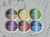
As we continue the debate, I am going to send for some color samples. As you can see in the images below, what the chips looks like vs the printed version is significantly different. Every chip is considerably darker.

IMG_5903.jpeg


IMG_5904.jpeg


I created these swatch chips to settle on colors. I have no idea what color will do what when printed so there are 16 hues of each color. I'll order 6 chips total with a different color combination between front and back, and two of each chip so I can compare hues against each other. Yes, there are a lot of colors crammed into a 1.5" chip, but I have good eyesight and hue delineation :)

Untitled-1.png


After this I'll settle on final design and color set and request the final proofs (I hope).

Am I missing anything that I should be thinking about?
 
Yeah, the colors on ceramic are a bit of trial and error. What I learned (really was taught by @Colquhoun here on this forum) is to maximum the saturation of the base color I am using. For example, if I am doing a blue, then I make sure that the Cyan in the CMYK is at or close to 100%. Then adjust the other colors to get something close to what I want. A little of the "K" Black goes a long way.

Great idea on the swatches. A couple suggestions:
  • Consider having these made on bigger chips (e.g. 47mm) for a few more bucks.
  • BR Pro does double sided for no extra charge. So, you could have these made on 3 chips for 6 sides total
  • Put the CMYK codes directly on the chip on its color in a small font.
  • This could make for a great group buy some time if you want to go through the hassle of that. There are others (me included) who would like to have color references for BR Pro.
I have my own samples for a different BR Pro project in the works right now, I'll share my colors with you when they come back in case it helps.
It’s not entirely necessary to go 100% on certain colors, but the idea of keeping the saturation high is a great starting point. You want to avoid muted or less saturated colors because they just end up looking washed out when printed.
 
Color swatches came in and I am glad I took the approach I did. I got two of each swatch so we could compare hues. Some observations:
  • Yellow is indeed REALLY hard to get right and I am not in love with any combination. I might go yellow/orange for the $1000 chip.
  • The darker hues on the yellow chip have dark flecks in them. I tried to get a picture to show what I mean.
  • Red is another difficult color. Some hues look brown-ish - like dried blood.
  • Two of the grey hues have a glint of magenta to them - so we are going to stay away from those for sure. It is significantly more noticeable in person.
  • Neon colors are just terrible.
  • The pink I tried just for giggles was a complete failure.
  • 47mm was the right call for these chips - thanks for the suggestion @GreekRedEye
  • I would highly recommend this swatch idea to anyone who is looking to go through this process and would strongly suggest getting two of each swatch chip for comparison. Each chip has two colors and thus it only took 6 chips to get what I needed. These swatches should help with any future designs so It is a cheap investment to save some time.
I think I have what I need to finalize a design and get some production samples made. Yay!

IMG_5924.jpeg


IMG_5920.jpeg


IMG_5921.jpeg
IMG_5922.jpeg
 

Attachments

  • IMG_5919.jpeg
    IMG_5919.jpeg
    141 KB · Views: 12
Color swatches came in and I am glad I took the approach I did. I got two of each swatch so we could compare hues. Some observations:
  • Yellow is indeed REALLY hard to get right and I am not in love with any combination. I might go yellow/orange for the $1000 chip.
  • The darker hues on the yellow chip have dark flecks in them. I tried to get a picture to show what I mean.
  • Red is another difficult color. Some hues look brown-ish - like dried blood.
  • Two of the grey hues have a glint of magenta to them - so we are going to stay away from those for sure. It is significantly more noticeable in person.
  • Neon colors are just terrible.
  • The pink I tried just for giggles was a complete failure.
  • 47mm was the right call for these chips - thanks for the suggestion @GreekRedEye
  • I would highly recommend this swatch idea to anyone who is looking to go through this process and would strongly suggest getting two of each swatch chip for comparison. Each chip has two colors and thus it only took 6 chips to get what I needed. These swatches should help with any future designs so It is a cheap investment to save some time.
I think I have what I need to finalize a design and get some production samples made. Yay!

View attachment 1275814

View attachment 1275816


View attachment 1275817View attachment 1275818
You used Hex codes? Hate to say it, but those are for onscreen colors, not for print. Most dye-sublimation printers (which are what ceramics are printed with) use CMYK and sometimes 6-color, which is CMYK with an added light cyan and light magenta. Having a sample chip printed with CMYK would give you a better sample of what the printer can produce, and with those CMYK codes you could adapt the values to get colors you want.
I'm not saying the samples are useless, but it does make it difficult to compare against the true colors that the printer is using to produce the chips.
 
You used Hex codes? Hate to say it, but those are for onscreen colors, not for print.
VERY insightful - this is the first I am hearing this but it totally makes sense now you mention it. So now I have the option to continue down this path or get another round of swatch samples with CMYK files sent over. This would be sample 3 - how many do people get before their final run?
 
VERY insightful - this is the first I am hearing this but it totally makes sense now you mention it. So now I have the option to continue down this path or get another round of swatch samples with CMYK files sent over. This would be sample 3 - how many do people get before their final run?
I design in CMYK, and I keep an active eye on the values. Sometimes having to almost ignore what you see onscreen and trust the CMYK numbers. For example, when designing in CMYK if you want that bright yellow, you can push the Y to 90%-100% and add the other colors to tweak it. Adding a small bit of M can give it almost a gold color, etc....but designing in the native CMYK is the way to go, imo. Calibrating your monitor in conjuction with different color profiles help, but that also can be a can of worms. :ROFL: :ROFLMAO:
Although, I've been a print designer for my entire career so I'm more familiar with that than web design or colors designed for the screen.
 
Last edited:
I design in CMYK, and I keep an active eye on the values. Sometimes having to almost ignore what you see onscreen and trust the CMYK numbers. For example, when designing in CMYK if you want that bright yellow, you can push the Y to 90%-100% and add the other colors to tweak it. Adding a small bit of M can give it almost a gold color, etc....but designing in the native CMYK is the way to go, imo. Calibrating your monitor in conjuction with different color profiles help, but that also can be a can of worms. :ROFL: :ROFLMAO:
Although, I've been a print designer for my entire career so I'm more familiar with that than web design or colors designed for the screen.

I pretend I’m a photographer and have never paid attention to color profiles because I don’t print my work. Thus, saying you sometimes ignore what’s on screen happens to be the most foreign concept my photographer’s brain has ever computed.

Then again, this is why I got the swatches because I don’t trust the monitor and thus am ignoring those colors for all intents and purposes. Writing them out as HEX is so I can find the color again. I guess I’d learn more about color theory if I wrote it out in CMYK - something super easy to do as I am using Photoshop.

I guess the thing I’m unclear about is if another color test run is required or not. That seems dependent on understanding if BR Pro Poker needs my .psd files with different color profiles. All I’d do is convert them to CMYK and call it good. ‍Do you know?

I’m very naive on this subject. I just figured any RGB or CMKY colors would get translated between each other automatically and the any particular color yellow in RGB would look the same in CMYK when printed.
 
I guess the thing I’m unclear about is if another color test run is required or not. That seems dependent on understanding if BR Pro Poker needs my .psd files with different color profiles. All I’d do is convert them to CMYK and call it good. ‍Do you know?
BR Pro probably took your file and converted it to CMYK color mode. You can confirm with them. If there are some colors on the printed wheels you like, you can convert the color wheel file to CMYK and then use those CMYK values.

I would probably still do one more run of samples of the actual chips with the colors you want. You can do 2 shades of each color, one on each side, to help dial in your colors (just make some kind of distinguishing mark if the color shades are close).

For the last BR Pro project I did I ran 3 samples of all the colors and 4 samples of the yellow.

maximum the saturation of the base color I am using. For example, if I am doing a blue, then I make sure that the Cyan in the CMYK is at or close to 100%. Then adjust the other colors to get something close to what I want. A little of the "K" Black goes a long way.
Going to reiterate this advice. If you want bright and rich colors, then I recommend you set the base color to 100% and adjust the other colors to get the hue you want. You can drop the base color some, but beware dropping it below 70%. And go easy on the black K value - it can quickly overtake and muddy your color (I think that happened on your first batch).

Here is a reference that gives you some CMYK values. What you see on the screen is not what exactly will print, but at least these codes have been curated by a print designer:
https://mixam.com/support/cmykchart

One last thing...I noted you wrote ".psd" file. Just a heads up that most folks design in Illustrator or other vector-based software. Vector is better, but you can get away with a raster image if it is high enough resolution.
 
I would probably still do one more run of samples of the actual chips with the colors you want. You can do 2 shades of each color, one on each side, to help dial in your colors (just make some kind of distinguishing mark if the color shades are close).
Yes samples are going to happen before I pull the trigger - these are going to be "right"
For the last BR Pro project I did I ran 3 samples of all the colors and 4 samples of the yellow.


Going to reiterate this advice. If you want bright and rich colors, then I recommend you set the base color to 100% and adjust the other colors to get the hue you want. You can drop the base color some, but beware dropping it below 70%. And go easy on the black K value - it can quickly overtake and muddy your color (I think that happened on your first batch).

Here is a reference that gives you some CMYK values. What you see on the screen is not what exactly will print, but at least these codes have been curated by a print designer:
https://mixam.com/support/cmykchart
Looking at the test batch of swatches and the colors we chose, here are the values for each combination we thought looked best. Interestingly they fall pretty close inline with what has been suggested.

Light Blue - C:64 M:10 Y:0 K:0
Dark Blue - C:83 M:67 Y:0 K:0
Ligt Red - C:0 M:31 Y:14 K:0
Dark Red - C:10 M:100 Y:82 K:2
Light Green - C:23 M:0 Y:31 K:0
Dark Green - C:78 M:19 Y:93 K:04
Light Purple - C:14 M:26 Y:0 K:0
Dark Purple - C:79 M:100 Y:3 K:2
Light Yellow - C:2 M:2 Y:62 K:0
Dark Yellow/Orange - C:0 M:33 Y:100 K:0

I have a new found appreciation for understanding CMYK values and will be tweaking these for sure! I'll recreate my reference doc with CMYK just so I can see how different values change the final printed color so I can make more educated decisions going forward.

It seems my color swatches are not throw away after all. Little did I know there was going to be this kind of learning curve!

One last thing...I noted you wrote ".psd" file. Just a heads up that most folks design in Illustrator or other vector-based software. Vector is better, but you can get away with a raster image if it is high enough resolution.
To get around this I have been using color fill layers for sharp lines and a resolution of 600 DPI.
 
I pretend I’m a photographer and have never paid attention to color profiles because I don’t print my work. Thus, saying you sometimes ignore what’s on screen happens to be the most foreign concept my photographer’s brain has ever computed.

Then again, this is why I got the swatches because I don’t trust the monitor and thus am ignoring those colors for all intents and purposes. Writing them out as HEX is so I can find the color again. I guess I’d learn more about color theory if I wrote it out in CMYK - something super easy to do as I am using Photoshop.

I guess the thing I’m unclear about is if another color test run is required or not. That seems dependent on understanding if BR Pro Poker needs my .psd files with different color profiles. All I’d do is convert them to CMYK and call it good. ‍Do you know?

I’m very naive on this subject. I just figured any RGB or CMKY colors would get translated between each other automatically and the any particular color yellow in RGB would look the same in CMYK when printed.
Yeah, I don’t generally trust what I see onscreen, only because there are certain CMYK values that I know will print a certain way. For example, 100% M and 100% Y make the brightest, least distorted red you can get, regardless of what it looks like onscreen. I’ve also got a ton of printed ceramic samples that I have the CMYK values for, so I can use them when choosing colors. Sometimes I’ll look at the screen and think, “Damn, that doesn’t look right...”. But I know it will be correct when printed because I’m holding a printed sample of that color.

Regarding BRPro converting to CMYK, they may do it before printing, but even if not, all hardware will make the conversion. Sending a RGB file to a CMYK printer will do it’s own conversion. But thats the problem…every software or hardware may convert those differently. That’s why it’s always best to be designing in CMYK ftom the start, so everything is speaking the same language.

Looking at some of your values for colors, I recommend keeping it simple whenever possible. For example, I see your light yellow as 2/2/62/0, but it will likely print clearer as 0/0/62/0 or 0//0/75/0, etc.

Unfortunately, this all goes out the window if you send the files to another chip manufacturer. The colors you get from BRPro will definitely be different if you had them done by Tina on her chips. Some colors may be similar, but I guarantee others will not. Sadly, much of this process is still trial and error.
I truly appreciate the knowledge transfer. I converted all my swatches to CMYK and WOW I can see why this is a better way of looking at printed color. I do have one question though. For the sample grays and black, the CMYK values are all over the board and all I really want is is a straight up 100% black and 25% grey. Would I just have the K value be 100% and 25% respectively. There are some gray hues with zero K value and instead have CMY all set to the same percentage - like 25%.

I am heavily invested in 3D printing and ALL of my designs are created through an iterative trial and error process. All the things I design are functional for my rocketry hobby and the final product might only be $5 in plastic, but I spend $20-$50 to get there.
If you're looking for a plain gray, it's good to go 0/0/0/25 instead of some mix of tints from CMY. Only because if the printer leans more to one color, the gray won't look neutral anymore, it could look like a tannish warm gray or a bluish cool gray.

However, when dealing with black, it is good to add some CMY to the K. A standard mix in paper printing to get the richest black is to go 60/40/40/100. If you print 0/0/0/100, it ends up looking a bit more washed out. That said, I don't think it's critical to do this with chips unless you're REALLY trying to get a deep black. I think black chips look ok when they're a very dark charcoal color instead of "bottom of the rabbit hole" black. :ROFL: :ROFLMAO:
If you decide to go with rich black, only use it on large areas like the base chip color. There's no need to do it for text, and could actually cause more issues. For black type, stick with 0/0/0/100.
 
After redesigning these chips in native CMYK, here are the final designs and the colors I am aiming for. These, as has been discussed, are not the actual colors, but you all get the general sense of what I am aiming for. I am actually doing two color proofs for each denomination with BLUE and YELLOW getting 4 combinations. Any feedback, suggestions, or ideas before I get the proofs made? I hope this will be the last round before I pull the trigger.

Screenshot 2024-02-27 at 7.36.37 PM.png
 
Samples are here and these are the final colors. The inset images will be different and I need to darken the red on the background a bit, but that's not a big problem. Now I get to work on the rolling edge. :)

IMG_6084.jpeg
 
Looks great! I love it. I think it looks good as is, but a couple tweaks to consider:
  • I would darken the grey on the $100 a smidge. Like another 10% darker. Right now the grey on the $100 is close to the grey on the $1.
  • In the photo the words look a little too heavy (maybe it is better in person). If you have them stroked, maybe remove the stroke or reduce stroke size.
This has been a fun project to follow. Will you be offering samples or letting folks order chips with this design? I might like a small Hanukkah themed limit set for playing dreidel.
 
Looks great! I love it. I think it looks good as is, but a couple tweaks to consider:
  • I would darken the grey on the $100 a smidge. Like another 10% darker. Right now the grey on the $100 is close to the grey on the $1.
I will darken the grey on the $100 by 15%. It is in the samples and a choice I have been waffling on. Interestingly, it is 40% K while the grey on the white is 50% K.
  • In the photo the words look a little too heavy (maybe it is better in person). If you have them stroked, maybe remove the stroke or reduce stroke size.
Yeah, they were a little heavy so I softened them up a little. They are fine as is but now they will be better. Great catch!
This has been a fun project to follow. Will you be offering samples or letting folks order chips with this design? I might like a small Hanukkah themed limit set for playing dreidel.
YES! I am totally down for others to hop on the order. Right now I am thinking 750 chips for us so an additional 250 will make things cheaper for me :). I can send samples of the chips I have if anyone wants, but will ask for them back. PM me so we can work out what is desired. I can change out any text elements that don't make sense for someone's order.
 
Let's talk about the rolling edge shall we?

I want to do aligned edges as I think they look slick. I do understand they might not be perfectly aligned as the alignment is done by hand and that is ok. That being said, I only have one shot at doing this "right" so I need some advice from you all.

Is the length of the rolling edge really 4.92 inches? I ask because when I designed an edge just for dimensional accuracy you can see there is an overlap. Measuring things out, it should be 4.89 inches instead. What does your experience say? What should I consider as I do this?
IMG_6110.jpeg


Thanks!
-Ian
 
BR Pro specifies these dimensions for rolling edge of 39mm chip file:

Face: 1.565" diameter
Edge: 4.92" x .133" (please ensure edge text is in all caps, and no taller than .075 inches at print size)

See:
https://brpropoker.com/pages/frequently-asked-questions

Also, when calculating the length of the 2d block on the rolling edge, you have to take into account it will be printed on a curved edge and must align with the curved counterpart on the face which, due to the curve, will be slightly longer. There is a trick in Illustrator to calculate that length that is explained in this youtube video:
 

Create an account or login to comment

You must be a member in order to leave a comment

Create account

Create an account and join our community. It's easy!

Log in

Already have an account? Log in here.

Back
Top Bottom