Getting some CPC scrowns stamped to create $25 and $100 chips for this set, which don't exist otherwise. I ordered green and black as a knee jerk reaction, but it only now occurred to me that going Cali might be the way to go. Thoughts on switching to purple/blurple $25 and white hundo instead? Obviously the white hundo would clash with the off-white 25 frac, which is another problem.
You are using an out of date browser. It may not display this or other websites correctly.
You should upgrade or use an alternative browser.
You should upgrade or use an alternative browser.
Diamond Tooth Gertie's - colour conundrum (1 Viewer)
- Thread starter BNads86
- Start date
I have recently come to feel that when Cali colors are an option, always go cali. The colors haver higher contrast and are easier to differentiate, yellows are great, green chip worst chip, etc. etc.
How often are you going to have quarters and hundos in play?
How often are you going to have quarters and hundos in play?
OP
OP
The hundos will almost never see play, just getting them to complete the setI have recently come to feel that when Cali colors are an option, always go cali. The colors haver higher contrast and are easier to differentiate, yellows are great, green chip worst chip, etc. etc.
How often are you going to have quarters and hundos in play?
")
I'm not going to tell you I've never had a .25 and a $100 on the table at the same time, but it's something that doesn't need to happen and should be avoidable if necessary. Also, if you pay extra for the CPC bright white, nobody's going to confuse the two chips. And back to my original point, if a $100 gets into play in a quarters game, it's going to be something of a novelty that the players will keep track of. Nobody's going to lose it in a dirty stack.
OP
OP
Good to know re: bright white, that's extremely helpful. Any votes on which purple to use? I don't have a sample set and unfortunately to switch the order I need to decide on short notice
Yes.Thoughts on switching to purple/blurple $25 and white hundo instead?
My vote would be retro lavender 25.
Regular lavender would be nice too though. I think it might just be a tad soft in color compared to the real trks though. RL is a little bit deeper and might match better
Littleluck55
Flush
Your blue is pretty dark. I’d be afraid the blurple May clash with it. I agree with Jeep, the lighter retro or regular lavender would look the best
OP
OP
That makes total sense, hadn't considered that. Thanks!!Your blue is pretty dark. I’d be afraid the blurple May clash with it. I agree with Jeep, the lighter retro or regular lavender would look the best
OP
OP
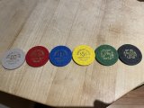
Thanks for the feedback, I'm much happier with this.
Apparently the bright white is more technically challenging to stamp, and the stamps don't show up as well. Ended up going standard white and retro lavender.
Apparently the bright white is more technically challenging to stamp, and the stamps don't show up as well. Ended up going standard white and retro lavender.
OP
OP
Quicksilver-75
4 of a Kind
Retro lavender for the $25.
Bright white for the $100.
No brass flakes. You could even ask David to size them to TRK diameters. Not sure if it's possible, but it would be nice.
Bright white for the $100.
No brass flakes. You could even ask David to size them to TRK diameters. Not sure if it's possible, but it would be nice.
Only caution- that retro lav is nowhere near the lovely fuchsia TRK was putting out.
While I love Cali colors, I think green (not sure which shade, tho) and black would be the way to go, especially as you already have a white quarter and they match the colors they used.
While I love Cali colors, I think green (not sure which shade, tho) and black would be the way to go, especially as you already have a white quarter and they match the colors they used.
Similar threads
- Replies
- 24
- Views
- 2K
- Replies
- 48
- Views
- 5K