Deja Poll (1 Viewer)

1 2 or 3 ?


  • Total voters
    47

spikeithard

Flush
Joined
Mar 8, 2014
Messages
2,459
Reaction score
1,126
Location
Phase lll at Del Boca Vista
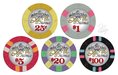
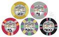
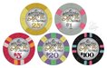
Do you like 1 2 or 3 best. pretty easy poll. Of course I have final choice but I want to use this as a guide to what most people think is best...I have a feeling I know what will win though ;)
 

Attachments

  • unnamed (1).jpg
    unnamed (1).jpg
    73.5 KB · Views: 250
  • unnamed.jpg
    unnamed.jpg
    72.6 KB · Views: 256
  • unnamed (2).jpg
    unnamed (2).jpg
    72.2 KB · Views: 242

jbutler

Royal Flush
Joined
Oct 28, 2014
Messages
10,669
Reaction score
10,708
1>3>>>>>>>>>>>2

voted red, but matching-colors are really close. not a fan of the all-black denoms.

also, i'm glad you ended up branching out from the mostly 1/4" spots. these look great.
 

Mr Tree

Straight Flush
Joined
Oct 29, 2014
Messages
8,423
Reaction score
13,818
Location
Roswell, GA
1>3>>>>>>>>>>>2

voted red, but matching-colors are really close. not a fan of the all-black denoms.

Agree that 3 isn't bad if that floats your boat more. I just don't think color matching the denoms was necessary on this one.
 

RowdyRawhide

Full House
Joined
Nov 4, 2014
Messages
3,897
Reaction score
4,143
Location
Kansas
1>3>>>>>>>>>>>2

voted red, but matching-colors are really close..

^^^^^This^^^^ The gray $1 and purple $20 give me pause, but still look solid, I think the red contrast is just a bit better. Black is not horrible either, but it gets kinda lost in the rest of the inlay on this one. These are looking great BTW
 

detroitdad

Royal Flush
Supporting Member
Joined
Nov 6, 2014
Messages
31,102
Reaction score
54,892
Location
Michigan
I voted red, but the black was really close. I don't really care for the matching color denom's
 

Don Clay

Full House
Joined
Apr 24, 2013
Messages
3,819
Reaction score
4,335
Location
France
though red seems to be the winner,
I voted 3,
I hope there will be a sample offer !
 

BGinGA

Royal Flush
Tourney Director
Joined
Oct 29, 2014
Messages
26,979
Reaction score
44,847
Location
Atlanta
Individually, I think the color-matched chips look outstanding. However, the red denom chips look more cohesive as a set. Imo, the black denoms are too 'bold' for the rest of the design... might work if the denom was a tad smaller, or the numerals were less dark (charcoal, for example). Hey, there's a thought! jk

I think if the individual chips were viewed side-by-side per denom, the color-matched chips would win hands-down. Looking at them grouped in sets, the natural inclination is to focus on the differences instead of each chip individually.

All that said, I think it's a toss-up between #1 and #3. All depends on which look you want to achieve. I'd probably go with #3, but it's very close. If I went with red, I'd probably take off the almost-too-bright edge a bit (ref. black comments above).
 

k9dr

Royal Flush
Supporting Member
Joined
Oct 28, 2014
Messages
12,227
Reaction score
41,363
Location
Champa Bay
I voted for red, but really liked the color matched denoms too. I especially liked the color matching on the $5, $20, and $100, but less so on the .25 and $1.
 

jbutler

Royal Flush
Joined
Oct 28, 2014
Messages
10,669
Reaction score
10,708
I especially liked the color matching on the $5, $20, and $100, but less so on the .25 and $1.

i agree with this. maybe if the color-matching looked better on the frac and $1 i'd have been more inclined to vote for that version over the red denoms.

i don't see how it could be done differently, though. maybe you could do a pink denom on the $1 (it would be anomaly in the set, its denom color not being the same as the base, but i don't mind that so much), but i think you're sort of stuck on the frac.
 

spikeithard

Flush
Joined
Mar 8, 2014
Messages
2,459
Reaction score
1,126
Location
Phase lll at Del Boca Vista
Individually, I think the color-matched chips look outstanding. However, the red denom chips look more cohesive as a set. Imo, the black denoms are too 'bold' for the rest of the design... might work if the denom was a tad smaller, or the numerals were less dark (charcoal, for example). Hey, there's a thought! jk

I think if the individual chips were viewed side-by-side per denom, the color-matched chips would win hands-down. Looking at them grouped in sets, the natural inclination is to focus on the differences instead of each chip individually.

All that said, I think it's a toss-up between #1 and #3. All depends on which look you want to achieve. I'd probably go with #3, but it's very close. If I went with red, I'd probably take off the almost-too-bright edge a bit (ref. black comments above).


Thanks,

notice I went .25 and not .50 Dave?:)


And yes I agree the .25 and 1 looks not as awesome as the rest. :( If anyone could pour in some ideas on how to fix this up (the .25 and 1), please please feel do so!

But also, I intend to follow up with a tourney set of ceramics. So I could do the color matching cash chips and all red denom tourney set?
 
Last edited:

BGinGA

Royal Flush
Tourney Director
Joined
Oct 29, 2014
Messages
26,979
Reaction score
44,847
Location
Atlanta
If I went with red, I'd probably take off the almost-too-bright edge a bit.

I think I"d prefer the color-matched $5 red denom across all chips -- it's a little more subtle with less contrast. Your chip base/spot colors are not blaring, but that bright red denom sure is.
 

Toby

Full House
Joined
Nov 2, 2014
Messages
3,765
Reaction score
6,273
Location
The Shire
The red denom works for me. Black is too stark, detracts from the rest of the design. Cool set! :)
 

spikeithard

Flush
Joined
Mar 8, 2014
Messages
2,459
Reaction score
1,126
Location
Phase lll at Del Boca Vista
I think I"d prefer the color-matched $5 red denom across all chips -- it's a little more subtle with less contrast. Your chip base/spot colors are not blaring, but that bright red denom sure is.


so your saying turn down the red intensity a bit on the denom? 'almost too bright edge' .
 

Poker Zombie

Royal Flush
Joined
Oct 29, 2014
Messages
15,741
Reaction score
32,755
Location
Nashville-ish
Picked Black, but hovered back and forth between it and Red. No love whatsoever on color-matched here. I like the classy, understated Black or Red. It's like James Bond, if he were a chip. He just wouldn't wear bright purple socks.
 

spikeithard

Flush
Joined
Mar 8, 2014
Messages
2,459
Reaction score
1,126
Location
Phase lll at Del Boca Vista
Picked Black, but hovered back and forth between it and Red. No love whatsoever on color-matched here. I like the classy, understated Black or Red. It's like James Bond, if he were a chip. He just wouldn't wear bright purple socks.
Yes unfortunately, the color matching is only melding with the last few denominations. First two.. meh. Don't think there is any way around this.


Sent using tapatalk!
 

Create an account or login to comment

You must be a member in order to leave a comment

Create account

Create an account and join our community. It's easy!

Log in

Already have an account? Log in here.

Top Bottom