- Joined
- Feb 25, 2016
- Messages
- 24,096
- Reaction score
- 48,801
- Rewards
- 2,021
- Location
- America's High-Five
If you turned up the opacity on the background images, it wouldn't be so bad. But as long as the customer is happy.Too busy for me to play on
If you turned up the opacity on the background images, it wouldn't be so bad. But as long as the customer is happy.Too busy for me to play on
Awesome design work !!! Where did you get the cloth made?Here's the artwork file to make it a lot clearer. I found the Goku and Vegeta images online, combined them on the felt then added a dragon image I had on file. I wish I could have used Shenron but I couldn't find a good image to use. I thought the betting line would be funky to have it fade between the two colors.
View attachment 27521
Go Birds!Another shout out to @Bloo_Design
I've had several "non-conventional" poker table themes lately and @Bloo_Design has killed it on all of them.
View attachment 1485798
Not one I would necessarily want to play poker on, but what a crazy fun Monopoly table!I have to give @Bloo_Design some serious props for this one!
This client wanted a Monopoly table 1st and a poker table 2nd.
Ray created the monopoly board from scratch, Sourced the logos, created the boxes/text/colors/etc flawlessly! Hard to tell without blowing it up, but the board is amazingly accurate, crisp & clean.
Too busy for me to play on, but the client is ecstatic over the design
View attachment 1475258
View attachment 1475258
Glad we were able to achieve what you wanted! Especially with a good chunk of the board from scratch. The install looks good.Not one I would necessarily want to play poker on, but what a crazy fun Monopoly table!
Another thumbs up to @Bloo_Design
View attachment 1502614View attachment 1502621
The blown up logo ended up looking great! Matches well with the chips and room.
Cool idea, but for better playability, should have gone with a 60" round instead of an oval table. It would be miserable to play a game of monopoly from the end of the oval, plus round tables are awesome for poker too!Not one I would necessarily want to play poker on, but what a crazy fun Monopoly table!
Another thumbs up to @Bloo_Design
View attachment 1502614View attachment 1502621
That is crazy cool! Growing up in the midwest, I was a Chiefs fan as a kid, and so was my dad. Colors are also real close to our favorite college team, Iowa State. Now you've got me thinking...Another shout out to @Bloo_Design
I've had several "non-conventional" poker table themes lately and @Bloo_Design has killed it on all of them.
View attachment 1485798

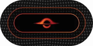
Less is more. Easy to get overly eager with layers when designing something. Drop the card holders and the overlay over the icons. I would also align things better (seems a bit off). Also the white borders kinda does not make sense for the colour scheme you have gone for.View attachment 1563853
First attempt of designing my custom (Halo 3 themed) felt for my first table build - never used adobe illustrator before this. Any suggestions to improve/add to it are welcome.
Less is more. Easy to get overly eager with layers when designing something. Drop the card holders and the overlay over the icons. I would also align things better (seems a bit off). Also the white borders kinda does not make sense for the colour scheme you have gone for.
Edit: would also drop the black on the edges and make the icons the outer part. Get better quality of the image you are going to use for the centerpiece, or swap it out for something different
You asked for advice, but all good. It is your own design after allThe
I’m fine with it being a bit mental tbh, it’s all the halo maps in the card holders, pretty nostalgic to me and a few friends - I will get rid of the white borders and try blend it in a bit better and change the colour of the betting line. The overlay is just a watermark
The black edges is just to show the rail and the main image in the front is in vector format, why it doesn’t look good quality (it looks better on AI)

Take the felt off and wash it. Cold water, delicate cycle with detergent. I've used spray and wash on stains.I’ve got a chanman table with custom cloth it was built around 2018-2019. I don’t recall what exact type of cloth it was. It got a tequila and soda drink spilled and now it looks like a water mark. Should we just dab at it with a wet warm cloth or should I get a steam cleaner? Thanks.
Do you use the spray glue to install like Tony does?Take the felt off and wash it. Cold water, delicate cycle with detergent. I've used spray and wash on stains.
Dry on air dry or delicate cycle. I've washed my felts in the washing machine multiple times. They come out looking brand new. Don't worry about wrinkles. When you put them back on, they will pull the wrinkles right out assuming you use a light coat of adhesive.
I’ve got a chanman table with custom cloth it was built around 2018-2019. I don’t recall what exact type of cloth it was. It got a tequila and soda drink spilled and now it looks like a water mark. Should we just dab at it with a wet warm cloth or should I get a steam cleaner? Thanks.
Yes. I use a very light spray of 3M #77Do you use the spray glue to install like Tony does?
Yes! The Little Green is also a great option that I use in between washer/dryer cycles. It's especially good when someone spills a beer.It's gaming suede. The material is very durable, you can do as Craig mentioned, and you can also use a steam cleaner. Many people have used a steam cleaner on our felts with no signs of damage. Dabbing it with a cloth to soak up excess liquid is always the best first step, but if the stain remains, then some more drastic measures are required.
I love the texture pattern on the blue sections.Felt provided by @T_Chan and in-house designer @Bloo_Design:
View attachment 1259619View attachment 1259620