-
PCF is an eBay Partner. If you make a purchase through one of our links, we may earn a commission at no extra cost to you. Thank you for your support!
You are using an out of date browser. It may not display this or other websites correctly.
You should upgrade or use an alternative browser.
You should upgrade or use an alternative browser.
Custom Poker Table Felt Thread (2 Viewers)
- Thread starter Tommy
- Start date
SpaceMonkey420
Full House
WhiteMamba1646
4 of a Kind
Very nice! I'm a Northern Iowa Panther. We've played a few games over the years.Today I got a sneak peak of the felt that Tim designed for the table Tony is building for me, and I can't stop staring at it! I absolutely love it.View attachment 584983
Theluckyhand2
Two Pair
Where do you create and find someone who can make a custom design I’ve been looking just to bs and possibly buy in the next year or so
bsdunbar1
4 of a Kind
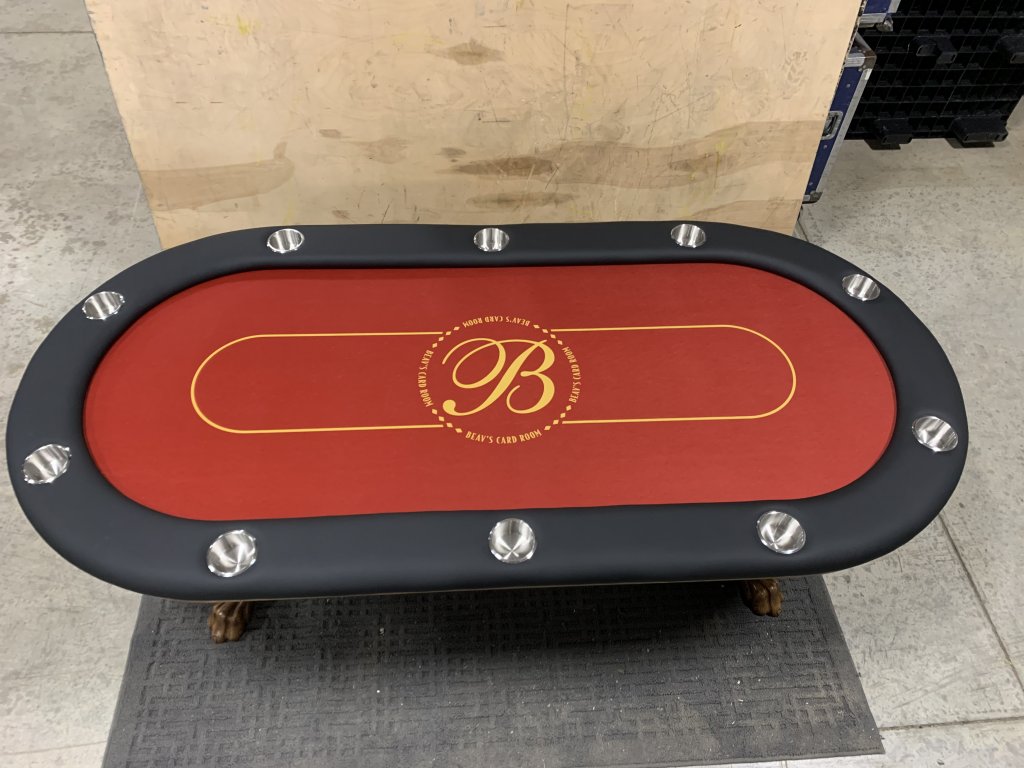
A fan favorite! This red is Electric.
#GBR


#GBR
Just wondering, has anyone that has one of these football field type of tables ever broke out and played a giant game of paper football on them?

Nice looking field, but it needs a better logo! Not quite the right shade of red.
bsdunbar1
4 of a Kind
Diamond Plate

doughboy63
Flush
That’s a neat look. I’m assume the “light source” is printed onto the fabric? If that makes sense. Or maybe the gradient from light to dark is printed in. If that’s a better way to state it. Either way cool unique look.
bsdunbar1
4 of a Kind
Yes the "shine" is printed on the clothThat’s a neat look. I’m assume the “light source” is printed onto the fabric? If that makes sense. Or maybe the gradient from light to dark is printed in. If that’s a better way to state it. Either way cool unique look.
- Joined
- Dec 29, 2017
- Messages
- 25,940
- Reaction score
- 35,097
- Rewards
- 0
- Location
- Burnaby (Greater Vancouver), BC
Just as long as nobody gets the urge to park their car on top of it.
beaver
Two Pair
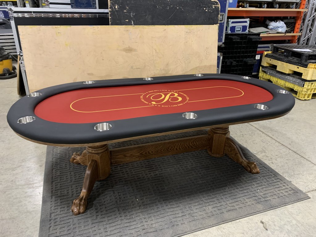
Congrats!
At last, a felt made for playing, where you can spot chips on (other than red chips that is, but I guess you 've factored that in).
")
beaver
Two Pair
Well my fives are red but I think they're a different enough shade that they will stick out enough.Congrats!
At last, a felt made for playing, where you can spot chips on (other than red chips that is, but I guess you 've factored that in).
- Joined
- Dec 29, 2017
- Messages
- 25,940
- Reaction score
- 35,097
- Rewards
- 0
- Location
- Burnaby (Greater Vancouver), BC
What could be more Canadian than a beaver? Very nice!
This turned out really nice. I'm considering going blue for my upcoming custom felt. How is it with blue chips in play? All my $1s are blue and one concern I have is the chips getting lost a bit in the blue felt.
BonScot
Straight Flush
WTF?!?! Got to be red for you. Especially if you’re putting your logo in the middle of the table.This turned out really nice. I'm considering going blue for my upcoming custom felt. How is it with blue chips in play? All my $1s are blue and one concern I have is the chips getting lost a bit in the blue felt.
I know, I know. I've received a bunch of mockups from J5, and I'm somehow just not loving the red felts compared to blue or blue-greenish options. An entire table of Red is almost a bit too overpowering somehow. My thought now is to go with a more subtle felt design and let the chips in play shine.WTF?!?! Got to be red for you. Especially if you’re putting your logo in the middle of the table.
BonScot
Straight Flush
Black with red betting like could work as well. However red is the colour for you my friend.I know, I know. I've received a bunch of mockups from J5, and I'm somehow just not loving the red felts compared to blue or blue-greenish options. An entire table of Red is almost a bit too overpowering somehow. My thought now is to go with a more subtle felt design and let the chips in play shine.
I say definitely go for a more subtle table felt design in general and in a non-competing color so you don't have any issues with seeing the chips. It's funny actually, to me, the best felt designs are the most "boring" (simple design or a monochrome color palette). The colors are for the chips!I know, I know. I've received a bunch of mockups from J5, and I'm somehow just not loving the red felts compared to blue or blue-greenish options. An entire table of Red is almost a bit too overpowering somehow. My thought now is to go with a more subtle felt design and let the chips in play shine.
Last edited:
or charcoal, or ash grey, with red betting line.Black with red betting line
Agreed. A little bit of red can go a long way. If I ever get around to doing a custom felt, I'll probably go with a boring tan or beige and let my logo and chips be the stand-out colors.I know, I know. I've received a bunch of mockups from J5, and I'm somehow just not loving the red felts compared to blue or blue-greenish options. An entire table of Red is almost a bit too overpowering somehow. My thought now is to go with a more subtle felt design and let the chips in play shine.
ConsensualPresidency
Two Pair
I’m going with a two-tone gray felt on my T_Chan to let the chips popor charcoal, or ash grey, with red betting line.
WhiteMamba1646
4 of a Kind
Its very close but i have good lighting in my garage with a couple LED strips installed so chips r never lost but i can see in some dim lighting rooms it can get lost in the felt cuz i have alot of blues the same color as the feltThis turned out really nice. I'm considering going blue for my upcoming custom felt. How is it with blue chips in play? All my $1s are blue and one concern I have is the chips getting lost a bit in the blue felt.
bsdunbar1
4 of a Kind
Awesome, i love it!!
Similar threads
- Replies
- 8
- Views
- 374
- Replies
- 8
- Views
- 657
- Replies
- 5
- Views
- 210
- Replies
- 8
- Views
- 144
- Replies
- 6
- Views
- 821