Custom chips received in person (1 Viewer)

Mayuri

Waiting List
Joined
Apr 26, 2026
Messages
7
Reaction score
6
Rewards
103
Location
Italy
Hi everyone,

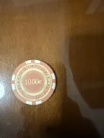
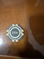
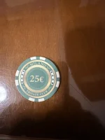
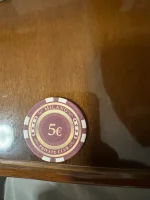
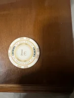
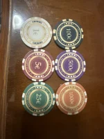
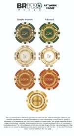
I received the printed samples by BR PRO for my custom chip set and wanted to ask for some advice.

Overall, I’m happy that I ordered samples before placing the full order, because seeing them in person is very different from looking at the digital mockups.

The main issues I noticed are:

  1. The colors look more faded/desaturated than the digital artwork.
  2. Some of the small details and text look slightly blurry / not as sharp as expected.
  3. The gold/bronze tones look much flatter in person than in the mockups.
I understand that printed ceramic chips will never look exactly like a digital render, especially with simulated gold/bronze colors, but I’m trying to understand if this is normal or if the artwork should be adjusted before ordering the full set.

Would increasing saturation/contrast in the files help?

Should I simplify some of the fine details?

Is this just a normal limitation of printed ceramic chips?

I’ll attach photos of the samples below.

Any advice would be appreciated before I decide whether to adjust the artwork, try another manufacturer, or move forward.
 

Attachments

  • IMG_4775.webp
    IMG_4775.webp
    22.8 KB · Views: 61
  • IMG_4893.webp
    IMG_4893.webp
    81.6 KB · Views: 62
  • IMG_4892.webp
    IMG_4892.webp
    128.8 KB · Views: 61
  • IMG_4891.webp
    IMG_4891.webp
    115.5 KB · Views: 60
  • IMG_4890.webp
    IMG_4890.webp
    95.7 KB · Views: 64
  • IMG_4889.webp
    IMG_4889.webp
    110.2 KB · Views: 65
  • IMG_4888.webp
    IMG_4888.webp
    92.2 KB · Views: 75
  • IMG_4887.webp
    IMG_4887.webp
    140.8 KB · Views: 68
  • IMG_4776.webp
    IMG_4776.webp
    34.3 KB · Views: 55
  • IMG_4777.webp
    IMG_4777.webp
    34.3 KB · Views: 32
  • IMG_4778.webp
    IMG_4778.webp
    39.7 KB · Views: 30
  • IMG_4779.webp
    IMG_4779.webp
    34.8 KB · Views: 33
  • IMG_4780.webp
    IMG_4780.webp
    26 KB · Views: 56
Unfortunately you will lose some quality when printing on ceramics. I’d say it’s all due to the sublimation process. I’ve experienced the same thing with some of my orders. I would recommend using larger details with defined edges. I’m also not a fan of yellow color on white background because it never prints well.

Here’s a design I did with a test print
1779320573138.webp

1779320613669.webp

You can see I lost a lot of those small fine details. I have to go back and make all the icons bigger so it shows up better on the final order. The blue color is a little off from expected too. Good thing you didn’t do any complicated edge spots haha
 
I think they actually look pretty decent for a first try. But yes, that always will be a limitation.

I think if you want to continue with the style you can push the fake shines/glares a little more to make them stand out a bit better and you can probably tweak some of the colours to make them stand out from each other a tad more, but my guess is with your general design they will always be on the edge of blending in with eachother when printed on a ceramic chip.
 
Last edited:
Quick update
At the moment, BR Pro Poker customer support has been very helpful and they are helping me figure out how to get the best possible printed result.
Before finalizing everything, I’d really appreciate some honest advice from the forum.
My goal is not just to make the chips look “okay”, but to make the final ceramic chips look as clean, sharp and premium as possible.
For people with experience in custom ceramics / printed chip artwork:
What would you recommend to make this design go from good to exceptional?
 

Attachments

  • Scurtu_adjusted.webp
    Scurtu_adjusted.webp
    79.4 KB · Views: 36
I think there is an inherent mismatch between the artwork -- which features the faux metallic shimmer and intricate floral flourishes (I'm talking about the small designs between the word "Milano" and the suits) -- and the medium. The chips are matte/rough (the opposite of shiny metallic), and the printing fidelity can't ever reproduce such fine detail. I think this inherent mismatch will always make it seem like there is something slightly off about them. I would suggest going with a design that doesn't fight against the inherent properties of the materials and instead embraces them.
 
Mayuri welcome!

The real problem here is you could have went with any design your heart desired and those are the edge marks you chose? :ROFL: :ROFLMAO: You could save some money if you went with something of the shelf.

BR Pro is a great vendor, and I know most ppl over the pond feel priced out of them. It was a great decision to get samples.

The one thing a sample set can’t show you is what stacks are going to look like on the table.

Another option would be to simplify your design use larger, and thicker type font
One of the things I do when I work with any designer as I ask for their input, I explained that they’re not going to offend me. You might work with Kristil and ask for her recommendations she is a fantastic designer.
 
One of the things I do when I work with any designer as I ask for their input, I explained that they’re not going to offend me. You might work with Kristil and ask for her recommendations she is a fantastic designer.

THIS^^^^^^^^^^^^^^^^^^^^^^^^^^^^^^^^^^
 
I think updating the design to something like this will help print quality while keeping the existing design. The image is AI generated so some things are not proportionate or correct. I’d redesign the edge spotting since it mimics cheap generic plastic poker chips. It’s best if you can design it so the edges don’t have to be aligned also. These chips feel similar to venerati chips from Sidepot so maybe an edge spot similar to those?
IMG_2547.webp
 

Create an account or login to comment

You must be a member in order to leave a comment

Create account

Create an account and join our community. It's easy!

Log in

Already have an account? Log in here.

Back
Top Bottom