Alright, I feel I might finally be close to getting what's been inside my brain for a while onto paper (screen?).
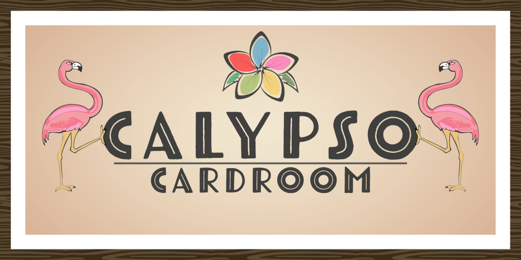
The Calypso Cardroom:
(Full "logo" as a wall piece for the room)
For a while I've had several custom ideas just rolling around my noggin', but one idea that's had me coming back over and again. I freaking love Atomic era and mid century design (original right?), and a while back I started a project called "The Atomic Club".
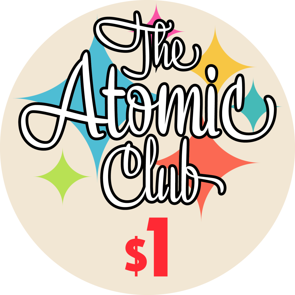
(Atomic Club Inlay design)
I was really digging so much about it, the warmth and colors, the simple starburst design, but it was always lacking a tropical flair that I wanted it to have as well. Hey, we like the Caribbean and if we took a vacation that didn't involve a beach at this point, I'm not sure I'd recognize us anymore. The whole house is decorated mashup of mid century and tropical vibes, and now the poker room is heading that way too.
Enter the other day, and the name "Calypso" finally pops into the brain. Ah, loved it, simple single word that instantly invokes a place and an idea. Well, I'd been sitting around doing way too modern design lately and this monstrosity pops into existence.
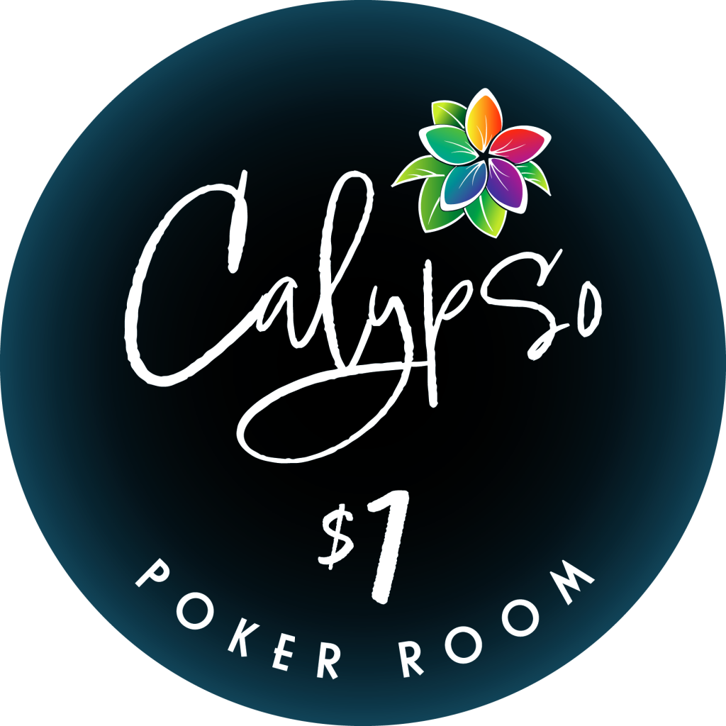
Hey, cool. There's the name. I drew a flower. Yippie. No, is crap. It has almost nothing I love design wise for my personal taste. So I get back to looking at the atomic design and start trying to think of how I can combine the two ideas, retaining what I like from each.
I simplify the frangipani flower even more than it was, delete some leaves, lose the deep gradient fills, and instead go for a watercolor over ink look that can be found all over art from the late 50's and early 60's, and we get to..
(Calypso Cardroom $1 Inlay Design - No Shape)
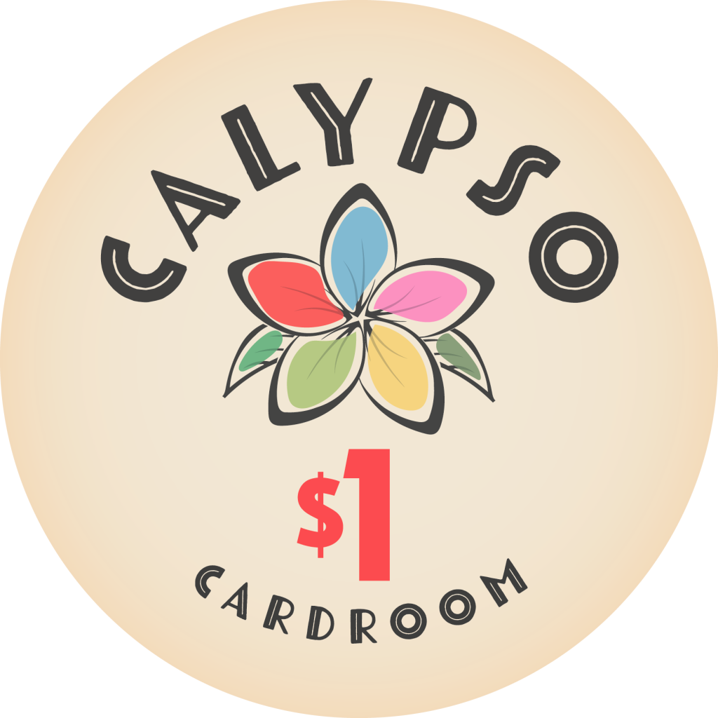
I freaking love it. It's so clean and old-school and basic, I get my colors, the name and the theme all there without a single palm tree being involved lol. (I've put way too many palms in other designs, we all have right?)
Pull out the color samples and get going, and now here's a proto set from frac to $100 denomination for a cash set.
Edit: Per input from the brother @deskjob101, swapped tiger/peach between the 1 and the 25. I agree. This is the way.
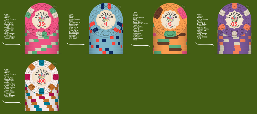
I tried to strike a balance between an older but modern look, and some kind of Frankenstein of a Cali set that is still easily playable for most of my guys that have only ever used Vegas colors. Still debating what order the shaped inlays would go on these guys (or if at all... What a premium, but worth it right? Right?!)
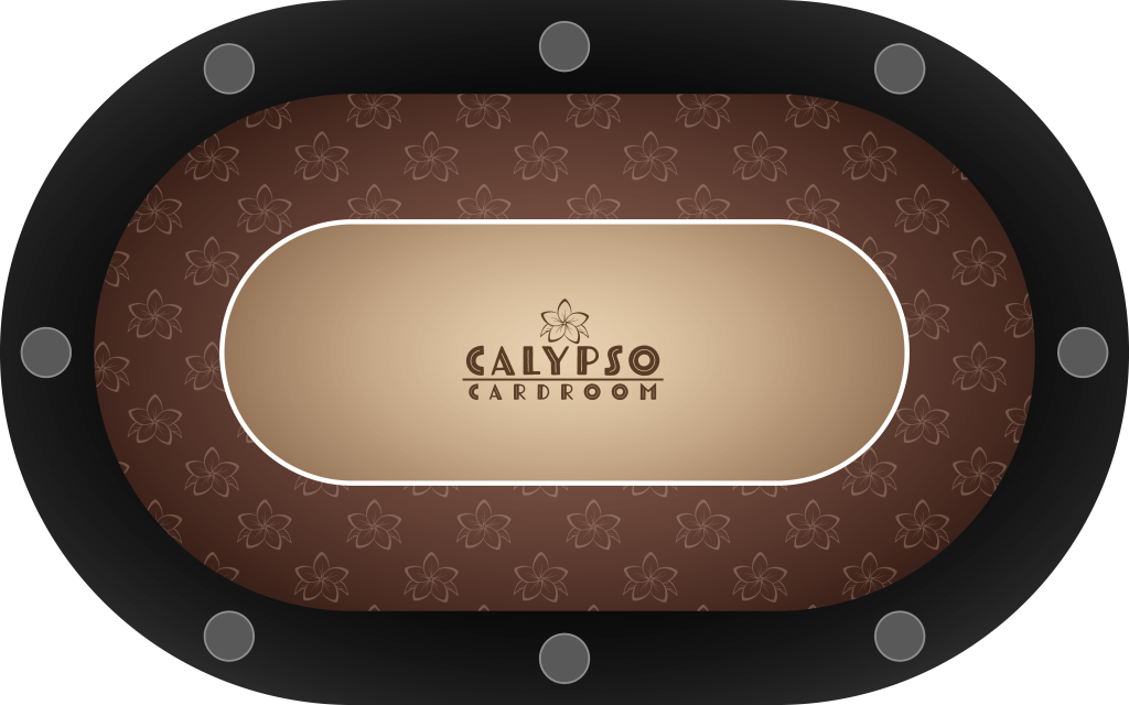
And finally as I am hopefully only a week or two weeks max away from gorilla delivering the new pub table for the room, I had to design a topper too, didn't I?
(Shown with rails and stainless cups, as ordered)
Alright, I suppose it's time to make my wallet cry?
Aaron
The Calypso Cardroom:
(Full "logo" as a wall piece for the room)
For a while I've had several custom ideas just rolling around my noggin', but one idea that's had me coming back over and again. I freaking love Atomic era and mid century design (original right?), and a while back I started a project called "The Atomic Club".
(Atomic Club Inlay design)
I was really digging so much about it, the warmth and colors, the simple starburst design, but it was always lacking a tropical flair that I wanted it to have as well. Hey, we like the Caribbean and if we took a vacation that didn't involve a beach at this point, I'm not sure I'd recognize us anymore. The whole house is decorated mashup of mid century and tropical vibes, and now the poker room is heading that way too.
Enter the other day, and the name "Calypso" finally pops into the brain. Ah, loved it, simple single word that instantly invokes a place and an idea. Well, I'd been sitting around doing way too modern design lately and this monstrosity pops into existence.
Hey, cool. There's the name. I drew a flower. Yippie. No, is crap. It has almost nothing I love design wise for my personal taste. So I get back to looking at the atomic design and start trying to think of how I can combine the two ideas, retaining what I like from each.
I simplify the frangipani flower even more than it was, delete some leaves, lose the deep gradient fills, and instead go for a watercolor over ink look that can be found all over art from the late 50's and early 60's, and we get to..
(Calypso Cardroom $1 Inlay Design - No Shape)
I freaking love it. It's so clean and old-school and basic, I get my colors, the name and the theme all there without a single palm tree being involved lol. (I've put way too many palms in other designs, we all have right?)
Pull out the color samples and get going, and now here's a proto set from frac to $100 denomination for a cash set.
Edit: Per input from the brother @deskjob101, swapped tiger/peach between the 1 and the 25. I agree. This is the way.
I tried to strike a balance between an older but modern look, and some kind of Frankenstein of a Cali set that is still easily playable for most of my guys that have only ever used Vegas colors. Still debating what order the shaped inlays would go on these guys (or if at all... What a premium, but worth it right? Right?!)
And finally as I am hopefully only a week or two weeks max away from gorilla delivering the new pub table for the room, I had to design a topper too, didn't I?
(Shown with rails and stainless cups, as ordered)
Alright, I suppose it's time to make my wallet cry?
Aaron
Last edited:
