AlcoHold'em Project (1 Viewer)

dokurobei

Pair
Joined
Feb 12, 2023
Messages
157
Reaction score
137
Location
Warsaw
Fellow addicts, please share your thoughts.

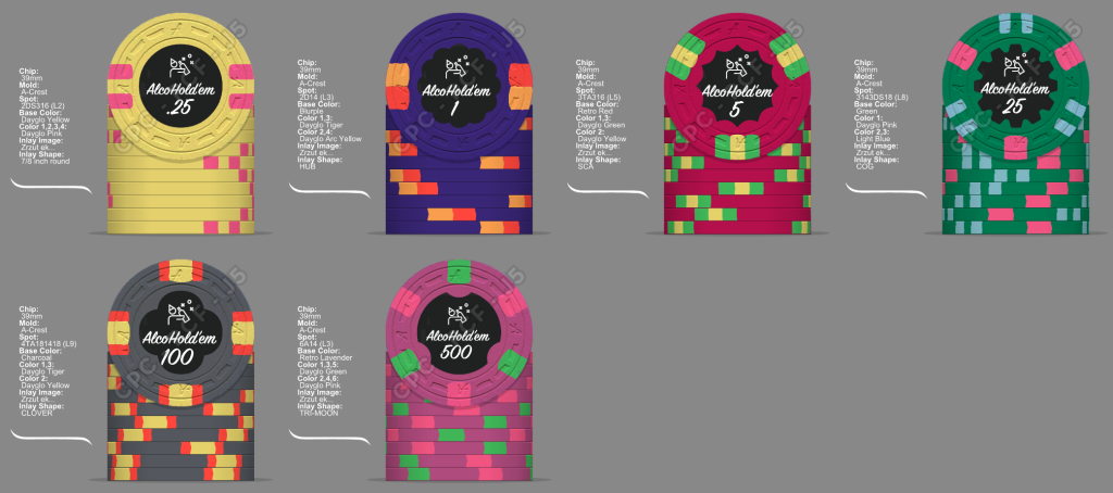
I've been playing with design tool for few months, taking some inspirations here and there. These are my current lineups - still not sure if charcoal hundo is a good idea, but I fell in love with CPC blurple and the only chip I can make use of it is 1. Having black hundo and blurple 1 may not look good in bigger stack.

The inlay design and shapes are, as you see, at the very beginning of their road to perfection, but you definitely get the theme of this set ;)
alcoholdem 1.png


alcoholdem 2.png


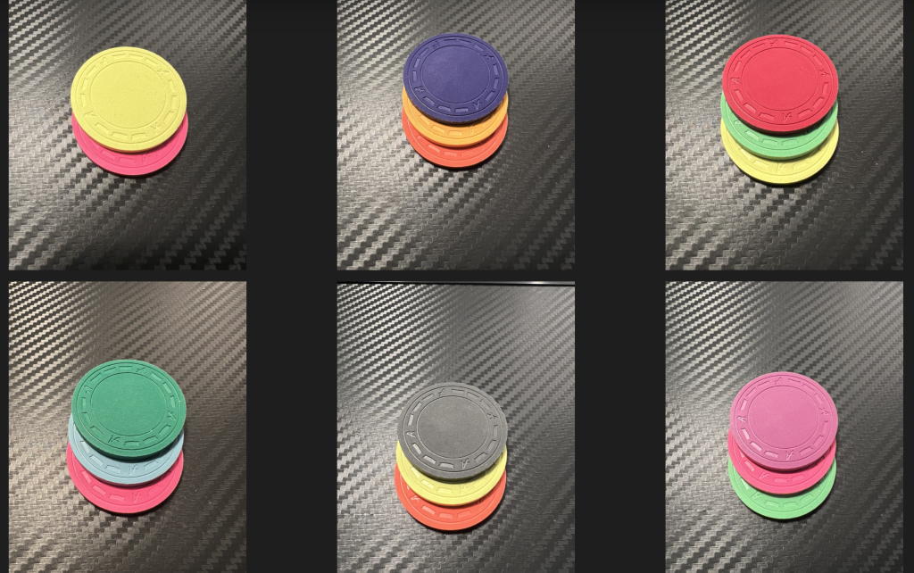
These are color samples combined:

Zrzut ekranu 2023-06-22 o 21.33.02.png
 
I prefer the dg peacock 1. That and the 25 are the stars of the show so far. I would still do a charcoal hundo. Also not a fan of the 5. Don’t like the green on red. Dg yellow and dg pink is a perfect match. I think overall there are too many colors that are reused over several chips.

The shaped inlays are off to me. Hub is usually on the 5, sca on the 25 and cog on the 100. No biggie, but it feels a little weird.
 
definitely the peacock 1.

i am also not a fan of the 5 - looks like a christmas themed chip.

feels like there is an awful lot of yellow represented in this set, and there is no white at all.

i question the 14 DG pink spots on the 500, especially when there are already 14 DG pink spots on the 25 (not to mention 18 DG pink spots on the frac). and if you care about spot progression, you should swap the spot patterns on the 25 and the 500 (but i really like the 25 as designed now).
 
With the inlay being black, the contrast on the blue looks better than the burple one
 
Thank you - will definitely consider your suggestions.

not a fan of the 5. Don’t like the green on red

not a fan of the 5 - looks like a christmas themed chip

My inspiration for 5s is Tiger Palace cash 5, with one difference: more green instead of pink:
Zrzut ekranu 2023-07-2 o 12.38.43.png


there are too many colors that are reused over several chips

feels like there is an awful lot of yellow represented in this set

There is approximately the same amount of DG yellow in the famous Biff Tannen set, but still looks amazing (and for me this is the most beautiful custom cpc set presented here on PCF)

biff.png


The shaped inlays are off to me. Hub is usually on the 5, sca on the 25 and cog on the 100. No biggie, but it feels a little weird.

Yeah, I agree that inlays are far from perfection for now - still not sure about using so many different shapes.

if you care about spot progression, you should swap the spot patterns on the 25 and the 500
Actually I care but only up to a hundo :D Will consider making a hundo with 8D18. 500s will not see many games, it's mostly for showing off purposes
 
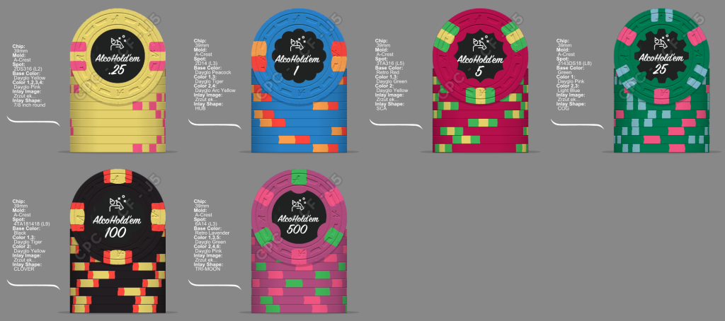
After applying changes to inlays, base colors of 1 and 100 and spot progression:

alcoholdem 3.png
alcoholdem 3a.png


Personally I don't like white color on chips - most probably will not add it to the project, but who knows
 
alcoholdem 4a.png
alcoholdem 4b.png


Some retouches to 5 (switch yellow and green spots), 100 (added white and changed orange to dark red - looks like reference to Poland flag) and 500 (after suggestion that there was too much pink)

Still not sure about which spot progression is better, but overall happy with results so far

If only they have 4TA316 pattern...
 
I think this is a big improvement! I like the bottom one best but I would still go with 3d14 on the 1. The progession 3d to 3TA works well too, I think
 
Man, the "polish" Charcoal 100 is a beauty. Very nice to see the evolution on that one :tup: And the DG Peacock 1 is a close second to me :)
 

Create an account or login to comment

You must be a member in order to leave a comment

Create account

Create an account and join our community. It's easy!

Log in

Already have an account? Log in here.

Back
Top Bottom