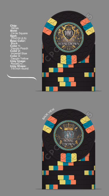
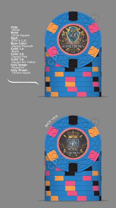
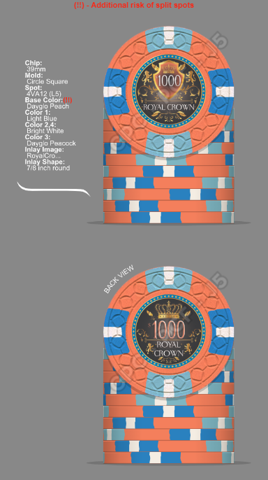
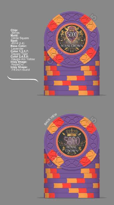
1st Cpc chip mockup....feed back please (1 Viewer)

italstylz

Pair
Joined
Jan 5, 2022
Messages
140
Reaction score
190
Location
Ancaster, Ontario, Canada
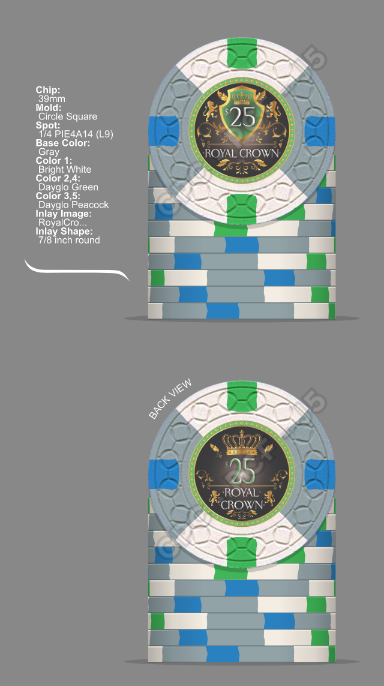
Hey guys , so iv been working on a custom chip set. I designed the inlay front and back. What do you think of the name???? Asking for feed back on everything inlay design, chips design and colors
CEEB70C22B774398A494C9D24BC184DF.png
10F8A5A9BB264BD0A23567A8E7F5ADB9.png
22BDE33095E04804A7060429F0EFD215.png
35863B318550468FB79FD8E4FF2077C4.png
4863980D90B443318762E8E64AFAFD76.png
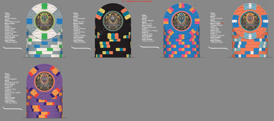
iv come up with 2 different designs for the 500 and 5000 chip, let me know which you guys like better
D7454E4276A24012973CC898E184BC72.png
 
Don't use white and grey as the base for your quarter pie (I don't like it on mine). Swap the green and the grey and I'd say your G2G.

I like the inlay. Different on both sides, but not too different. Font might be a little small.

The name doesn't do much for me, but they are custom to you. If you dig it, that is all that matters.
 
As a disclaimer, I am just an amateur in design advice compared to some of the major experts on here, but one of the things that sticks out to me is the complexity of the inlay. I’d be worried it would not look great and the complexity would be lost when the chips would be pressed. The denomination seems that it would also be lost and not stick out.
 
Another thing I notice is in the edge spots. The complexity of your edge spots will cost you (your combinations are some of the most expensive available). Just my personal opinion, but I try to design the edge spots where the lower denominations are usually the less complex and cheaper edge spots and progress up to more expensive and complex edge spots in the higher denominations (Just my thing).

For tournament set designs, I actually prefer to have the same edge spot for all chips with different color patterns. I prefer a simpler edge spot design on tourney sets. This is just me, though.
 
Welcome! Lots of complex spot patterns - I like a person who isn’t afraid of price per chip! :)

For me, there’s a bit too much red, orange and blue, particularly between the 500/1000/5000. I don’t like that much color reuse but that’s just me.

Your inlay is definitely busy, so that might be something to look at but if you love it then good deal. Biggest issue might be the size and clarity of the denominations which seem to get washed out with the busy inlay. I like the denominations to be obvious.

Can’t go wrong with the name: The Crown. Like it!
 
Great chips, however I don't like 1000 chip.
Also going to be expensive with this inlays...
 
They’re cool! However, in my personal opinion less is sometimes more. I would go with a regular 1/4 pie on the 25. For the same reason I would change to all peacock/bright white spots on the 1ks. Love the 100 and the 500 that has black as one of the spot colors!
 
Welcome! Lots of complex spot patterns - I like a person who isn’t afraid of price per chip! :)

For me, there’s a bit too much red, orange and blue, particularly between the 500/1000/5000. I don’t like that much color reuse but that’s just me.

Your inlay is definitely busy, so that might be something to look at but if you love it then good deal. Biggest issue might be the size and clarity of the denominations which seem to get washed out with the busy inlay. I like the denominations to be obvious.

Can’t go wrong with the name: The Crown. Like it!

Totally agree, especially with the orange.
 
I agree with pretty much everything that's already been said. Inlay is a little too busy/text might be difficult to read. Try some less complex spot patterns, especially for lower denoms. Or consistent pattern for all the chips. Too much blue and orange overall

All the chips are gorgeous on their own, they just don't feel like they completely belong together in a set yet.

But I love the 25, reminds me of the Seahawks!
 
Search the Chip DB and look for chips you really like, then see if you can understand why you like them.

The first set I designed had really high ($$) spot levels. My last set had really low spot levels- not because of the cost, but because how I’ve found simple, clean ships to be so lovely.

Take your time, play around, look at a lot of chips to discover what you really like, and go from there.

Don’t rush it, or you might end up regretting it.
 
Sounds like a good plan. Iv kinda did that here I'm always drawn to the bright colors and tried to make them work all together. I'm definitely not rushing this or your right I will regret it
 
Cash or tourney?

If it’s tourney, I’d lose the dollar sign. It’ll clear up your design a little bit, but more importantly, it’ll center your 1000 and 5000 in the shield.

I was also going to tell you to get rid of the whispy shadows under all your denoms until I realized it was the PCF watermark. :LOL: :laugh::LOL: :laugh:
 
Don't use white and grey as the base for your quarter pie (I don't like it on mine). Swap the green and the grey and I'd say your G2G.

I like the inlay. Different on both sides, but not too different. Font might be a little small.

The name doesn't do much for me, but they are custom to you. If you dig it, that is all that matters.
I would love to see a picture of your quarter pie. I'm just no a big fan of the greens,,,and was trying to get around it
 
I’d be curious to hear the story behind Royal Crown
Well to be honest I was having a hard time trying to come up with a name. So I thought to my self what do I like .....soccer.....football....I'm italian....and then it came to me......I love to drink Crown Royal Whiskey. So that is how I came up with the name. But I'm definitely open to any other suggestions..
 
Well to be honest I was having a hard time trying to come up with a name. So I thought to my self what do I like .....soccer.....football....I'm italian....and then it came to me......I love to drink Crown Royal Whiskey. So that is how I came up with the name. But I'm definitely open to any other suggestions..
If it truly means something to you go for it. But you’re looking to spend 1000s of dollars here.
 
My best friend named his kid Jack Daniel, so far be it from me to tell you what you want to put on a poker chip. I would say that knowing the origin of the name, the 5000 chip is the only one that feels inspired by the theme as far as the color goes.

If I were running the design for this project, I would have the base colors for 3 of the chips be purple, gold, and red for the predominant colors on a crown royal label. If you like some other varieties of their whiskey, I’d lean into those too. Green apple? Throw a green in there! Black label? Black chip! Let those base colors drive your choices for your spot colors. It might help bring those spot levels down a little bit too, making it a bit more cost effective. Or not. Your set, your choice!

I think your inlays are the most finished piece of the puzzle. Refine those as you play in the chip builder until you feel like they pop with your color choices and you’ll be good to go!
All great suggestions I'll keep that in mind while trying to refine the chips design. Thanks
 
I'm gonna go with the obvious mould choices:

Lcrown
Scrown
E&C
Depending on how much of the original design and colors you keep, a simpler mold may assist in toning on down the “busy” factor some.

While I personally think the CirSq is the best overall mold currently available, it’s not as clean as the SmCrown or maybe even the DiaSq (MD-50). You might try mock-ups with those two, just to see what it does for the overall look. These three molds also offer the best sound and feel, in my experience and to my senses.

With your current design, both the LgCrown and E&C molds are likely too busy, with too much fine line detail, despite playing directly into your theme, as @LinkyBabe astutely pointed out for you.
I personally like the cirSq the best, but I will try those other molds as well. I'm currently going to redesign the Inlay to be less busy. I'm sure that will help
 
  • Like
Reactions: BNM
I personally like the cirSq the best, but I will try those other molds as well. I'm currently going to redesign the Inlay to be less busy. I'm sure that will help
Good choice! Or, bella scelta , I should say!

I think others may have said this, but I do want to say, at the end of the day this is your set and you get to live and play with it. So, do what you like and what seems beat to you. It behooves you greatly to take into account the counsel you are getting here and do lots of research, to help you avoid dirty stacks, squinting at chips to confirm values, and buyers remorse, but if you ultimately want to throw all convention on its head because that’s what you like best then go with the wind, signore!
Thank you. Your right, but I like the positive critic, it will help bring the set to where it needs to be. Letting other eyes that have been doing this way longer look at the design helps you to see things you dont realize till someone else points them out.
 
  • Like
Reactions: BNM
I get what your saying, but it's so hard to come up with something that means something to you that you want to put on a poker chip
The name is what has me tripped up for my last set. I’ve bounced back and forth between two names and see issues with both. I won’t be buying for a while, so I have time. But yeah, it’s hard. The others were easy for me.
 

Create an account or login to comment

You must be a member in order to leave a comment

Create account

Create an account and join our community. It's easy!

Log in

Already have an account? Log in here.

Back
Top Bottom