The Armory
Owner: @Psypher1000
Artist: J5
Manufacturer: CPC
Mold: Scroll
Showcase Thread: https://www.pokerchipforum.com/threads/the-armory-cash-set.11008/#post-162901
Thoughts from the owner:
Before an army goes to battle, they normally take a visit to the armory first to gear up and prepare for what's ahead. So it is with The Armory set of chips - the intent was to create a lower stakes cash set so that friends with less experience, less bankroll, or less game could still play comfortably and enjoy themselves without fear of losing a car payment (or worse). Furthermore, games played at The Armory were intended to be played "helpfully", meaning that after a game or a session had wrapped the players would gladly revisit a hand & discuss choices made, optimal/alternate lines of play, etc., so that we might all get better along the way. With that in mind, the Ferrum Ferro Acuitur phrase was inscribed at the bottom. For our non-Latin speaking friends out there (read as: "everyone"), that roughly translates to, "As iron sharpens iron" - a reference to Proverbs 27:17 which is completed with "so one man sharpens another." With that in mind the crossed swords were added behind the color-matched shield, effectively rounding out the inlay.
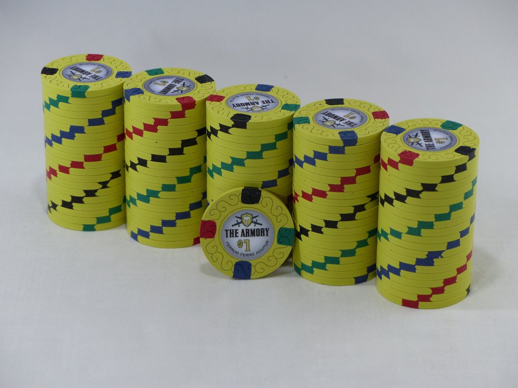
From an overall design perspective this set was largely formed out of parts that, in isolation, I would normally find very disquieting. I have always leaned toward symmetry, logic, geometry, and the like vs abstraction so it's particularly ironic that the set found its beginnings with the $1. The first time I saw the Mapes $1 my mind was blown. It's the first time I recall seeing a yellow $1, particularly from Nevada, the first time I recall seeing spots that didn't protrude very deeply into the chip, and the first time I recall seeing four different-colored single spots like that on a chip. It hurt my engineer's brain, but in a good way.
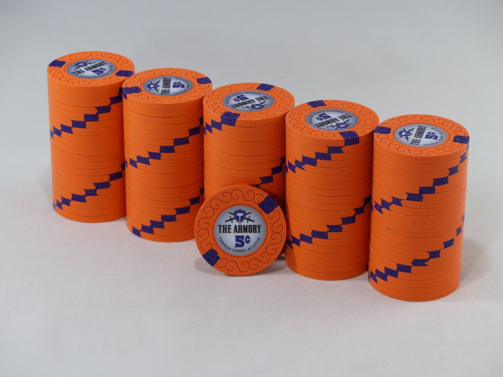
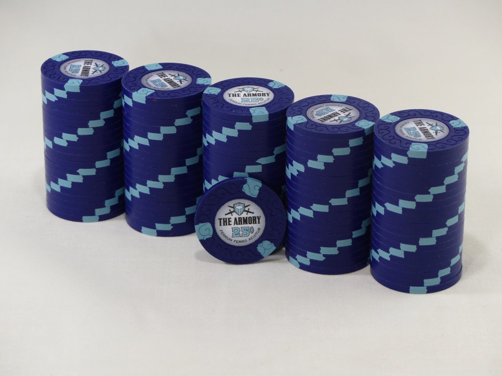
If the $1 was a sea of chaos, then I needed to be anchored by something. That something became two things - consistent 1/4 inch spots, and spot progression. That quickly settled the spot pattern for 5c through the $20 (which made more sense to me than a $25 in that I can get $20 bills out of the ATM but not $25's). I love contrasting base colors so a blue quarter made great sense, and then having an orange base on the nickel worked as well. Progression would indicate that we go from simple to complex so the spots on the fracs had to be a single color. I wanted my wife to have some input on the set since she'd be using the chips some. Her contribution was settling on the exact shade of orange on the nickel, as well as choosing the spot color - she's a Suns fan, so the purple wasn't a surprise.
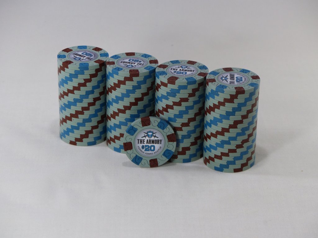
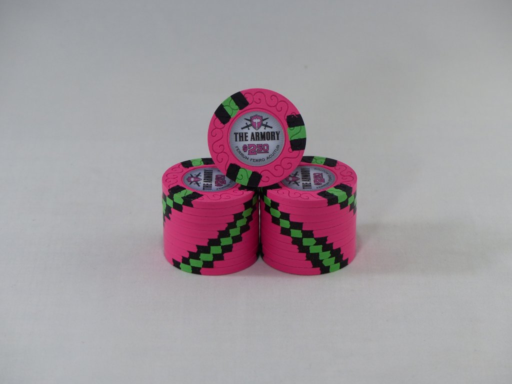
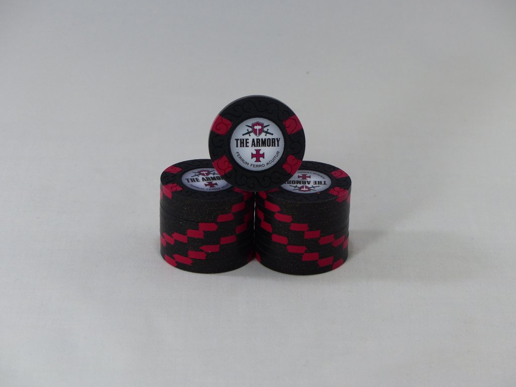
The larger denoms were a bit more challenging. The $1 is already wonky in that it has five different colors of clay, and getting progressively more complex than that might have resulted in a tie dye chip for the $20. Furthermore, I needed the color combinations of the five to both be distinctly different enough from the $1 to avoid dirty stacks while at the same time being pleasing to my eye. I'm generally not a fan of yellow spots on red chips and I had concerns about using two of the colors from the $1 on the five, but the final result is what you see. The orange on the five helps it to stand out enough from the yellow/red on the $1, and the other three spots offer sufficient difference to avoid dirty stacks. The $20 was a community collaboration. The black NCV was intended to be flexible enough to use as a $100, rebuy chip, or whatever the situation called for. The cross symbol was a nod to the tourney set that came before it and is itself a riff on St. George's cross frequently seen on shields and, of course, the English flag. The spots on the NCV were intended to be a callback to the crossed swords in the logo. And finally we have the snapper. This is a chip that was never intended to be in play, but was just added in the name of gratuitous fan service to my love of snappers. Since it wasn't to be used with the set I ultimately didn't constrain myself to the 1/4" spots at all and I knew I wanted DG green paired with it. Ultimately this is where we landed.
Set Denominations & Breakdown:


Quotes from the community:
"SMOKIN'! Nice work on these. The nickels, quarters, and $5s all make me drool!" - @liftapint
"These look insane!!!! All the colours are amazing, especially love the pinks!" - @MillyS
"Awesome set, congrats! I think my favorites are the nickel and $20, really unique chips that are incredibly enhanced by the color-matching on the inlay" - @Irish
Owner: @Psypher1000
Artist: J5
Manufacturer: CPC
Mold: Scroll
Showcase Thread: https://www.pokerchipforum.com/threads/the-armory-cash-set.11008/#post-162901
Thoughts from the owner:
Before an army goes to battle, they normally take a visit to the armory first to gear up and prepare for what's ahead. So it is with The Armory set of chips - the intent was to create a lower stakes cash set so that friends with less experience, less bankroll, or less game could still play comfortably and enjoy themselves without fear of losing a car payment (or worse). Furthermore, games played at The Armory were intended to be played "helpfully", meaning that after a game or a session had wrapped the players would gladly revisit a hand & discuss choices made, optimal/alternate lines of play, etc., so that we might all get better along the way. With that in mind, the Ferrum Ferro Acuitur phrase was inscribed at the bottom. For our non-Latin speaking friends out there (read as: "everyone"), that roughly translates to, "As iron sharpens iron" - a reference to Proverbs 27:17 which is completed with "so one man sharpens another." With that in mind the crossed swords were added behind the color-matched shield, effectively rounding out the inlay.
From an overall design perspective this set was largely formed out of parts that, in isolation, I would normally find very disquieting. I have always leaned toward symmetry, logic, geometry, and the like vs abstraction so it's particularly ironic that the set found its beginnings with the $1. The first time I saw the Mapes $1 my mind was blown. It's the first time I recall seeing a yellow $1, particularly from Nevada, the first time I recall seeing spots that didn't protrude very deeply into the chip, and the first time I recall seeing four different-colored single spots like that on a chip. It hurt my engineer's brain, but in a good way.
If the $1 was a sea of chaos, then I needed to be anchored by something. That something became two things - consistent 1/4 inch spots, and spot progression. That quickly settled the spot pattern for 5c through the $20 (which made more sense to me than a $25 in that I can get $20 bills out of the ATM but not $25's). I love contrasting base colors so a blue quarter made great sense, and then having an orange base on the nickel worked as well. Progression would indicate that we go from simple to complex so the spots on the fracs had to be a single color. I wanted my wife to have some input on the set since she'd be using the chips some. Her contribution was settling on the exact shade of orange on the nickel, as well as choosing the spot color - she's a Suns fan, so the purple wasn't a surprise.
The larger denoms were a bit more challenging. The $1 is already wonky in that it has five different colors of clay, and getting progressively more complex than that might have resulted in a tie dye chip for the $20. Furthermore, I needed the color combinations of the five to both be distinctly different enough from the $1 to avoid dirty stacks while at the same time being pleasing to my eye. I'm generally not a fan of yellow spots on red chips and I had concerns about using two of the colors from the $1 on the five, but the final result is what you see. The orange on the five helps it to stand out enough from the yellow/red on the $1, and the other three spots offer sufficient difference to avoid dirty stacks. The $20 was a community collaboration. The black NCV was intended to be flexible enough to use as a $100, rebuy chip, or whatever the situation called for. The cross symbol was a nod to the tourney set that came before it and is itself a riff on St. George's cross frequently seen on shields and, of course, the English flag. The spots on the NCV were intended to be a callback to the crossed swords in the logo. And finally we have the snapper. This is a chip that was never intended to be in play, but was just added in the name of gratuitous fan service to my love of snappers. Since it wasn't to be used with the set I ultimately didn't constrain myself to the 1/4" spots at all and I knew I wanted DG green paired with it. Ultimately this is where we landed.
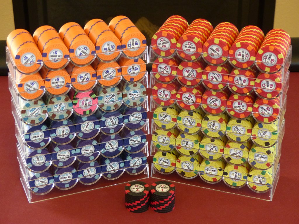
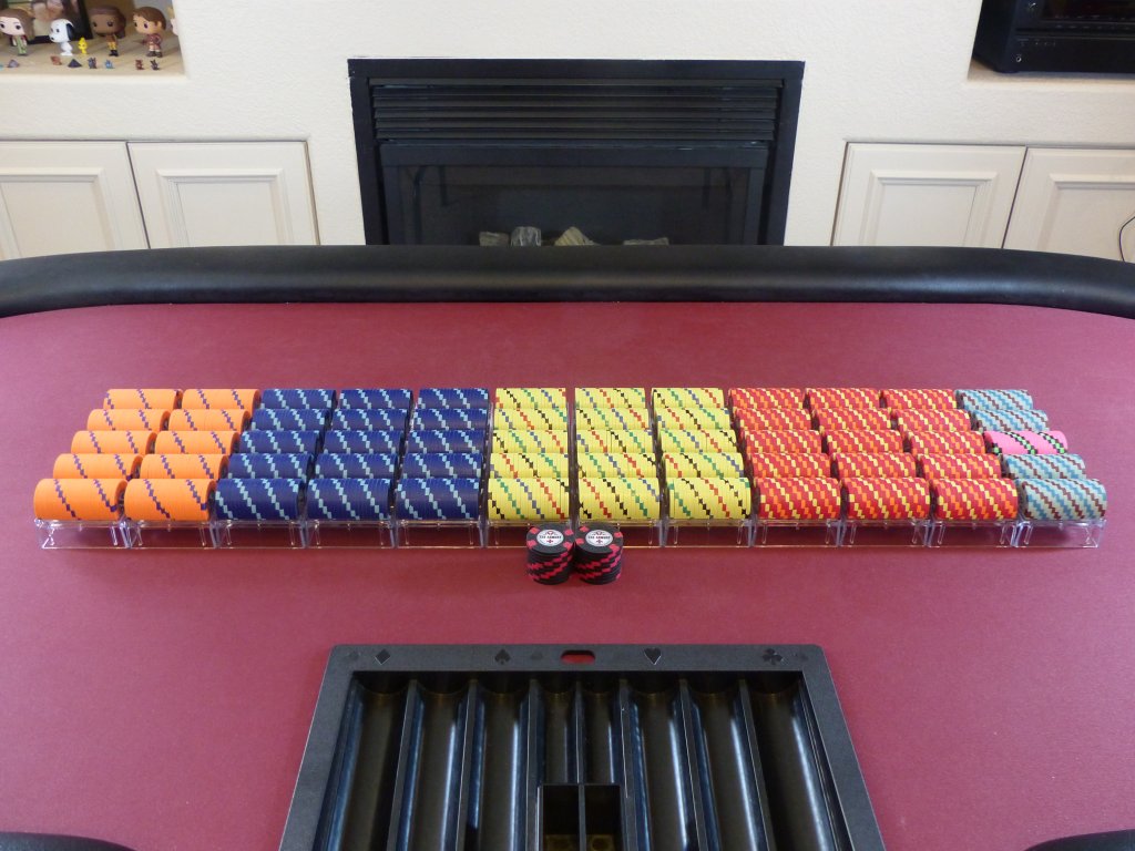
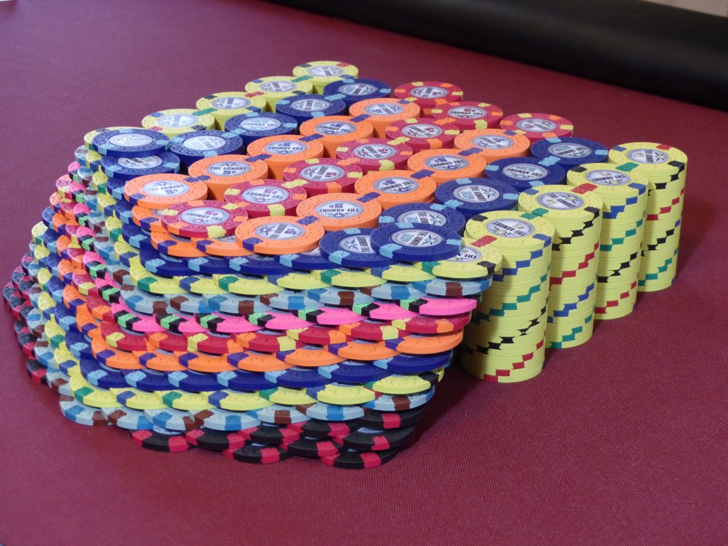
Set Denominations & Breakdown:
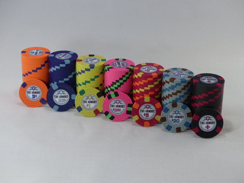
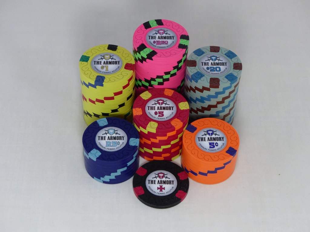
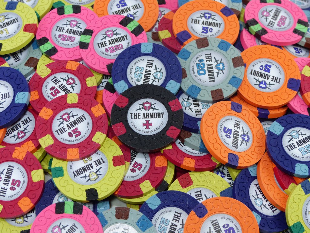
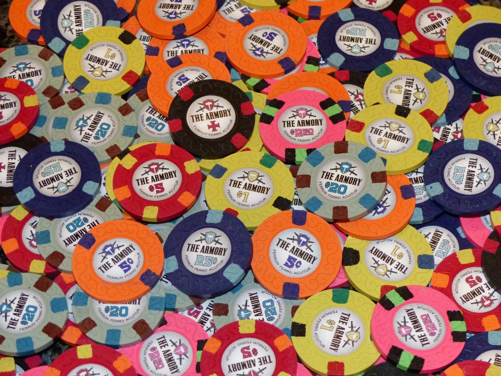
- 200 - 5c - Dayglo Peach 214 with Blurple spots
- 300 - 25¢ - Retro Blue 314 with Light Blue spots
- 300 - $1 - Dayglo Yellow 4Q14 with Blue, Mandarin Red, Black, and Green spots
- 300 - $5 - Retro Red 6A14 with Dayglo Peach and Dayglo Yellow spots
- 80 - $20 - Gray 8A14 with Chocolate and Imperial Blue spots
- 20 - NCV - Black 414A with Retro Red spots
- 20 - $2.50 - Dayglo Pink 3TA316 with Black and Dayglo Green spots
Quotes from the community:
"SMOKIN'! Nice work on these. The nickels, quarters, and $5s all make me drool!" - @liftapint
"These look insane!!!! All the colours are amazing, especially love the pinks!" - @MillyS
"Awesome set, congrats! I think my favorites are the nickel and $20, really unique chips that are incredibly enhanced by the color-matching on the inlay" - @Irish
