Story Hill
Owner: @MarquetteMonkey
Artist: @MarquetteMonkey
Manufacturer: CPC
Mold: CSQ
Showcase Thread: https://www.pokerchipforum.com/threads/welcome-to-story-hill-cpc.64864/
Thoughts from the owner:
Since finding PCF, the part of this community that I enjoyed the most with was seeing others' custom sets. I loved the personalization, the backstories, and the inspirations. I knew quickly that I wanted to make my own custom set. The right theme, however, took me well over a year to arrive at. I knew it couldn't be forced. I wanted to create an 'heirloom set', so it needed to have significance to me and my family. That's when the Story Hill set idea was born.
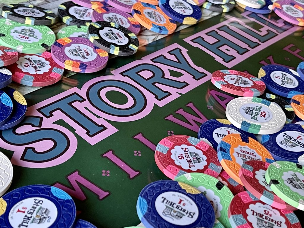
I grew up in a wonderful little neighborhood called Story Hill. I later moved into this same neighborhood with my wife as newlyweds, starting a new chapter in a familiar scene. Not too far from downtown Milwaukee and a short walk down the hill to Miller Park (then County Stadium) where the Brewers play, the neighborhood is filled with charm. It is known for its variety of houses that have so much character - many of which are Tudor style and feel like they could be in a fairytale story. The hand drawn font of Story Hill on the chips aims to mimic a storybook flair. This set depicts a drawing of my childhood home on one side and a drawing of the first home my wife and I bought on the other side.
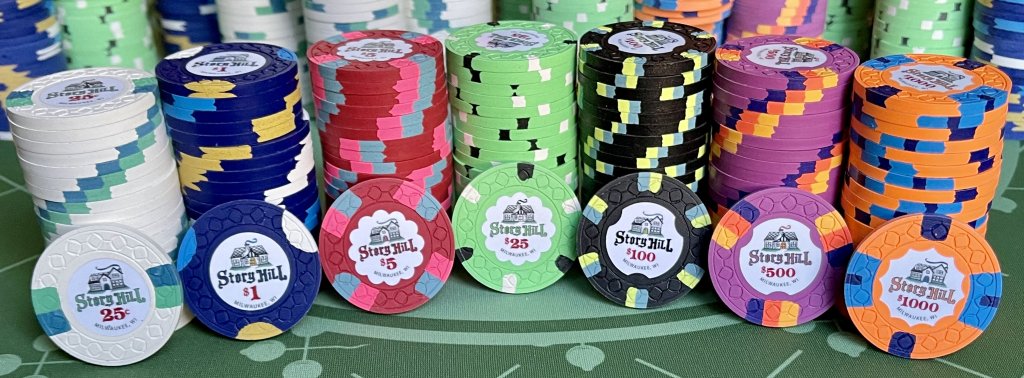
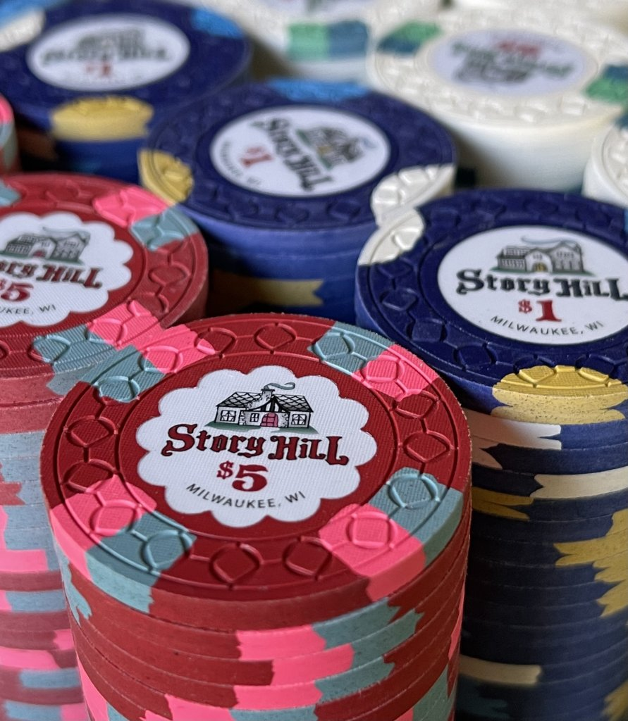
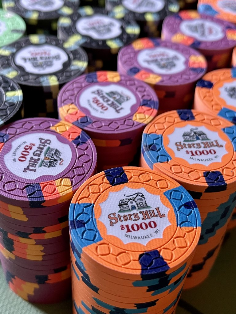
I am an inlay guy - its the most important part of the chip for me. It doesn't matter how perfect the spots and colors are, if it has a bad inlay, it ruins the chip for me. So getting the inlay right was a priority. I generally like clean inlays - white backgrounds, an interesting focal point, and legible but unique font. I drew a lot of inspiration from @72o Knollwoods set which was my first love on PCF and inspired me to do my own hand-drawn font and house. Generally, I am not the biggest fan of chips that have two different inlays on either side of the chip. However, because I wanted the set to depict both houses that had meaning to me, I decided to have both houses on each chip - one on either side. My goal was to have the drawings be cohesive in style so that the differences were almost unnoticeable in a splashed pot, yet at the same time accurately capture the unique charm of both houses. I also really like well executed color matching of inlay elements to base chip and spot colors. Bold, gradient color matching generally is not my style and is very difficult to successfully pull off, so I decided to add subtle color matching elements in the font, house doors, and smoke coming from the chimney. I had many iterations of my inlay, but ultimately I was very pleased with how it captured the essence of the two houses I lived in as well as the storybook charm of the neighborhood.
As for the rest of the set design, I knew 3 things: 1) Spot progression was important to me, 2) I wanted my workhorse chip ($1) to be Marquette University colors, and 3) I wanted a hub shaped inlay for my $5. That meant adding shaped inlays to most of the rest of the set for it to make a cohesive set which was an expensive endeavor, but I was very pleased with how they turned out. Finally, I wanted a set that was versatile enough to be used for cash games as well as single or two table tournaments.
Thank you for reading and I hope that my set or any one of the other fantastic sets nominated serves as inspiration for the creation of many more fantastic sets to be shared on PCF!
Thoughts from the committee:
Story Hill has an excellent clay lineup top to bottom with some really cool & unique spot/color combinations. It's really tough to get a 7 chip lineup with minimal repeating colors that both looks good and cohesive, but @MarquetteMonkey hit it out of the park here. However the real highlight of the set is the incredible inlay design, which has a simple & clean appearance at first glance, but lots of interesting finer details upon closer inspection. The subtle color matching of certain elements complements each individual chip while the constant red denomination helps to tie the set together. The style of the font wonderfully matches the storybook style graphics. Incredible attention to detail in every aspect of this set!
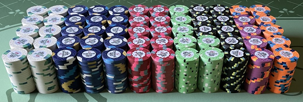
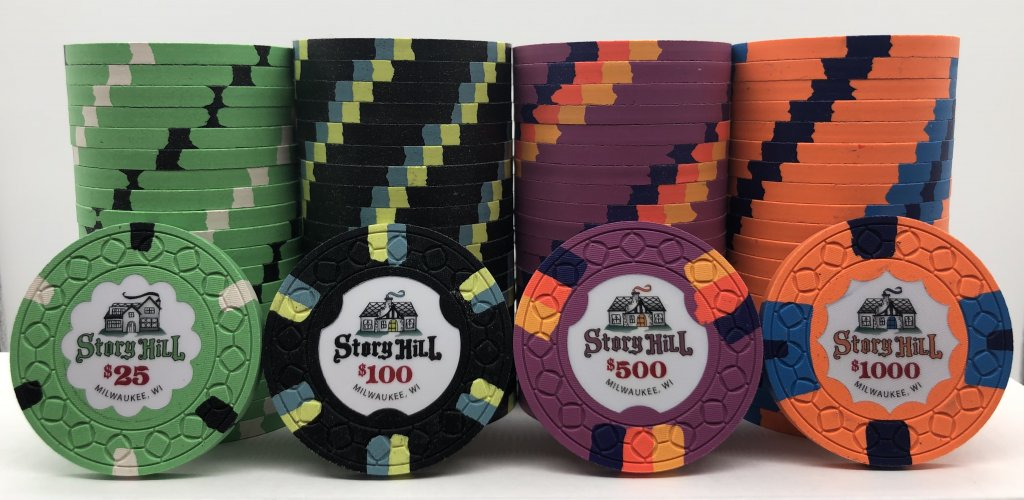
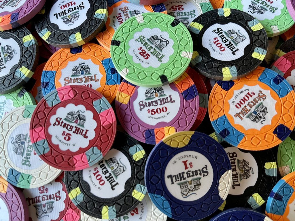
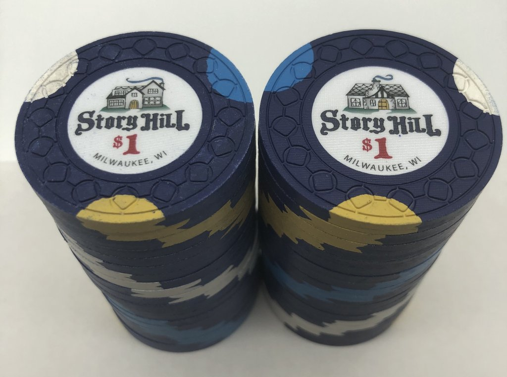
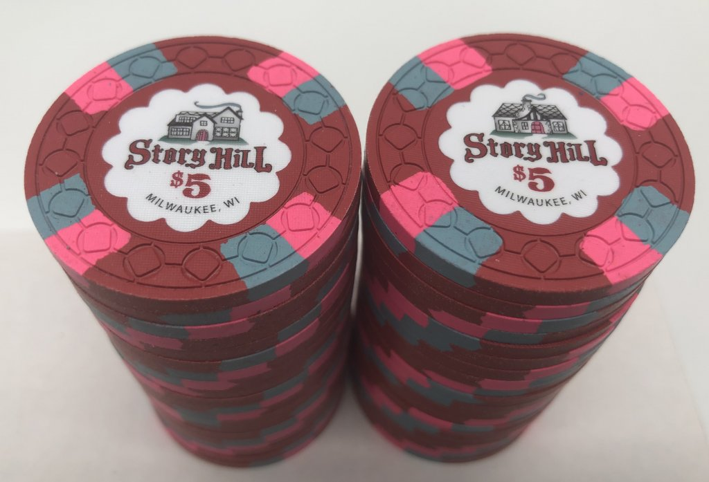
Set Denominations & Breakdown:

Owner: @MarquetteMonkey
Artist: @MarquetteMonkey
Manufacturer: CPC
Mold: CSQ
Showcase Thread: https://www.pokerchipforum.com/threads/welcome-to-story-hill-cpc.64864/
Thoughts from the owner:
Since finding PCF, the part of this community that I enjoyed the most with was seeing others' custom sets. I loved the personalization, the backstories, and the inspirations. I knew quickly that I wanted to make my own custom set. The right theme, however, took me well over a year to arrive at. I knew it couldn't be forced. I wanted to create an 'heirloom set', so it needed to have significance to me and my family. That's when the Story Hill set idea was born.
I grew up in a wonderful little neighborhood called Story Hill. I later moved into this same neighborhood with my wife as newlyweds, starting a new chapter in a familiar scene. Not too far from downtown Milwaukee and a short walk down the hill to Miller Park (then County Stadium) where the Brewers play, the neighborhood is filled with charm. It is known for its variety of houses that have so much character - many of which are Tudor style and feel like they could be in a fairytale story. The hand drawn font of Story Hill on the chips aims to mimic a storybook flair. This set depicts a drawing of my childhood home on one side and a drawing of the first home my wife and I bought on the other side.
I am an inlay guy - its the most important part of the chip for me. It doesn't matter how perfect the spots and colors are, if it has a bad inlay, it ruins the chip for me. So getting the inlay right was a priority. I generally like clean inlays - white backgrounds, an interesting focal point, and legible but unique font. I drew a lot of inspiration from @72o Knollwoods set which was my first love on PCF and inspired me to do my own hand-drawn font and house. Generally, I am not the biggest fan of chips that have two different inlays on either side of the chip. However, because I wanted the set to depict both houses that had meaning to me, I decided to have both houses on each chip - one on either side. My goal was to have the drawings be cohesive in style so that the differences were almost unnoticeable in a splashed pot, yet at the same time accurately capture the unique charm of both houses. I also really like well executed color matching of inlay elements to base chip and spot colors. Bold, gradient color matching generally is not my style and is very difficult to successfully pull off, so I decided to add subtle color matching elements in the font, house doors, and smoke coming from the chimney. I had many iterations of my inlay, but ultimately I was very pleased with how it captured the essence of the two houses I lived in as well as the storybook charm of the neighborhood.
As for the rest of the set design, I knew 3 things: 1) Spot progression was important to me, 2) I wanted my workhorse chip ($1) to be Marquette University colors, and 3) I wanted a hub shaped inlay for my $5. That meant adding shaped inlays to most of the rest of the set for it to make a cohesive set which was an expensive endeavor, but I was very pleased with how they turned out. Finally, I wanted a set that was versatile enough to be used for cash games as well as single or two table tournaments.
Thank you for reading and I hope that my set or any one of the other fantastic sets nominated serves as inspiration for the creation of many more fantastic sets to be shared on PCF!
Thoughts from the committee:
Story Hill has an excellent clay lineup top to bottom with some really cool & unique spot/color combinations. It's really tough to get a 7 chip lineup with minimal repeating colors that both looks good and cohesive, but @MarquetteMonkey hit it out of the park here. However the real highlight of the set is the incredible inlay design, which has a simple & clean appearance at first glance, but lots of interesting finer details upon closer inspection. The subtle color matching of certain elements complements each individual chip while the constant red denomination helps to tie the set together. The style of the font wonderfully matches the storybook style graphics. Incredible attention to detail in every aspect of this set!
Set Denominations & Breakdown:
- 200 x 25c - Bright White 2D14 with Light Green / Imperial Blue spots
- 300 x $1 - Retro Blue 3ATRIM with Bright White / Canary / Dayglo Peacock spots
- 200 x $5 - Mandarin Red 4D14 with Light Blue / Dayglo Pink spots
- 140 x $25 - Dayglo Green 6A18 with Black / Bright White spots
- 160 x $100 - Black 6D18 with Dayglo Yellow / Light Blue spots
- 80 x $500 - Retro Lavender 3TA316 with Dayglo Arc Yellow / Dayglo Tiger / Blurple spots
- 120 x $1000 - Dayglo Peach 2V12214 with Dayglo Peacock / Retro Blue / Retro Blue spots
