Marhault
Full House
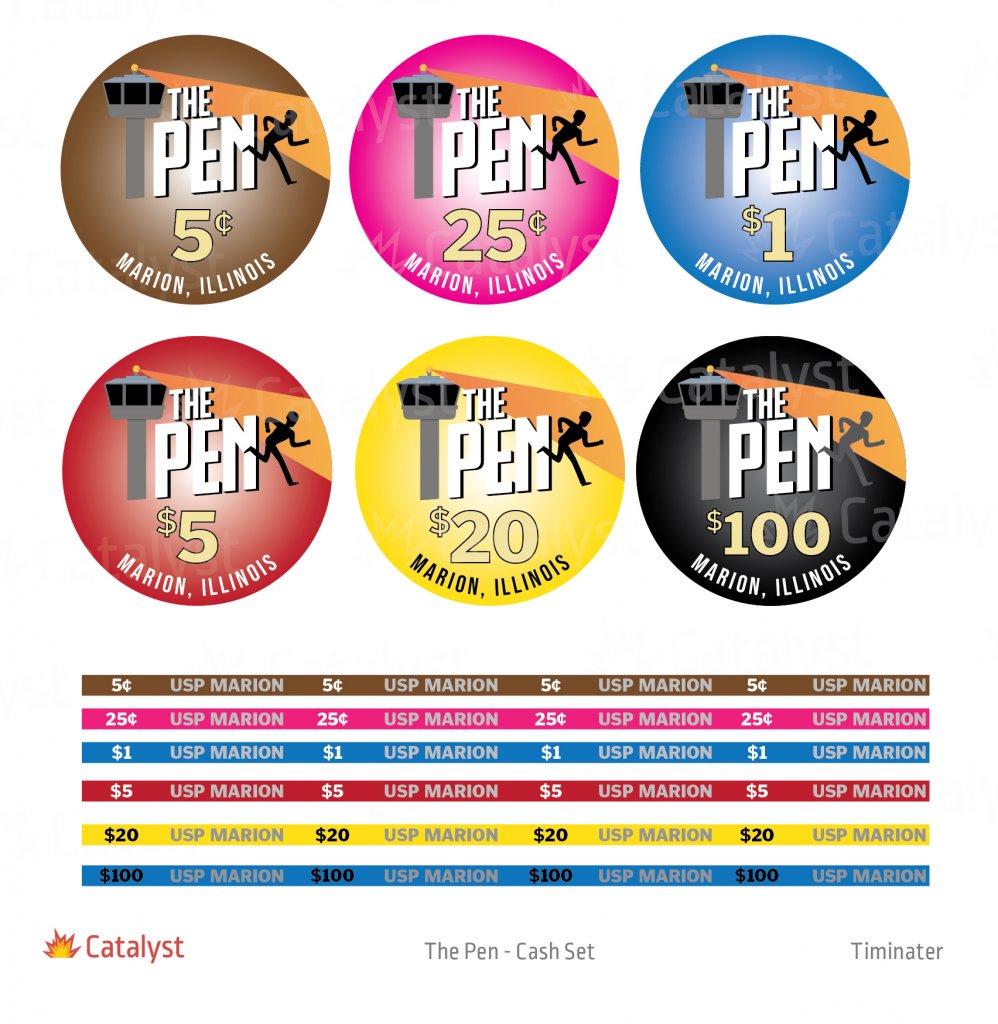
So I decided after a lot of debate that I wanted to do a custom set theme related to my job. For those that may not know I work at a Federal Penitentiary. This was after throwing around a lot of different themes.
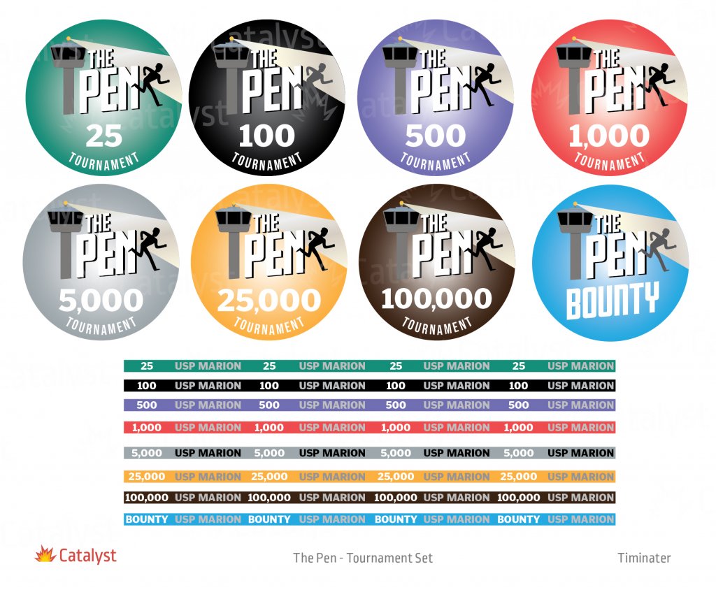
I went to @timinater to have him do the full set for me. We went through several iterations. Quite a few minor color changes and in the end this is what we settled on.


The 5c and the 100k won't be getting created for now. They're chips that I won't likely be using so towards the end I decided to axe them but they're included on the final proof in case I decide later on to get them produced.
The black hundo in the cash set has a blue rolling edge to represent the "thin blue line". The tower on the chip is a representation of the towers that are outside our institution.
I couldn't be happier. There was a lot of help a long the way. I asked advice of many people along the way. I wanted to call out a few in no particular order.
@Kensco helped with tons of knowledge about lines and color bleed and the sizing and spacing of letters on ceramics in particular as well as coming up with a design altering draft early on that sent us in this final direction.
@FordPickup92 for dealing with me constantly sharing drafts with her and helping with advice on colors and possible conflicts with dirty stacks etc and just general advice.
@Poker Zombie for giving me some good sizing outlines early on as well as some technical numbers of sizes in relationship to art, denomination and location.
If I didn't name you please know that I appreciated all the help along the way even if it was just to take a quick look at the design for a thumbs up/thumbs down.
I forget who gave me this advice but I'm gonna sit on this design for a couple months before proceeding to make sure I still love it as much a month or 2 from now, and also because things are pretty busy here right now so after the holidays is a better idea. I will for sure share some finished pics once they are complete.
I went to @timinater to have him do the full set for me. We went through several iterations. Quite a few minor color changes and in the end this is what we settled on.
The 5c and the 100k won't be getting created for now. They're chips that I won't likely be using so towards the end I decided to axe them but they're included on the final proof in case I decide later on to get them produced.
The black hundo in the cash set has a blue rolling edge to represent the "thin blue line". The tower on the chip is a representation of the towers that are outside our institution.
I couldn't be happier. There was a lot of help a long the way. I asked advice of many people along the way. I wanted to call out a few in no particular order.
@Kensco helped with tons of knowledge about lines and color bleed and the sizing and spacing of letters on ceramics in particular as well as coming up with a design altering draft early on that sent us in this final direction.
@FordPickup92 for dealing with me constantly sharing drafts with her and helping with advice on colors and possible conflicts with dirty stacks etc and just general advice.
@Poker Zombie for giving me some good sizing outlines early on as well as some technical numbers of sizes in relationship to art, denomination and location.
If I didn't name you please know that I appreciated all the help along the way even if it was just to take a quick look at the design for a thumbs up/thumbs down.
I forget who gave me this advice but I'm gonna sit on this design for a couple months before proceeding to make sure I still love it as much a month or 2 from now, and also because things are pretty busy here right now so after the holidays is a better idea. I will for sure share some finished pics once they are complete.

