Kid_Eastwood
4 of a Kind
Hi, personally I prefer the flower all around the label.
Yep, I agree. That font's probably not right, but I like the effect. I'll eventually send these ideas off to one of the artists on here for a more professional finish.I like the one on the left but the font really makes 'Desert' look like 'Desen'...
") )
)Maybe use the red on the 1 for the denomination. Nice work. I like the use of color.Here's an attempt at a little color matching. Row #1 uses only the base color (the sage green), row #2 uses only a color pulled from the chip, and row #3 uses a base color pulled from the chip and an outline of a slightly darker hue to help define the characters.
I'm not sure which of these I like most. Obviously, the yellow and white get lost in row #2, which is why I made row #3, but I actually like the un-outlined numbers better, especially on the $100 chip. With the outlines, I think the numbers start to look sort of baseball-y, kind of like @SeanGecko's inlays. (Sean, love your chips, just not the look I'm going for here.
One other option is to drop the color entirely and use the same dark grey that's used on the text for all the denominations.
Anybody have thoughts?
View attachment 239430
I see it. Just makes me think of the numbers on the back of jerseys. No offense, I hope.I was going for a more early 1900’s scricpt but I can see the baseball theme connection too.
I see it. Just makes me think of the numbers on the back of jerseys. No offense, I hope.
[/QUOTE
!
I kind of like this, actually. Bums me out that there’s no blue in the set. Is the middle spot a peach color?Maybe the Aurora Star $2 as a THC replacement for the GC $5? Not exactly the same color scheme but kind of the same tones.
View attachment 240565
Thank you!Development of this set is looking Great!
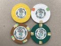
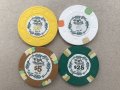
Try black?Thinking about a $25 now. Anybody have thoughts on these? I'm not convinced green is the way to go.
View attachment 241720
View attachment 241721
I do love purple chips. Not sure how to make it fit with the theme, though. The edge spots would need to tie in really well, I think.Purple something?
| Denom | Count | Bank |
| $ 0.05 | - | $ - |
| $ 0.25 | 160 | $ 40.00 |
| $ 1.00 | 200 | $ 200.00 |
| $ 5.00 | 140 | $ 700.00 |
| $ 25.00 | 80 | $ 2,000.00 |
| $ 100.00 | 20 | $ 2,000.00 |
| Total | 600 | $ 4,940.00 |
I'm leaning toward $20 instead of $25, also. Just haven't mocked up the new label yet. Glad to hear others are on board!I like the idea of more $5s. I also like the $20 instead of the $25 in a breakdown like yours. If you haven’t considered it, it works nicely for rebuys and cashouts as most people use $20 bills to buy in and easier to cash $20s too
Good points, all.$1 and $5 will be your workhorse chips in 0.25/0.50 or slightly higher cash stakes. Your question will be: how easy would it be to add on to my $1s and $5s in the future if I needed more? Thankfully, with HS Cleveland $1s and Garden City $5s, the answer is probably "fairly easy". It is probably less so with Empress $25s and Ambassador $100s.