DeeVee8
Flush
Are these going to be Majestics mold?
I was thinking the same thing. I like the white 500 but a purple chip would be nice in there somewhere. To me the blue and the red are the weakest of the set.Maybe Instead of blue, a purple chip?
The spirit molds have sharp edges. 8v’s, not so much, and Majestics even more bevel.
Are these going to be Majestics mold?
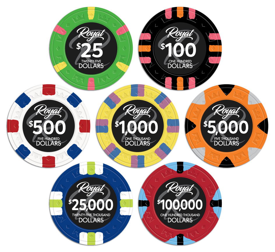
Here is a picture of the set. This is not final but shows where we are heading.
View attachment 225854
Maybe Instead of blue, a purple chip?
A purple/lavender chip would be more versatile than blue for those wanting to buy blanks and separate labels (stock or otherwise).I was thinking the same thing. I like the white 500 but a purple chip would be nice in there somewhere. To me the blue and the red are the weakest of the set.
Keep the feedback coming. I will have J5 make some more updates later. Possibly making the red $100,000 chip a $5 chip. Also adding some sort of a purple chip as a $100,000.


Did you use freehand draw for the spots?What about on the 100 alternating the spots. I find with this spot specifically it looks best evening out the color like "pink, orange, pink" then "orange, pink, orange" and back again.
View attachment 225899
And changing the pink spots on the 25 to dark green, lighter green or purple. Having the same pink in neighboring chips would tilt me.
For which? My own, not exactly. Everything starts out with crisp shapes. After everything is plotted the spots are individually shaped by hand using various tools in illustrator.Did you use freehand draw for the spots?
That's Electric Lime, iirc.Just personal opinion but the white and yellow look too dim with spot pattern. How about a tri moon? Just sayin
Could make a great Cali cash set out of these and wouldn't need to use the red chip (not a fan of that spot pattern).
Just personal opinion but the white and yellow look too dim with spot pattern. How about a tri moon? Just sayin
Please put that blue in the $100What about on the 100 alternating the spots. I find with this spot specifically it looks best evening out the color like "pink, orange, pink" then "orange, pink, orange" and back again.
View attachment 225899
And changing the pink spots on the 25 to dark green, lighter green or purple. Having the same pink in neighboring chips would tilt me.