-
PCF is an eBay Partner. If you make a purchase through one of our links, we may earn a commission at no extra cost to you. Thank you for your support!
You are using an out of date browser. It may not display this or other websites correctly.
You should upgrade or use an alternative browser.
You should upgrade or use an alternative browser.
Looking for opinions/ ideas (9 Viewers)
- Thread starter cubadoze
- Start date
I think that is great advice that i agree with. Keep it simple and don't try to have too much going on.
Alright, here comes the feedback. Honestly, your inlay is absolutely impossible to see. If you are passionate about using the Gold you are going to have to have a VERY dark background. Maybe try Black and see what it looks like. If you want to add some uniqueness, have the fancy design on the right and left side be colored the same as your chip. Also, your denomination is way too tiny. I would get rid of the bottom crown (make it more simple) and enlarge it greatly. With a little work I think you will have something to be proud of. Best wishes on your project. Gold can look great when utilized correctly.")

Alright, here comes the feedback. Honestly, your inlay is absolutely impossible to see. If you are passionate about using the Gold you are going to have to have a VERY dark background. Maybe try Black and see what it looks like. If you want to add some uniqueness, have the fancy design on the right and left side be colored the same as your chip. Also, your denomination is way too tiny. I would get rid of the bottom crown (make it more simple) and enlarge it greatly. With a little work I think you will have something to be proud of. Best wishes on your project. Gold can look great when utilized correctly.
Last edited:
Gojira777
Pair
I agree with @Huskerchipper. The denomintaions are very hard to read. But I like the theme! Black backround and a more simple label could work.
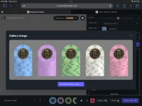
The 1k and 5k are very close in colors and could make dirty stack issues especially in darker lighting. Maybe try a different color for one of them. Yellow 1k for example?
I‘d also prefer a 25k chip over a 10k when there‘s a 5k in the set.
The 1k and 5k are very close in colors and could make dirty stack issues especially in darker lighting. Maybe try a different color for one of them. Yellow 1k for example?
I‘d also prefer a 25k chip over a 10k when there‘s a 5k in the set.
cubadoze
Waiting List
Really appreciate the feedbCk JimI think that is great advice that i agree with. Keep it simple and don't try to have too much going on.
Alright, here comes the feedback. Honestly, your inlay is absolutely impossible to see. If you are passionate about using the Gold you are going to have to have a VERY dark background. Maybe try Black and see what it looks like. If you want to add some uniqueness, have the fancy design on the right and left side be colored the same as your chip. Also, your denomination is way too tiny. I would get rid of the bottom crown (make it more simple) and enlarge it greatly. With a little work I think you will have something to be proud of. Best wishes on your project. Gold can look great when utilized correctly.
View attachment 1688526
Thank youI agree with @Huskerchipper. The denomintaions are very hard to read. But I like the theme! Black backround and a more simple label could work.
The 1k and 5k are very close in colors and could make dirty stack issues especially in darker lighting. Maybe try a different color for one of them. Yellow 1k for example?
I‘d also prefer a 25k chip over a 10k when there‘s a 5k in the set.
 this was the first concept so I’ll try again with your guys advice in mind
Gojira777
Pair
Keep posting your progress here! There‘s a lot of people here that are always happy to help!
Your inserts or edge spots are a tournament style. If this is a cash game, you need to vary the inserts.
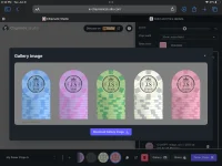
I love the idea of pastels, depending upon your manufacturer. There can be a lot of variance in the colors off the screen.
The pink and purple are way too close in Color or Hue. The blue and green are also too close most of the time you wanna mix a darker chip next to a lighter chip next to a darker chip.
Also, you’ll likely want to run the mock through a colorblind filter. There’s a couple of websites so you can upload the photo and it will show you various different colorblind types and how your chips look against those.
keep posting your progression
Gojira777
Pair
I doubt that this is going to be a cash set since it is starting with $100 and goes up to $10k.Your inserts or edge spots are a tournament style. If this is a cash game, you need to vary the inserts.

cubadoze
Waiting List
Keep posting your progress here! There‘s a lot of people here that are always happy to help!
Your inserts or edge spots are a tournament style. If this is a cash game, you need to vary the inserts.
I love the idea of pastels, depending upon your manufacturer. There can be a lot of variance in the colors off the screen.
The pink and purple are way too close in Color or Hue. The blue and green are also too close most of the time you wanna mix a darker chip next to a lighter chip next to a darker chip.
Also, you’ll likely want to run the mock through a colorblind filter. There’s a couple of websites so you can upload the photo and it will show you various different colorblind types and how your chips look against those.
keep posting your progression
Attachments
Gojira777
Pair
The black and gold is great in my opinion.
Colors are still pretty close on the 500 and 10k. I don‘t know if I would put both of those pink shades in the same set.
Colors are still pretty close on the 500 and 10k. I don‘t know if I would put both of those pink shades in the same set.
chipinla
Straight Flush
- Joined
- Apr 12, 2018
- Messages
- 9,654
- Reaction score
- 26,171
- Rewards
- 427
What is happening?
cubadoze
Waiting List
Working on concepts for a custom setWhat is happening?
chipinla
Straight Flush
- Joined
- Apr 12, 2018
- Messages
- 9,654
- Reaction score
- 26,171
- Rewards
- 427
Start here. Then start over.
https://www.pokerchipforum.com/poker-chip-database/categories/custom-sets.2/
https://www.pokerchipforum.com/poker-chip-database/categories/custom-sets.2/
chipinla
Straight Flush
- Joined
- Apr 12, 2018
- Messages
- 9,654
- Reaction score
- 26,171
- Rewards
- 427
Every chip doesn’t (shouldn’t be a tribute) to Easter/pastel
chipinla
Straight Flush
- Joined
- Apr 12, 2018
- Messages
- 9,654
- Reaction score
- 26,171
- Rewards
- 427
oneeyedjack
Pair
I would say the denomination still needs to be bigger and I think more color contrast in your edge spots would help the chips stand-out more from other denomination of your set.
Similar threads
- Replies
- 18
- Views
- 1K
- Replies
- 43
- Views
- 3K
- Replies
- 0
- Views
- 299
- Replies
- 6
- Views
- 602
- Replies
- 11
- Views
- 871