Initial thoughts, after opening a few decks and messing around for a half hour or so:
Card stock: The card stock is definitely on the thicker side. Being these were made by Fournier, I compared them to the Fournier 2800 card stock. The Tapestrys are a good deal thicker - roughly 2 full cards thicker when I stack 2 decks side by side, and it's noticeable right out of the box. The overall feel is similar to the 2800s, the Tapestrys have a slightly more textured surface than the Fournier stock. They flex and riffle like a good Fournier stock, the extra texture requires a hair more effort to push the deck together after a riffle in comparison, but overall they shuffle very well. When shuffling, you get more of that scratchy sound with the extra texture - those who deal a lot will know what I'm talking about
")
With the extra thickness, I noticed a slight tendency for the card edges to catch a bit when I gathered them after a deal and when washing.
Face design: This is easily the coolest part about these setups, they are 100% built for meetups.
I think folks will find the black jack index absolutely perfect for mixed dealer's choice games, while being just large enough for those hold'em folks that are used to jumbo index. The red security ink is the perfect shade , it's a very rich crimson red that makes seeing the suits from across the table easy.
Fournier/Modiano/Tapestry/Victorian/Copag
The pips and suits are all very clear, distinguishable and easy to read, and the black jack index gave Jason more room for his awesome face card graphics to be on full display. Comparing these the Classic Victorians, extra graphic size is very noticeable in a very good way.
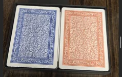
Back design / colors: As I mentioned prior, the colors from the two different setup colors offer the opportunity to mix and match a little, you could go blue/red, orange / teal , blue / orange and red / teal.
The back design is very nice and printed without any issues from what I can tell. Being honest, I'm a little disappointed in a couple of the colors. One of the things I loved about prior offerings is how deep and rich the back colors were on prior runs like the Classic Victorians. The red / Dragon and orange / Phoenix back colors are identical to past colors, those are both good. The hydra color in particular is really light, it's definitely more of a light teal vs the deep aqua green I was hoping for. The blue / Kraken is also a bit lighter than prior runs. The Tapestry back design has a lot of white detail/fill in comparison to past designs, and I think that plays a lot into the lighter appearance, but overall I just wish a darker aqua color was used to make them pop more.
Overall my first impression is these are beautiful, very well made cards. I bought a case primarily to run these for dealer's choice cash games at meetups, and I'm very happy with the final results. Thanks again Jason for offering these to the community!

")