RofoPoker
High Hand
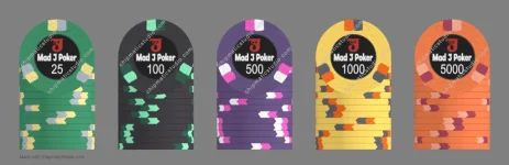
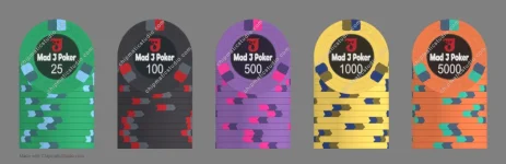
Got to playing around with the Chipmatic studio (very cool!) and came up with a fairly standard palette for a T25-base tournament set. I'm a fan of classic chip colors and simple spot patterns, so I certainly don't think I've put together anything revolutionary here. Just color patterns that seemed to go well together and/or stuck with me based on what I've seen over the years.
"Mad J" is just a play on my name, or more accurately a play on my login ID for my kids' school's online portal which starts with the first three letters of my last name (MAD) and my first initial (J). I'm not much of a graphic designer so the label is pretty basic, but again I'm a man of simple tastes. The "Angry J" character was designed with the help of Copilot.
Anyway after doing all this I'm seriously considering putting in a custom order through the group buy thread, but if I'm going to spend that money I want to really like what I get out of it. Any suggestions from fellow chippers would certainly be appreciated!