

rocktheproject
Pair
Hey all!
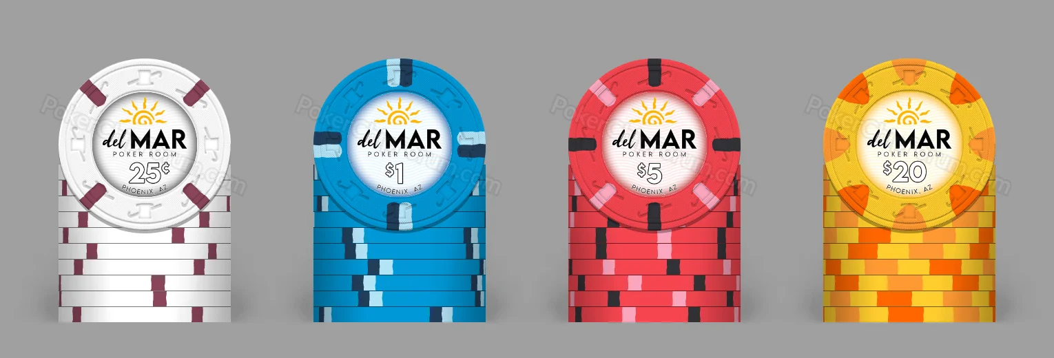
I'm still experimenting with design ideas (mostly for my own enjoyment), and this is what I've come up with. I know that these resemble the Del Lago design, which I really like, but there's also a lot of backstory.
When I was young, I lived in Mesa, AZ, and I spent a lot of time at my grandparents' house on a street called Del Mar. A lot of my best memories come from this house, like hanging out in their pool (hence the background wave pattern). I also have a lot of good memories of Arizona, so I wanted to include the setting sun logo, but I'm not sure how well it's working with the design, and this is where I'd love to hear your feedback. Something about it feels incomplete, but I'm not entirely sure what it is.
I made the chips in the Paulson chip designer, but that was just for fun and to color-match the inlays. If you have any feedback, I'd love to hear it!
I'm still experimenting with design ideas (mostly for my own enjoyment), and this is what I've come up with. I know that these resemble the Del Lago design, which I really like, but there's also a lot of backstory.
When I was young, I lived in Mesa, AZ, and I spent a lot of time at my grandparents' house on a street called Del Mar. A lot of my best memories come from this house, like hanging out in their pool (hence the background wave pattern). I also have a lot of good memories of Arizona, so I wanted to include the setting sun logo, but I'm not sure how well it's working with the design, and this is where I'd love to hear your feedback. Something about it feels incomplete, but I'm not entirely sure what it is.
I made the chips in the Paulson chip designer, but that was just for fun and to color-match the inlays. If you have any feedback, I'd love to hear it!


