phcjpp
Two Pair
- Joined
- Oct 22, 2017
- Messages
- 419
- Reaction score
- 1,216
- Rewards
- 76
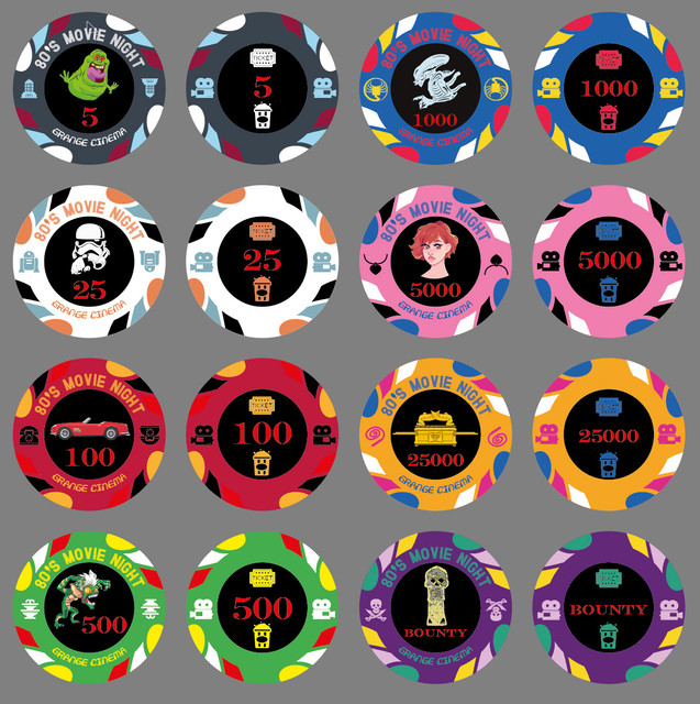
Evening all,
I have the very beginnings of a movie inspired set that I have been working on today in Adobe Illustrator (never used before today but was fairly easy to get going in the end - the pathfinder tool is amazing for chips!).
Once I have a decent idea I will hand everything over to one of the resident design experts. At the moment I am thinking 43mm Sun Fly polyinno HB005 (Chip Diameter: 43mm, Sticker Diameter: 25.4mm Thickness: 3.3mm) although could be convinced otherwise.
The base colours of the chips need to be black , white (or grey), red, green, blue, pink, any colour, any colour. Shades of colour and the colour of the last 2 chips is completely flexibly as are the edge spot designs.
I have picked a few of my favourite movies but if you have better ideas please do shout - the movie needs to be related to the colour somehow! Finding a green movie was a shocker. I would have loved to do Ferris' day off for the red one but couldn't find a vector of the Ferrari!
Very best
Chris
")