You are using an out of date browser. It may not display this or other websites correctly.
You should upgrade or use an alternative browser.
You should upgrade or use an alternative browser.
Silver Club $20 MSK Plaque Official Order Thread *CLOSED* (5 Viewers)
- Thread starter Quicksilver-75
- Start date
Gotta go for the orange!....And the whole thing wouldn't be complete without a vote of some sort.... Orange or Grey dropshadow on the denom?View attachment 44152 View attachment 44153
Don't mind the other small differences.
RowdyRawhide
Full House
I'll take one of both please
I'll guess I'll vote for orange but they both look good so neither is a deal breaker
I'll guess I'll vote for orange but they both look good so neither is a deal breaker
Last edited:
DJ Mack
Flush
I'd probably say gray but it's not a deal breaker for me either!
ChipEnvy
Full House
In for a $20.
Quicksilver-75
4 of a Kind
uhhhh...You were going to get one of each "on me" Don't worryIn for a $20.
Quicksilver-75
4 of a Kind
So we have a new issue to tackle....
The serial numbers. I am in completely uncharted waters here. I'm uncertain how MSK applies these. I "believe" its like a hotstamp process but am not 100%. If anybody knows chime in..
That said, I would like some input as I'm completely flexible. I particularly would like to hear from @DJ Mack who will be using his for play.
1) Placement - I was thinking bottom-center of the raised edge. But center-right might fill the plaque better and if hotstamped wont leave groove-flash on stacking surfaces.
2) Format - we can do whatever we want here. So something like PCFSC0001..., SC0001PCF..., 06081601...
3) Colors - This will be the easiest to figure out as soon as MSK gets back to me. I was leaning towards white (if possible) for both if we went bottom-center. but I think the recessed surface will be the best place for these. So maybe chrome/silver?
1) I would say either bottom right or centre right - pretty much what you said
2) format - SC00001 looks good
3) colours - I reckon silver/chrome would look the best and also tie in with the name 'silver'
I have no clue about how they would apply them
just my 0.02
2) format - SC00001 looks good
3) colours - I reckon silver/chrome would look the best and also tie in with the name 'silver'
I have no clue about how they would apply them
just my 0.02
Quicksilver-75
4 of a Kind
I went back again this morning and looked at a printout I can hold in my hand...I think theres room bottom-center ABOVE the raised edge under the oval. But it looks cramped next to the denom. So then I was thinking mabe same postion but right-justified? Leaving it opposite position to the denom..1) I would say either bottom right or centre right - pretty much what you said
2) format - SC00001 looks good
3) colours - I reckon silver/chrome would look the best and also tie in with the name 'silver'
I have no clue about how they would apply them
just my 0.02
DJ Mack
Flush
1 - I kind of like the idea of center right, would you be thinking of it running vertically, but parallel to the edge?
2 - I don't really care but maybe something like 16SC#### or SC16#### just to denote the year. Mentioning PCF, while nice, is not really critical. First and foremost they are your plaques.
3 - Definitely agree with silver/chrome
2 - I don't really care but maybe something like 16SC#### or SC16#### just to denote the year. Mentioning PCF, while nice, is not really critical. First and foremost they are your plaques.
3 - Definitely agree with silver/chrome
Lol yeah right justified - lol I think that what I was meant to sayI went back again this morning and looked at a printout I can hold in my hand...I think theres room bottom-center ABOVE the raised edge under the oval. But it looks cramped next to the denom. So then I was thinking mabe same postion but right-justified? Leaving it opposite position to the denom..
Quicksilver-75
4 of a Kind
Quicksilver-75
4 of a Kind
I'm really digging A or B, but A first.
DJ Mack
Flush
I'm leaning towards C first, it looks like it belongs. The other three look like adding it on was an afterthought. The black honeycomb behind the lettering just seems a bit off to me. If you go with A maybe knock it down a bit so it's completely off the stripe.
RowdyRawhide
Full House
This^^^^^^I'm really digging A or B, but A first.
If you can get it off the ribbon
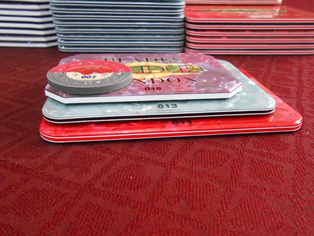
Just checked my blades plaques as they are serial numbered. They are printed on the inside. I do not know if that is how they do them all, but that is how the blades plaques were done
Quicksilver-75
4 of a Kind
Could I trouble you for a pic?This^^^^^^
If you can get it off the ribbon
Just checked my blades plaques as they are serial numbered. They are printed on the inside. I do not know if that is how they do them all, but that is how the blades plaques were done
Quicksilver-75
4 of a Kind
NVM. I borrowed one. I sure hope they have other colors than black. Otherwise we could look into UV marks?
Quicksilver-75
4 of a Kind
I'm terribly sorry guys. I have issues. I'm never satisfied. Just ask @Gear. I change my mind so much its a wonder I can get dressed in the morning....
Anyways. I really didn't like the backdrop on the plaques before. What do you guys think of these.?..@DJ Mack , @MillyS , @RowdyRawhide
EDIT: Added the serial numbers. They are screened on to the back of the top layer. I can use whatever color possible. I think we can all agree moving to where it is shown may be best. The honeycomb will make it hard to decipher and if I move it near the raised edge there is a chance it may end up half under it...


Last edited:
DJ Mack
Flush
I'm still buyin' (y) :thumbsup:
RowdyRawhide
Full House
Hey they are your plaques you make them how you want. I think all of your improvements on the new ones are spot on though.
I'm still in
I'm still in
Quicksilver-75
4 of a Kind
Uhhgggg....Changed the location of the serial.....again. I also moved the flare points of the gradient to purposely make the spots where the serial #s will go darker thus giving a higher contrast.


DJ Mack
Flush
Yep, I agree - do em as you like em. We're just along for the ride. That said, with the new flare points I think the serial numbers are perfect in that location. Nice and crisp.
looking pretty damn goodUhhgggg....Changed the location of the serial.....again. I also moved the flare points of the gradient to purposely make the spots where the serial #s will go darker thus giving a higher contrast.
View attachment 44298 View attachment 44299
DJ Mack
Flush
Out of curiosity what program are you using to do your artwork?
Quicksilver-75
4 of a Kind
Almost always illustrator. Photoshop if i'm using any raster images. A few other utility programs for very specific tasks but inevitably always finish the project with illustrator.Out of curiosity what program are you using to do your artwork?
Quicksilver-75
4 of a Kind
OP Updated for Last Chance buyers.
RowdyRawhide
Full House
I think I have some high hand plaques coming from you. You can hold those till these come in and put them all in one package. No need for fanci figures on combined shipping those few bucks aren't gonna break me
Quicksilver-75
4 of a Kind
No problem. I don't think your plaques will actually increase the cost. Maybe by $1.40 if memory serves..I think I have some high hand plaques coming from you. You can hold those till these come in and put them all in one package. No need for fanci figures on combined shipping those few bucks aren't gonna break me
LabMonkey
Flush
I'm still in for a single $20 plaque. Thanks!
Quicksilver-75
4 of a Kind
1 hour & 5 minutes left.
Similar threads
- Replies
- 7
- Views
- 520
Taking Orders
Matsui Zen $20 and $100 plaque Group Buy 2023
- Replies
- 26
- Views
- 2K
- Replies
- 124
- Views
- 5K
- Locked
- Replies
- 13
- Views
- 707


