What do you think about this design? (1 Viewer)

BarbaraBooey143

High Hand
Joined
Dec 13, 2022
Messages
71
Reaction score
50
Location
USA
Hello everyone. I have some experience playing live poker, but am new to chip designing. I appreciate any feedback.

The goal of my design is for the poker chips to feel very expensive and high-quality. I would like a wealthy, refined feel, that makes players want to buy bigger chips, and play splashy poker.

I'm currently a student (and don't have the bankroll to play mid or high stakes). However, after I graduate and save some money, I hope to one day play in $5/10, $10/25, or possibly even $25/50 home games.

I would love to have chips that feel very valuable, and subconsciously make players want to buy in deeper, and play more aggressive poker.

I chose the theme "Value Town - Bluff City" because I want to subconsciously cause players to make big bluffs, and play looser poker. I want players to be thinking, "Is this guy bluffing me? Or is he trying to stack me with the nuts?"

I'm not an artist. My design concept is not set in stone. (I'm planning to hire a graphic designer to create the inlays. What I have so far is just a mock-up.)

I'm curious what people think about the 1/4 Pie chips. Would it be better to go with something more traditional?

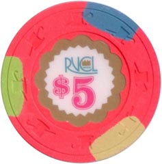
100% of the credit goes to PokerChipsDesign. I attached one of his layouts, which I used as inspiration and modified a little. The lowest denomination is $0.05 and the highest is $25,000.


View attachment 1041945


The original:

View attachment 1041946
 
Sorry but they come across as very bland. The chips colors should be complimentary, not in the same hue.

edit- while I really like 1/4pie chips, I think they should be a single chip in the set. Do a search on "spot progression" for edge spotting ideas.
 
Okay, I appreciate the feedback. I should do more research on spot progression. Overall, what do you think about the colors? Do you have any chips you've seen, that I might be able to use as inspiration?
 
I dig the monochrome scheme. I'd do them on the small crown mold and come up with a super classy inlay design. Nothing crazy or too busy.
 
These reminded me of @detroitdad's quarter pies. He might have some feedback about what he likes/dislikes about his set too.

20190130_173424.jpeg

I am going to disagree with Silver. I like the concept and find that the chips work together with a shared theme. I like how they all show a range of the color; it's an interesting play on the quarter pie design.

My criticisms are pretty small, but here they go:

1. I'm sure you were gonna do this anyway, but I'd make the fracs .05 and .25 to avoid confusion with the $5 and $25 chips.
2. I could see dirty stacks happening between the two 5s and between the .25 and 1.
3. It is possible that having a white edge spot and an off white edge spot on the .25 chip will end up looking like half of it is dirty and half of it is clean. This isn't a guarantee, just something to consider.

Overall, I dig it.
 
These reminded me of @detroitdad's quarter pies. He might have some feedback about what he likes/dislikes about his set too.

View attachment 1041962

I am going to disagree with Silver. I like the concept and find that the chips work together with a shared theme. I like how they all show a range of the color; it's an interesting play on the quarter pie design.

My criticisms are pretty small, but here they go:

1. I'm sure you were gonna do this anyway, but I'd make the fracs .05 and .25 to avoid confusion with the $5 and $25 chips.
2. I could see dirty stacks happening between the two 5s and between the .25 and 1.
3. It is possible that having a white edge spot and an off white edge spot on the .25 chip will end up looking like half of it is dirty and half of it is clean. This isn't a guarantee, just something to consider.

Overall, I dig it.

Thank you, I appreciate the feedback. Realistically, these are the chips that I would use in a normal game. I doubt I would ever use the lower or higher denominations, unless it was just for fun.

index2.png


Or possibly:

index3.png
 
Minor feedback on denominations: You might want to consider using a font that has thinner numerals to give your denoms more room to breathe. The font here looks like it belongs on the side of a building. Check out the denominations on the Moose hotstamps for inspiration.
 
Minor feedback on denominations: You might want to consider using a font that has thinner numerals to give your denoms more room to breathe. The font here looks like it belongs on the side of a building. Check out the denominations on the Moose hotstamps for inspiration.

Good idea. I'm really bad with fonts and text. I would probably need a graphic designer to do the inlay better.
Here is another color scheme I found on this site (and I modified a bit). I like the colors, and there's more variation in spots.

index4.png
 
Also thinking about this one. Does anyone by chance have a recommendation for a graphic designer to help with the inlay?

index5.png
 
I think you have a good start and you have an idea what you are looking for.
If you are planning on hiring a designer, I would recommend not stressing too much about graphics at this stage. Letting the designer choose typefaces and graphics based on your overall concept is what they do. Often, they will likely come up with something you had not even considered, but satisfies all of your vision for the design.
Now, if you want to do it yourself, that’s fine…keep posting your progress here and I’m sure you’ll get lots of great feedback.
 
I made some changes to the font, and the theme: Value & Bluff: Two sides of the same coin.

indexnew.png
 
I think I've narrowed it down to these two options. I'm not planning to use the "American High Roller" inlay. It's just there temporarily as a place holder.

Reasons I like #1: It feels very sophisticated and elegant. It's like something you would see at a very expensive casino. I also really like the contrasting spot designs.

index11.png


Reasons I like #2: I love the colors. They feel very playful and circus-like. I would like to have an action-oriented, gambling game, and these feel pretty fun. However, the only thing I dislike about #2 is the spots are all the same. It might be nice to have a little more variety.


index12.png


We can do an informal vote. If you prefer #1, you can "like" this post. If you prefer #2, you can click "love." And if you don't like either, and think I should go in a different direction, you can click "angry."

Also, if you are a graphic designer and believe you can help me creatively, feel free to send me a PM. I appreciate any feedback!
 
I made some changes to the font, and the theme: Value & Bluff: Two sides of the same coin.

View attachment 1042192

One of the concerns when putting together a set is dirty stacks, i.e., a stray chip getting lost in a stack of a different denomination. While each chip on its own looks great, they won’t necessarily play well together. In this case, I’d say your 5 and 25 would definitely be prone to dirty stacks, and the 1 to a lesser degree.

That can be an issue when chips have repeating similar colors, especially the same size edgespots. The 1/2” spots are particularly difficult for this.

You’re doing the right thing by trying lots of designs, and asking for advice. Also, be sure to take your time, especially if you’re going with CPC. That’s a ton of money to drop on something. Earl on, I made some sets in the design too that I really liked, then went back to them after a while, and wondered what I was thinking.

Good luck! I always eager to see new sets.
 
Last edited:

Create an account or login to comment

You must be a member in order to leave a comment

Create account

Create an account and join our community. It's easy!

Log in

Already have an account? Log in here.

Back
Top Bottom