What design of cards should we make next? (15 Viewers)

justincarothers

Straight Flush
Vendor
Supporter
Joined
Nov 7, 2014
Messages
8,282
Reaction score
21,188
Rewards
555
Location
Texas
Was thinking of doing another run of the Signature series. Blackjack index. Bridge Size

What are your thoughts on this back design?
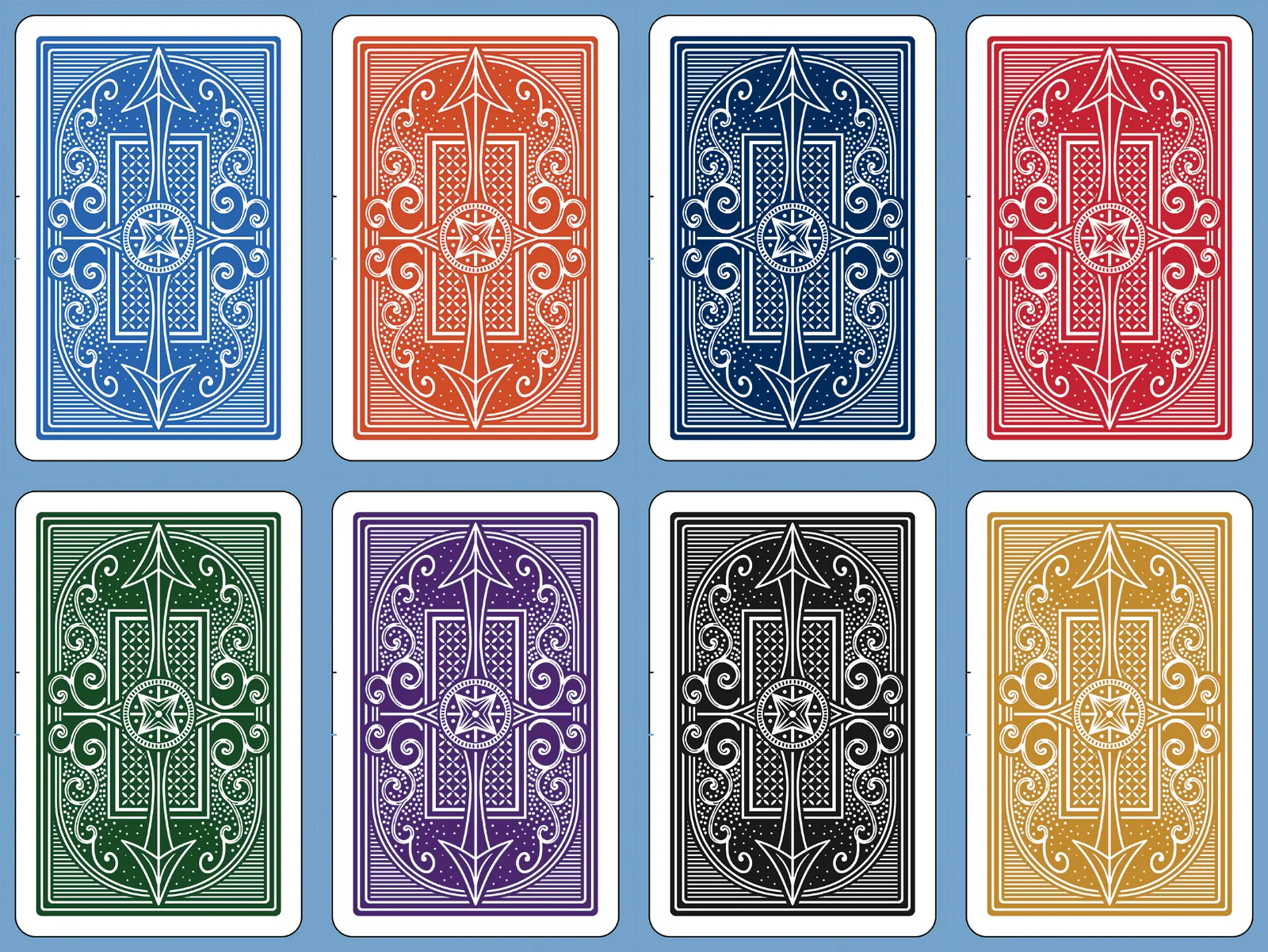
COLOURS PREV.webp


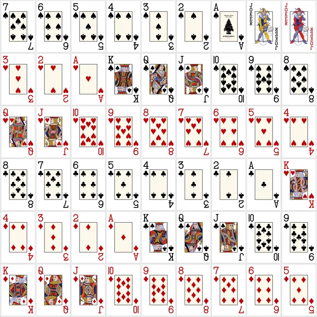
With this face art:

1783546294617.webp
 
Love the back design! Would you consider altering the face art back to that of the initial run and have the cream center on the aces and 2-10 cards and none on the paint cards?

Alternatively, are you open to fonts used by Cartamundi, Piatnik, Grimaud if a designer is able to replicate?
 
Love the back design! Would you consider altering the face art back to that of the initial run and have the cream center on the aces and 2-10 cards and none on the paint cards?

Alternatively, are you open to fonts used by Cartamundi, Piatnik, Grimaud if a designer is able to replicate?
I am open to anything :)

You mean this face art?

Broken Arrow Cards May 2024 PREVIEW-hi-res.webp
 
As long as you keep my AOS I'm happy. :cool

I would prefer the newer face art (but don't mind the older court card faces but you got to keep the count card fonts from the new face).
And especially please do the cream box on all cards..... :)

As far as backs I like the 2 on the left side:
Lighter Blue/Red
Green/Purple
 
I like these. If I had my pick I would want the green backs as pictured and then either maroon or brown as the other back color for the set.

I don't love the boxy font as used on the green/blue yellow box setups, but otherwise down for @JMC9389's other suggestions and/or the proposed signature series.
 
I vote for the first card graphics with the numbered cards having a cream center and gold & black set.
 
I vote for the black and gold backs. New face art is just fine. Would love to see a 4 color option, but not enough interest I guess.
 
The teal purple backs were a little close. Otherwise any BA setups I’ve had have been great.

My vote is Knicks Blue / Orange.
 
Was thinking of doing another run of the Signature series. Blackjack index. Bridge Size

What are your thoughts on this back design?

View attachment 1700200

With this face art:

View attachment 1700202
I really like the colored faces!

I’m a big fan of when card companies do that. It’s a very classy look.

I always like traditional navy blue a deep red as an option. I also like that dark green you have….maybe with a burgundy like someone else suggested.

For the backs I prefer more simple casino like designs…like the circles you did before. Maybe a small w pattern like this …

IMG_0789.webp
IMG_0791.webp
 
I’m guessing bridge setups are out selling poker setups 2-1. :cautious:

My vote would be for gold/navy and purple /green.
 
Feedback from 5/5 PLO players:

The club icon/pip is hard to distinguish from the spade. It needs to be more pronounced.

It has gotten better but the yellow cards were really bad.
 
definitely but they didn’t really like the new art that much better for the pips

Game later today I’ll double check, but I also think they didn’t like the Jack. I think they complained that the top of the J should go all the way through and that the hook wasn’t large enough
 
I’m guessing bridge setups are out selling poker setups 2-1. :cautious:

My vote would be for gold/navy and purple /green.
I like the gold and navy/blue poker size group buy we did. Most of the people I play with prefer the jumbo poker size cards.
 
definitely but they didn’t really like the new art that much better for the pips

Game later today I’ll double check, but I also think they didn’t like the Jack. I think they complained that the top of the J should go all the way through and that the hook wasn’t large enough
Jack issues were also with old art/fonts.

I’d be surprised if they still had issues with the new spade/club pips with the professional series cards!
 
Jack issues were also with old art/fonts.

I’d be surprised if they still had issues with the new spade/club pips with the professional series cards!
I can’t understand any issue with either Jacks honestly…but I will say the new clubs are definitely more “squished” and less defined IMO (ie little to no white space between the ‘leaves’). From a distance I do think they will be more easily confused compared to the old clubs.

If I could, I would use the old clubs, or an alternate version, on the new cards, just to make it even more clear.
 
Last edited:

Create an account or login to comment

You must be a member in order to leave a comment

Create account

Create an account and join our community. It's easy!

Log in

Already have an account? Log in here.

Back
Top Bottom