SeanGecko
4 of a Kind
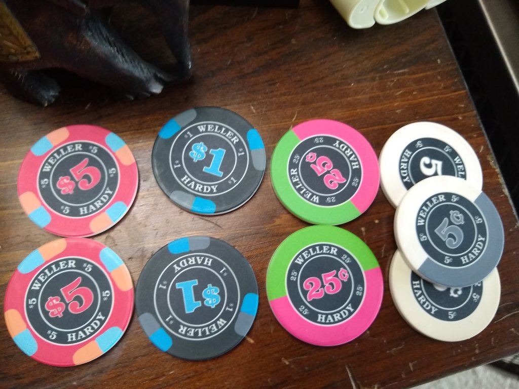
Unsure about the $5 we are all fans of the Quarter and the Dollar. Feel free to critique away.

Agree with both of these.I would remove the micro denom markings - they're not adding anything other than noise.
Quarter pie for the quarter, same colours. Or even have the denom in green on one side and pink on the other.
Lakers fans or no, that's a cool chip! What about red, instead of purple?Thinking maybe this direction..... not sure yet. The HARDY faction are not fans of the LAKERS View attachment 382609View attachment 382610
I do not like that spot pattern.I really do like the middle one. The yellow is a great complement to the set! What about a 4V418 spot (a la Majestics)?
Well...fine then!I do not like that spot pattern.
Do you like the red or yellow 5?Funny, the $5 is the only one I’m sure about.
The spots on the $1 are too dark
Do you like the red or yellow 5?
I don't know....I would remove the micro denom markings - they're not adding anything other than noise.
Quarter pie for the quarter, same colours. Or even have the denom in green on one side and pink on the other.
As for the $5, try a some different edge spot colours. Red/white/blue is always popular!
Have to do the white chips. TRADITION!!!Are you dead set on the solid white nickels? I feel like you will get bored with them quickly. I’d prefer a different/brighter color for the nickels, or half pie nickels and quarter pie quarters.
Regardless which way you go, I’m curious to see the finished product.
Going to be this for the $5.My 2c, in case I 'm not already confused:
From the ABC mock-ups
5c half-pie (2-color, white and grey)
25c quarter pie (light blue and fuchsia)
$1 third from left
$5 either the middle one from ABC or the CPC-type 8A14 (yellow anyway)
