improviseallday
Flush
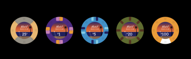
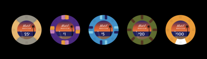
Current Draft


Goals
The chips should remind you of watching a sunset during an island vacation.


They should feel distinct from @JeepologyOffroad's excellent Moonlight Cardhouse sets.
---
Anything feedback and suggestions is welcome.
- Can Tina print these browns and light blues, or do I need to make some adjustments?
- Is the charcoal detailing in the "inlay" too fine or too similar in color to be visible?
- What should I add to the $20/$100 chips, if anything?
---
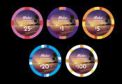
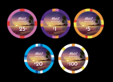
Previous Iterations
#5

#4

#3

#2

#1

Goals
The chips should remind you of watching a sunset during an island vacation.
They should feel distinct from @JeepologyOffroad's excellent Moonlight Cardhouse sets.
---
Anything feedback and suggestions is welcome.
- Is the charcoal detailing in the "inlay" too fine or too similar in color to be visible?
- What should I add to the $20/$100 chips, if anything?
---
Previous Iterations
#5
#4
#3
#2
#1
Attachments
-
 Screen Shot 2023-08-01 at 10.54.09 PM.png66.6 KB · Views: 148
 -
 Screen Shot 2023-08-02 at 12.31.59 AM.png90 KB · Views: 127
 -
 Screen Shot 2023-08-16 at 7.50.21 PM.png275.6 KB · Views: 113
 -
 Screen Shot 2023-08-16 at 7.50.33 PM.png356.4 KB · Views: 112
 -
 Screen Shot 2023-08-16 at 8.17.50 PM.png330.2 KB · Views: 105
Last edited:


")


")