IceQueenCassa
Sitting Out
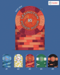
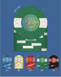
I designed these online and wanted to get people's options on them well before I print them. Please let me know what you think!


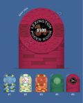
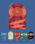
Here is a less controversial color mockup XDAlso I'd like to buy a barrel of these, so please if you do something crazy like this please let me know, I can give you money for them to put with your order!
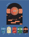
View attachment 1166284
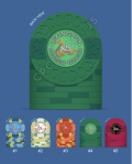
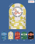
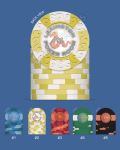
Personally I kinda like this better
View attachment 1166285

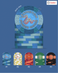
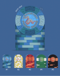
Bro, don't embarrass me like this. People are watching
")
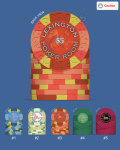
LOL.. The 25s and 100s are 43mm and don't have as intricate design options unfortunatelyAt first look, It felt like someone just mixed all the colour in when doing the design mock up with 25c $1 & $5 and then got lazy with $25 & $100
A lot of things don’t flow well and just look well too busy and messy to a certain degree.
Don’t rush with CPC design, you will be better off with taking your time and learn what is needed and what is not from other work and projects
LOL.. The 25s and 100s are 43mm and don't have as intricate design options unfortunately
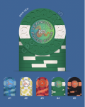
I was thinking the same thing, maybe 160 peach base and then these as a special edition chip@Machine These are GREAT $5's, but, I think I prefer the larger, round label. I like the effect of the red as a smaller spot versus the larger exposed qtr. This 5 needs to get made.
View attachment 1166666View attachment 1166667