I guess no one told you. There are a group of people here that collect DBs. They will buy pretty much any unique DB, which helps the designer to meet the BR Pro minimums. Just reach out to @HimewadI don’t have any extras at the moment. I can always order some more if a group of people are interested.
Love the icon and the custom labels! Those turned out really nice!
-
PCF is an eBay Partner. If you make a purchase through one of our links, we may earn a commission at no extra cost to you. Thank you for your support!
You are using an out of date browser. It may not display this or other websites correctly.
You should upgrade or use an alternative browser.
You should upgrade or use an alternative browser.
The Poker Lab Mockup (1 Viewer)
- Thread starter mr11
- Start date
OP
OP
mr11
3 of a Kind
Received a CPC color sample set and I think I've got the final design. Any more input? Otherwise I think I'll put these in the queue once CPC is open for orders again


OP
OP
mr11
3 of a Kind
Thought of a new inlay design. Looking for any feedback.
Current design

Proposed Inlay

Current design
Proposed Inlay
I like it. Not sure how to say this but it seems to give the layout more structure by separating the dog and the denomination and somehow makes it look more polished.
BigGrizz
Flush
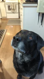
I would replace the card pips with a bone. Go all in on the goodest boy.
Also, I absolutely love your design and so does my best friend Dozer.

Also, I absolutely love your design and so does my best friend Dozer.
Maybe a bone surrounding the pips. But I wouldn’t go any smaller on the denom size.I would replace the card pips with a bone. Go all in on the goodest boy.
Also, I absolutely love your design and so does my best friend Dozer.
View attachment 1598252
BigGrizz
Flush
Oh no. No smaller on denom size. I just think the suit pips are overrated and going all in on theme is better.
OP
OP
mr11
3 of a Kind
I cleaned up the inlay some (made sure everything was centered, adjusted spacing, etc.) I think I still like the suit and dashes but wanted to post suggestions for feedback


I would replace the card pips with a bone. Go all in on the goodest boy.
Also, I absolutely love your design and so does my best friend Dozer.
Maybe a bone surrounding the pips. But I wouldn’t go any smaller on the denom size.
Pippa
Straight Flush
- Joined
- Aug 13, 2020
- Messages
- 8,339
- Reaction score
- 11,538
- Rewards
- 572
My dog Bruno approvedWanted to get people's opinion on the design that I've created for my custom T25 tournament set. I'll probably get these through Broken Arrow Cardroom (pending tariff situation). This is my first time designing any chips and working with Illustrator so hopefully I didn't mess anything up.
Background on these chips - I wanted to create something unique and personal for my home game but not have something specific like "Matt's cardroom". I've always enjoyed having a black lab so I thought "the poker lab" was a cool name for a home cardroom. The label is pretty simple but it somewhat mimics the simplicity of the rounders label. I like the simplicity but wonder if it is too simple. I also tried to add in edge spot progression.
Thoughts behind the chips:
25 - watermelon colors
100 - I was going for a hunting orange on the edge spots but it feels more like a circus theme. All orange edge spots felt too boring to me.
500 - I like the purple base color and just thought the edge spots had good progression
1000 - Again more progression. I like the black edge spots as its kind of like cross hairs in a scope
5000 - I tried making this super colorful and fun. I can't remember where I saw it but i got inspiration from a chip that had a similar edge spot and colors and it reminds me of a jawbreaker
Tournament chips are 39mm, Bounty is 43mm, and Dealer and blinds are 49mm. I'll probably get the non-tournament chips from BRPro.
If needed, I can put these into CPC design tool to get a sample of stacks (I'd love to get these from CPC but hard to justify the price difference when starting out)
View attachment 1495804 View attachment 1495805 View attachment 1495806
Attachments
chipinla
Straight Flush
- Joined
- Apr 12, 2018
- Messages
- 9,763
- Reaction score
- 26,408
- Rewards
- 722
Have you considered something other than bright white as the background for the inlay? I just have never liked bright white inlays. I think adding a little something can make a set so much nice looking. Even soemthing simple like an off white/cream.

I did gradient inlays one time and it adds so much to the set. Here’s a rough idea as well as what my set ended up looking like.


Just ideas but I think it’s worth always exploring.
I did gradient inlays one time and it adds so much to the set. Here’s a rough idea as well as what my set ended up looking like.
Just ideas but I think it’s worth always exploring.
chipinla
Straight Flush
- Joined
- Apr 12, 2018
- Messages
- 9,763
- Reaction score
- 26,408
- Rewards
- 722
Only because you have asked, I think you should spend some more time on the inlay. Your font is a little cartoonish for my taste. I did a rough mock-up just to give you an idea of what I’m talking about. I just think you can keep your main concept but give it that extra little pop.

OP
OP
mr11
3 of a Kind
I do like this idea! I was worried about adding color and having different shades. I’m not the most artistic person in the world so I figured I’d try to keep it simple. I’ll play around with this a bit but I think it looks classy.Only because you have asked, I think you should spend some more time on the inlay. Your font is a little cartoonish for my taste. I did a rough mock-up just to give you an idea of what I’m talking about. I just think you can keep your main concept but give it that extra little pop.
OP
OP
mr11
3 of a Kind
The poker lab is supposed to be a double entendre where it’s about my dog who is always by my side but also a place where we learn the game of poker. I’m trying to get the inlay to a point where keeps that dog theme but also looks professional. Thanks all for the help so far!

BigGrizz
Flush
Of these, I'd vote for the 3rd one with the bone around the pips. My 2 cents.I cleaned up the inlay some (made sure everything was centered, adjusted spacing, etc.) I think I still like the suit and dashes but wanted to post suggestions for feedback
View attachment 1599363
View attachment 1599355
View attachment 1599360View attachment 1599361
I couldn't possibly agree more. A large stark white background is always a bit off putting to me and I always notice it immediately. I have talked privately to several of the top artists here on the subject. One had a view that stark white should only be used when going for a super modern inlay design. I love some of the options you posted filling in the large dead spaces.Have you considered something other than bright white as the background for the inlay? I just have never liked bright white inlays.
Last edited:
OP
OP
mr11
3 of a Kind
Ok I think I've got the inlay to a better point. I took all the input and this is what I got so far. I actually can't believe how much this inlay/whole project has progressed lol

If no comments, I'll mock up the rest of the inlays. The goal is to change the background to match colors of the chips
If no comments, I'll mock up the rest of the inlays. The goal is to change the background to match colors of the chips
Very nice. Looking forward to seeing the whole set.
GamingWithChips
3 of a Kind
I don't hate the idea of the background, but I think it's currently too busy, the dog kind of blends in. Maybe drop the opacity of the colours or make the dog white for contrast? (edit: ...don't make the dog white...I forgot you have a black dog lol, maybe try reducing the opacity then)
I'd also make the bone slightly smaller, maybe skinnier?
To be fair though, my preference is simple designs, so I actually like where you started lol
I'd also make the bone slightly smaller, maybe skinnier?
To be fair though, my preference is simple designs, so I actually like where you started lol
Last edited:
OP
OP
mr11
3 of a Kind
Yeah background is too much. Once I looked at the whole set, I knew I wouldn’t be able to progress the inlay
OP
OP
mr11
3 of a Kind
Worked on the full set tonight and this is where I'm at - any feedback?

Reminder Version 1:

Version 2:

Reminder Version 1:
Version 2:
GamingWithChips
3 of a Kind
Awesome!
The first one is very fun, better than before. The only thing I'd change is simplify the background colours of the T25-T1000 to only having 1 accent colour (I say this mostly because the T1000 looks like a discoloration/kind of wonky), I would go with a burgundy for the T1000. With that said, definitely keep the rainbow on the T5000, looks intentional there.
And I can't decide between the simplified ones, I think both look great!
OP
OP
mr11
3 of a Kind
I tried to have the background color reflect the edge spot color. So for one edge spots, there was one solid background color. Two edge spots got two colors, 3 got 3 and 4 for 4. I could try to play around with how the gradient is. Maybe triangular would look better than linear
GamingWithChips
3 of a Kind
Oh I saw what you were going for for sureI tried to have the background color reflect the edge spot color. So for one edge spots, there was one solid background color. Two edge spots got two colors, 3 got 3 and 4 for 4. I could try to play around with how the gradient is. Maybe triangular would look better than linear
")
I think it looks good on all but the T1000 honestly, just think that one needs adjusting. That's also why I suggested one colour though, it removes that issue and then it also makes the big chip stand out more as special
Version 2 looks good. While the bone and paw prints was fun, it was too busy with them and took away from the size of the denomination. A simple and clean inlay design works best due to how small the inlays are already.
OP
OP
mr11
3 of a Kind
I was worried about that also. Next step may be to print these out and compareVersion 2 looks good. While the bone and paw prints was fun, it was too busy with them and took away from the size of the denomination. A simple and clean inlay design works best due to how small the inlays are already.
One point regarding small denoms. Your players are going to look at the chips before game play, then most will play the colors. Nobody really looks at the chips mid hand to see which chip is the T100 and which is the T500. Especially with fairly standard tournament colors.I was worried about that also. Next step may be to print these out and compare
FYI, if you can't tell from my comment, I like the top set best.
chipinla
Straight Flush
- Joined
- Apr 12, 2018
- Messages
- 9,763
- Reaction score
- 26,408
- Rewards
- 722
You must really love that font…
Last edited:
OP
OP
mr11
3 of a Kind
Do you have other fonts that you suggest? I didn’t really want to go search through all the fonts againYou must really love that font…
GamingWithChips
3 of a Kind
Just a random thought, can you use ChatGPT to show you some similar fonts to what you are currently using? That’s should save a lot of time
If you like the font, you should keep the font. The dog and the bone makes this a somewhat whimsical design. I think the font fits just fine.Do you have other fonts that you suggest? I didn’t really want to go search through all the fonts again
I also use a somewhat unusual font in my designs. And now that I've had some custom chips, buttons, cut cards and etc made with it, I feel locked in for future designs. Even when I made a big change in my design, I kept the earlier used font. It gives my sets continuity.
At one time, I had members and designers try to convince me to change the font. I didn't listen to them, and I'm glad.
Early design:
More recent design:
Similar threads
- Poll
- Replies
- 4
- Views
- 164
- Replies
- 11
- Views
- 373
- Replies
- 22
- Views
- 870
- Replies
- 9
- Views
- 589
- Replies
- 25
- Views
- 638