The Poker Lab Mockup (1 Viewer)

mr11

Pair
Joined
Feb 14, 2025
Messages
186
Reaction score
230
Location
Chicagoland
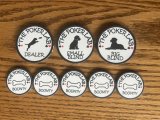
Wanted to get people's opinion on the design that I've created for my custom T25 tournament set. I'll probably get these through Broken Arrow Cardroom (pending tariff situation). This is my first time designing any chips and working with Illustrator so hopefully I didn't mess anything up.

Background on these chips - I wanted to create something unique and personal for my home game but not have something specific like "Matt's cardroom". I've always enjoyed having a black lab so I thought "the poker lab" was a cool name for a home cardroom. The label is pretty simple but it somewhat mimics the simplicity of the rounders label. I like the simplicity but wonder if it is too simple. I also tried to add in edge spot progression.

Thoughts behind the chips:
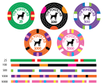
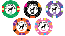
25 - watermelon colors
100 - I was going for a hunting orange on the edge spots but it feels more like a circus theme. All orange edge spots felt too boring to me.
500 - I like the purple base color and just thought the edge spots had good progression
1000 - Again more progression. I like the black edge spots as its kind of like cross hairs in a scope
5000 - I tried making this super colorful and fun. I can't remember where I saw it but i got inspiration from a chip that had a similar edge spot and colors and it reminds me of a jawbreaker

Tournament chips are 39mm, Bounty is 43mm, and Dealer and blinds are 49mm. I'll probably get the non-tournament chips from BRPro.

If needed, I can put these into CPC design tool to get a sample of stacks (I'd love to get these from CPC but hard to justify the price difference when starting out)

1744900855990.png
1744900876901.png
1744900903333.png
 
It is a good start! I like the inlays on the extra chips more. Makes me wonder if you should have different photo on each chip. Pup to and adult or some progression maybe.

I would make the 500 a tad lighter color to play better with the black 100. Don’t want them to similar. Also three chips in a row 500-1000-5k all have a green spot might want to look into that.

I would also test a boarder around the label and test having the name The Poker Lab in black and just color match the number.

The extra chips are amazing I must say! But do you actually use Small Blind big Blind chips when you play?
 
Really nice job, +points for the puppy on the small blind.

No real constructive feedback.

Only minor thought was some repeating colors like the green and white spots. Don’t see a risk of dirty stacks, but you might want to vary to not repeat those as much. No biggy.

GL
 
@liftapint may have insight to share with her Boneyards. +1 on lighter purple to avoid dirty stacks with black T100.
 
Last edited:
It is a good start! I like the inlays on the extra chips more. Makes me wonder if you should have different photo on each chip. Pup to and adult or some progression maybe.

I would make the 500 a tad lighter color to play better with the black 100. Don’t want them to similar. Also three chips in a row 500-1000-5k all have a green spot might want to look into that.

I would also test a boarder around the label and test having the name The Poker Lab in black and just color match the number.

The extra chips are amazing I must say! But do you actually use Small Blind big Blind chips when you play?
I think I’d keep the icon the same for the tourney chips. I’m going to look into lightening the purple and changing some of the green and white edge spots. I tested a boarder when I was developing these and just didn’t like it. It made the inlay feel smaller. I will look at making “The poker lab” black. We do usually play with blind chips. The group I play with is very casual and some are new to poker so they often forget about putting blinds in and the chips help them out. Plus I like them for a small added cost haha.

Thank you all for your insight! It’s greatly appreciated
 
I love this theme and wish I would have thought of it myself. I have 2 black labs. I really like the design and the different pictures on the bounty and dealer buttons. Nice job!
 
I can order some extra dealer buttons and blind chips if you’re interested. BRPro requires a min order of 10 for edge spots so that would work out well actually
 
I can order some extra dealer buttons and blind chips if you’re interested. BRPro requires a min order of 10 for edge spots so that would work out well actually
I would interested. I would be open to 2 of each if that helps?
 
I would interested. I would be open to 2 of each if that helps?
Yeah that would work out well cause I’ll order 6 also. I’ll wait until the end of the month to see if anyone else wants any dealer, blind, or bounty chips
 
Hey mr11 - love the artwork! Yay to dog chips!! :)

I’d love 2 of each (DB, small blind, big blind, and Bounty) to add to the collection if you wouldn’t mind. Love the design!
 
So after getting CPC and tina samples, I think I've made my decision that I'm going to save up and go the CPC route! I'm a sucker for a nice clay chip and I couldn't get past the slipperiness of Tina chips. With that, I want to get some feedback on the design that I've come up with so far. I've got a couple options of each denominations.

1745605540836.png


Currently my personal favorite line up is 1A, 2, 3B, 4C, and 5B but curious what other people think.

The theme that I'm going for with this set is Black lab/ duck hunting. I want to keep some progression in the chip design but not have the levels get to crazy to keep costs down.
I love the 1A chip as this is supposed to look like a male mallard. The other options are camo theme
The 100 chip has that hunting orange which I think I have my heart set on
The 500 chip is supposed to be water color theme while keeping the traditional 500 purple base color (not sure what shade looks the best)
The 1000 chip was fall color theme - the time when I think of duck hunting
The 5000 chip is going circus colors to represent the silly fun mood that you can get out of a lab

I was also thinking that the inlay design might be a little too simple so I mocked this up and wanted to get people's opinion:
1745606412182.png


I think I'll keep the design for the dealer, blinds and bounty chip from before unless the suits at the end of the curve is a much better design

Eventually, I'll probably try to get my hands on a CPC color sample but wanted to try to nail down the design first
 
I am no design expert but I like the 4A and 4B tones better. I also like 5C better but that is just what catches my eye.

I also like your updated inlay. That looks good.
 
I like the new inlay. The suits add just enough without junking it up. And I am straight B across the board. Obviously what suits your eye is what matters but I am not a fan of the single edge spots.

I think it will be a sharp looking set. :cool
 
I just updated the AI file with the suits and I think it adds a nice touch. If anyone else wants to add onto the mini group buy, please let me know.

So far I have:
@Snakeeyes for 2 of each dealer, small blind and big blind buttons.
@FedorOfSpades for 2 of each dealer, small blind, big blind, and bounty chips.

I'll reach out tomorrow to get your contact info

1746095749045.png

1746095786502.png
 
Love it - the suits adds a great touch of color and style to them, they look great!

Let me know what size button/chips you’re getting and the prices, I’d think about adding a few more DBs. Love your design!
 
You’ve done an awesome job designing the set and should get whatever you want - but I’d agree with the 60mm preference. Personally I think the 80mm > 60mm and 60mm > 49mm. All just preference tho.

I’m cool with whatever you want tho - it’ll be beautiful either way
 
Where do you get the 80mm? Broken arrow group buy?

I think I’ll go 60mm through BRpro so I can get the edge design on there
 
Yes - Broken Arrow 80mm acrylic DB GB. They happen a few times a year.

But I bet your designs will come out great on a 60mm (or 49mm if that’s what you decide) BRpro tho. BRPro seems like the no brainer option! Those edge designs look so good
 
Update on the design:

-Sticking with the green base color on the 25
-My thinking was the Burple was too close to the black and lavender was too close to the Dayglo peacock. I think I'm sticking with the purple
-I thought Dayglo arc yellow might look good with the 1000. The butterscotch from before would have been too dark. Also re-organized the colors so the pink isnt repeating from 1000 to 5000
-Updated Inlays on all designs

Debating if I like the single edge spot or not. I think it looks unique but wondering if it looks bad. Also wondering if the pink 5000 clashes with 5000 now.
CPC Chips 2025.05.02.jpg
 
Those are cool. Any extras on the dealer button? PS check out my avatar for my custom labels done a couple years ago
 
I don’t have any extras at the moment. I can always order some more if a group of people are interested.

Love the icon and the custom labels! Those turned out really nice!
 

Create an account or login to comment

You must be a member in order to leave a comment

Create account

Create an account and join our community. It's easy!

Log in

Already have an account? Log in here.

Back
Top Bottom
Cart