Salmonblaster
Two Pair
Apologies for this being a little long-winded but I took another stab at designing a set and this time I went in a totally different direction than I have with previous designs.
As a bit of back story on the name, my wife loves heirloom roses and in fact has planted 64 of them along the fence line of our front yard. All diferent kinds of colors, shapes, sizes, etc. She is so proud of them and spends a lot of time regularly tending to and caring for them. They are resilient and strong and beautiful, just like her.
As for myself and my sense of style, of late my fashion sense has moved away from more current items and skewed more towards vintage bow ties, sweater vests, flat caps and tweed/plaid patterns. Cigars and brandy. A simpler time with simpler pleasures.
Wanting to work all of that into a design that felt personal to our home was the inspiration here, along with the feel of a set that has lived through generations.
The concept was to create a private gaming collection that felt as though it has always existed. Something that has spent years in the card room of an old estate house.
Taking a lot of my design sensibilities from things like old English libraries, bespoke tailoring, antique bookplates, engraved stationery, and heirloom objects, the color palette naturally evolved into things evocative of those experiences. Tailor's chalk, wool, bookbindings, art, etc. Solid muted colors that also felt like they had a touch of wear on them from their use over time.
I decided against introducing a spot pattern mainly because whenever I did, it felt like it went against the identity of the set. I tried with a couple of different iterations but ultimately felt happiest with a set palette that was made up of solid colors collected from materials like paper, cloth and ceramic. A heritage design if you will.
I wanted the inlays to represent not only those visual philosophies but to also show the style that a classic gaming set like the one I was picturing in my head would likely have.
The HR watermark is meant to be reminiscent of the watermark on an old study or office's stationery. In a fun nod to classic home gaming and the personalized monogrammed Paulson chips of that era, the H and R are also my wife and I's first initials so the mark holds even more meaning. The rose emblem is meant to evoke thoughts of either a wax seal on an envelope from that same office stationery or perhaps a book stamp that would adorn the inside page of each book in a personal library.
I have a feeling I may have made my most controversial choice in the inlay design when I decided to use written denominations. I experimented with both numeric and written denominations in numerous designs and drafts. Every time I switched to numbers, the chips started to feel more like modern casino chips. In my opinion, spelling out the denominations changed the tone back towards the engraved stationery, antique currency, and heirloom objects, that felt more true to the spirit and inspiration behind the set.
The felt design is also meant to have restraint and simplification so that the cards, the chips and the game itself have more of the focus than the surface the game is being played on. Of the same design world and aesthetic, but a supporting player rather than a featured star. Something that wouldn't look out of place atop a heavy wooden poker table in the corner of a large game or billiards room.
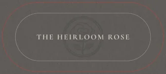
The over-arching goal here was to create something incredibly personal and meaningful. A set that could hopefully made someone feel or remember their own version of that kind of place and time. A set that felt equally at home in a library, study or game room and a set that was named after the beautiful flowers that adorn its property.


As a bit of back story on the name, my wife loves heirloom roses and in fact has planted 64 of them along the fence line of our front yard. All diferent kinds of colors, shapes, sizes, etc. She is so proud of them and spends a lot of time regularly tending to and caring for them. They are resilient and strong and beautiful, just like her.
As for myself and my sense of style, of late my fashion sense has moved away from more current items and skewed more towards vintage bow ties, sweater vests, flat caps and tweed/plaid patterns. Cigars and brandy. A simpler time with simpler pleasures.
Wanting to work all of that into a design that felt personal to our home was the inspiration here, along with the feel of a set that has lived through generations.
The concept was to create a private gaming collection that felt as though it has always existed. Something that has spent years in the card room of an old estate house.
Taking a lot of my design sensibilities from things like old English libraries, bespoke tailoring, antique bookplates, engraved stationery, and heirloom objects, the color palette naturally evolved into things evocative of those experiences. Tailor's chalk, wool, bookbindings, art, etc. Solid muted colors that also felt like they had a touch of wear on them from their use over time.
I decided against introducing a spot pattern mainly because whenever I did, it felt like it went against the identity of the set. I tried with a couple of different iterations but ultimately felt happiest with a set palette that was made up of solid colors collected from materials like paper, cloth and ceramic. A heritage design if you will.
I wanted the inlays to represent not only those visual philosophies but to also show the style that a classic gaming set like the one I was picturing in my head would likely have.
The HR watermark is meant to be reminiscent of the watermark on an old study or office's stationery. In a fun nod to classic home gaming and the personalized monogrammed Paulson chips of that era, the H and R are also my wife and I's first initials so the mark holds even more meaning. The rose emblem is meant to evoke thoughts of either a wax seal on an envelope from that same office stationery or perhaps a book stamp that would adorn the inside page of each book in a personal library.
I have a feeling I may have made my most controversial choice in the inlay design when I decided to use written denominations. I experimented with both numeric and written denominations in numerous designs and drafts. Every time I switched to numbers, the chips started to feel more like modern casino chips. In my opinion, spelling out the denominations changed the tone back towards the engraved stationery, antique currency, and heirloom objects, that felt more true to the spirit and inspiration behind the set.
The felt design is also meant to have restraint and simplification so that the cards, the chips and the game itself have more of the focus than the surface the game is being played on. Of the same design world and aesthetic, but a supporting player rather than a featured star. Something that wouldn't look out of place atop a heavy wooden poker table in the corner of a large game or billiards room.
The over-arching goal here was to create something incredibly personal and meaningful. A set that could hopefully made someone feel or remember their own version of that kind of place and time. A set that felt equally at home in a library, study or game room and a set that was named after the beautiful flowers that adorn its property.