The Aperture - Cash Set (1 Viewer)

justsomedude

Straight Flush
Joined
Nov 10, 2014
Messages
9,868
Reaction score
17,618
Location
The Black Hills
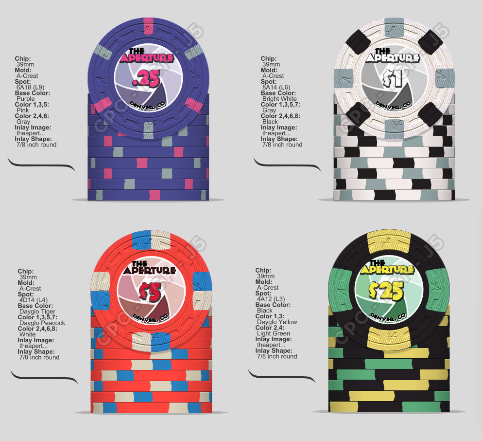
Thinking about taking the plunge... open to input and criticisms...

THE APERTURE

upload_2017-7-23_21-56-54.png


upload_2017-7-23_22-6-38.png
 
Last edited:
Digging that $1! The $25 feels like too much black in the set. Maybe one of the spot colors as the base and make the vacant spot Charcoal?

Just spitballing here. Love the theme!
 
The $1 kicks ass for sure, might want to change the name & denom to black to make easier to read.

The $5 seems like the weakest chips. With the 25c & $1 chip both being so cool it feels like a drop off. Very similar to so many casino chips out there already.

Should the name on the $5 be in red or even blue to go with the rest of the chips?
 
Actually I have some input.
You might want to make sure that the font you are using for "Aperture" will be readable on a small scale.
Try adding "Card Room" or "Casino" across the bottom for symmetry with "Aperture". And keep the "Denver, Co" right below in small font.
Might work/might not:)
I'd go with "25c" (actual cents sign) instead of ".25".
And in small font on one side: "Property of Fish72s"
 
Digging that $1! The $25 feels like too much black in the set. Maybe one of the spot colors as the base and make the vacant spot Charcoal?

The $1 kicks ass for sure, might want to change the name & denom to black to make easier to read.

The $5 seems like the weakest chips. With the 25c & $1 chip both being so cool it feels like a drop off. Very similar to so many casino chips out there already.

Yeah, the $5 fell behind. It was actually the first chip I designed to mimic the Bally's $5 (one of my favorite chips), but then I thought it looked better as a $25... ugh... I dunno... Maybe the original $5 should stay and I should tweak the $25?

upload_2017-7-23_22-57-6.png


upload_2017-7-23_22-56-27.png


Actually I have some input.
You might want to make sure that the font you are using for "Aperture" will be readable on a small scale.
Try adding "Card Room" or "Casino" across the bottom for symmetry with "Aperture". And keep the "Denver, Co" right below in small font.
Might work/might not:)
I'd go with "25c" (actual cents sign) instead of ".25".
And in small font on one side: "Property of Fish72s"

Agreed... actually thinking of changing it to "AK's Aperture Lounge", with "AK" and "Lounge" above and below in smaller text. Gotta get a designer on board...
 
Yeah, the $5 fell behind. It was actually the first chip I designed to mimic the Bally's $5 (one of my favorite chips), but then I thought it looked better as a $25... ugh... I dunno... Maybe the original $5 should stay and I should tweak the $25?

View attachment 110534

View attachment 110533


Agreed... actually thinking of changing it to "AK's Aperture Lounge", with "AK" and "Lounge" above and below in smaller text. Gotta get a designer on board...
That's a kick ass redbird. I would use that and go with a 4d14 or 3t316 for you $25 (personally I would go with a $20, it's a custom set...and they don't make $25 bills). Maybe a canary or even a chocolate or butterscotch base)
 
Ok... thanks for the input fellas!!!... gonna swap in the new $5 and rework the $20/$25... then might circle back to the frac once that's squared away...
 
Ok, maybe this is going a little too deep with this but .....
what if your Aperture size, the graphic of an actual aperture opening, were to increase slightly from as the denominations increased?

Also, I like the proportions with having 5 'shutter blades', but if you had six then you could do alternating shades. Just looking for symmetry.
 
I know.

@justsomedude please tell me you mocked this Ballys $5 first in the CDT and then came up with the frac and $1 afterwards.

Yup! The "new" $5 was the first chip I whipped up. Then came the $1 and the frac, and the high denom was last.

Ok, maybe this is going a little too deep with this but .....
what if your Aperture size, the graphic of an actual aperture opening, were to increase slightly from as the denominations increased?

Also, I like the proportions with having 5 'shutter blades', but if you had six then you could do alternating shades. Just looking for symmetry.

Not sure I'd be on board with the aperture size changing... but... I kinda dig the 5 blades for the alternating shades! The art in general is just conceptual to get the theme across. I'm not Illustrator master - so I need to get some one on board to help me dial everything in. :p
 
You could also go baller and get an oversized chip for your higher denom......or a plaque...:whistle: :whistling::whistle: :whistling:
 
I would also change the color of the denom to black on the "1$" chip" so it matches one of the edge spots and not the base color.
I would change the color of the "the" on every chip to match the text "aperture".
The last version of the "5$" chip is the best one.
I agree that the "25$" should have a green base color.
 
Colors look okay ($1 best in set), spot patterns weird but I can see why you went with that - fits the theme well - but what I really can't stand is the font... this is only minimally worse than Comic Sans imo :sick:

I would go for a font with a sleek, modern look for this theme, not a comic-y thing. I would have recommended Avenir or some free variant (actually Mac OS X ships with a license for Avenir Next LT since a couple of versions) or something in the likes of it.
 
In my opinion too much edge spots.
I would increase the edge spots with the denom, but start with lesser edge spots.
The black chip is too dark in my humble opinion. :cool:
 
In my opinion too much edge spots.
I would increase the edge spots with the denom, but start with lesser edge spots.
The black chip is too dark in my humble opinion. :cool:

Yeah... I think the black is a no go... I was trying too hard with the "black and white" photo theme concept.

As for the edge spots, the 8 or sets-of-8 has a tie-in due to there being 8-blades in some camera lenses... perhaps I'm taking it a bit too far... :whistle: :whistling:
 
I just think that that many edge spots on every chip is too distracting and makes it harder to see what's at stake.
 
You can either reduce the number of spots or color the spots more close to the chip base color, both results in a similar effect.
 
Last edited:

Create an account or login to comment

You must be a member in order to leave a comment

Create account

Create an account and join our community. It's easy!

Log in

Already have an account? Log in here.

Back
Top Bottom