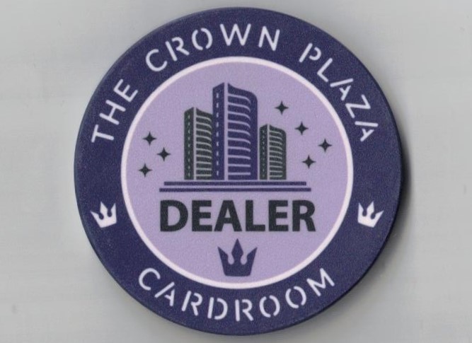
I love the first draft! I think there's a few things you can do to make you happier with the results. That label is very crowded, and the negative space is very minimal between the elements. I'd blow up each group and kill the dead space.Here's my first stab for a Players button. I'll be honest, not too crazy with the results. For anyone who's designed before -- what are some canvas dimensions and other image info I might need to be considering?
View attachment 1040851
View attachment 1040850
If you want to play around with a vector program (If you haven't already), that logo would be a great one to get your feet wet. Lots of straight lines would be great to learn to use the pen tool. PLUS, if you could mock up a "D" or "d", the rest of the letters for "dealer" are all in the players logo. You could mirror the logo font , which could look kinda cool.
You'll want 1/8" (3-4mm of gutter around the edge of the canvas to ensure the print doesn't run off the edge. I think there was a thread out there that discusses the formula for designing the rolling edge and what dimensions you'll need. That might just be an easy answer from someone who's designed for BRpro before though too @Colquhoun?


")