I thought exactly the same thing!Definitely not this one. It looks like someone is getting bent over and having a great time.
View attachment 627352
Top one for me
You are using an out of date browser. It may not display this or other websites correctly.
You should upgrade or use an alternative browser.
You should upgrade or use an alternative browser.
Some feedback please :) (1 Viewer)
- Thread starter Thomacetti
- Start date
Blue & black: interesting. The arrow in the up is overkill.
Black & red: font and colors work. The logo is confusing. (I didn’t see the bend-over at first, but now I can’t I see it.)
Blue & orange: like the font & colors. The text bubble is confusing.
What do the logos mean to you? What emotion do you want to convey with them?
All of these feel like small firm logos. I would challenge you to think about building a brand that looks big. Challenge the initial mindset and set yourself up as a solid, established firm that will kick ass and dominate for your clients. One with history and experience.
I would look big, established company logos. Think big, act big, show big, and folks will start to think of you that way.
Caveat: I work in a big firm, and when I was with the government, wanted to buy from big firms. So my bias may not matter to you. I don’t know if looking small has an advantage in the broader market and would work better with your target clients.
Most importantly- congrats! That absolutely awesome what you’re doing. I hope you kill it!
Pretty sure that’s an HR violation of some sort.Definitely not this one. It looks like someone is getting bent over and having a great time.
View attachment 627352
Top one for me
I’m going to go with option 1. I love what it says without saying it.
Thank you all so much for this invaluable feedback...
I'll send the feedback to my designer and will keep posting updates.
Feel free to pile on
Thanks too for the encouragements...sometimes you just have to jump to see how deep/cold the water is

I'll send the feedback to my designer and will keep posting updates.
Feel free to pile on
Thanks too for the encouragements...sometimes you just have to jump to see how deep/cold the water is
Definitely not this one. It looks like someone is getting bent over and having a great time.
View attachment 627352
Top one for me
LoL
I found this logo from a Melbourne HR company
True story -> link
First words....do you have some tennisballs in your pants or just happy to see me
Mr Winberg
Full House
Alrighty @Thomacetti, remember you started the derailment!LoL
I found this logo from a Melbourne HR company
View attachment 627528
True story -> link
First words....do you have some tennisballs in your pants or just happy to see me
This Swedish company:
decided that it was a good idea to represent the 'o' with a heart:
ChipEnvy
Full House
I can't unsee it!Definitely not this one. It looks like someone is getting bent over and having a great time.
View attachment 627352
Top one for me
ChipEnvy
Full House
I like the top one.
Update 
I like this much better then the above.

Thanks for the feedback
I like this much better then the above.
Thanks for the feedback
That’s been done already ... unless you’re in Belgium and Montana
Ut-oh. Couple of issues there.
TeddyPSULions
Sitting Out
I like the first logo
lol wow, you might need to have a little chat with your designer
Get your mind ready to be blown...

Thanks for pointing that out.
I gave my designer the idea based on feedback I got from Steve
So I explained I liked the 'upward motion' approach.
He can explain how he just reused an existing artwork....
But I still like it (a lot) and that artwork was used for project (limited in time) that is now ended (since 2017).
Domain is for sale too....
Would it be bad to proceed with the new design but add more personal touches ?
I want this to be done asap and like what there is now...starting all over will take another week or two

I had received another update from the designer and only saw it when I wanted to ask what is up.
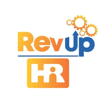
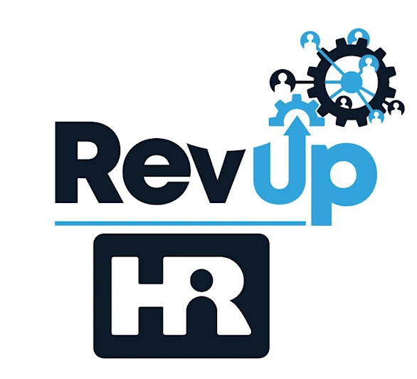
new

old

new
old
Fair, like said, I like this new design...
Love colors on the old version (pops) and like the people added to the gears on the new version.
Maybe inverse old colors so the 'up' is orange and rest in blue
Also think to use the same 'persons' in the gears like in the 'R' from HR
Like there are small & bigger ones, some more hidden...and different colors (blue & black).
This emphasis on the diversity of the workforce in a company (but they are all needed to keep the wheels spinning)
Fair, like said, I like this new design...
Love colors on the old version (pops) and like the people added to the gears on the new version.
Maybe inverse old colors so the 'up' is orange and rest in blue
Also think to use the same 'persons' in the gears like in the 'R' from HR
Like there are small & bigger ones, some more hidden...and different colors (blue & black).
This emphasis on the diversity of the workforce in a company (but they are all needed to keep the wheels spinning)
as an engineer with OCD tendencies, the thing I like most about the new design is the gears actually mesh properly! the old one (and the one it was "inspired" from) was just random gears thrown next to one another.
I like it but I wonder if there's a way to consolidate it all better? as drawn now, it is busy from SW to NE, and all white space in the NW and SE corners.
Similar threads
- Replies
- 16
- Views
- 534
- Replies
- 8
- Views
- 495
- Replies
- 6
- Views
- 183
- Replies
- 17
- Views
- 542
