Some feedback please :) (1 Viewer)

Thomacetti

4 of a Kind
Supporter
Joined
Nov 7, 2014
Messages
6,336
Reaction score
15,848
Location
Belgium
I started my own company in HR consultancy.

Name: RevUp HR

I have someone working on a small logo
Please let me know what you prefer (or none)
1612263136643.png


1612263166407.png


1612263202310.png


These are drafts...so don't hold back please

THANKS
 
Using the order of appearance:

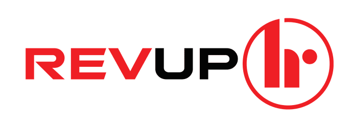
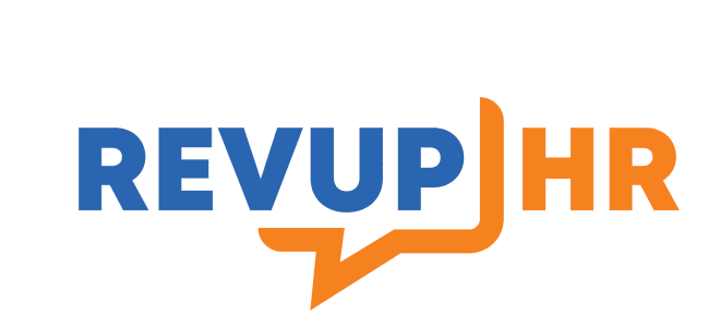
I like the look n feel of the second, but I agree a bit with @Perthmike. I spent some time trying to see if it could be interpreted as something NSFW, and although you really need to stretch the imagination, I fear that every person looking at it will think "hmmm.... does that look like...?"

My feedback is
2 (if changes are made to secure from NSFW interpretations) > 3 > 1
 
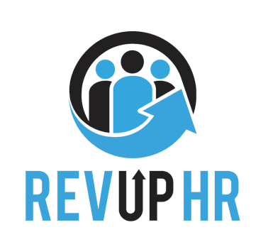
I like the simplicity of the third one but I'm not sure the speech bubble makes sense to me for an HR consultancy
 
I still prefer the first one.
Probably with more colour in it (maybe red instead of black; light blue is OK).
 
First logo for me, to contest. Nice tones, with applicable logo.

The Third logo is fine, but the SMS imagery would make me think your company does some kind of social/messaging app.

Other than the clear NSFW imagery with the second logo I'm not a huge fan of the colours. The Red/Black combo has a male feel to it which may or may not be what you are going for. Not sure why it remind of power tool brands. That said, the black in the first logo is maybe a little heavy too, perhaps light blue & then a dark blue?
 
1st one looks a little dated. 2nd one the symbol doesn’t match the typeface, they look too separate. I like the 3rd, because it’s simple and clear.
That one with the dot makes the lone figure seem all alone...not the message for hr, imo.
 
How about something like the first one but rather than the blue arrow sweeping up from the right have an outer ring with an arrow or line sweeping clockwise from lower left like a tachometer to play on the term “Rev”?
1612278887498.png

1612278909434.jpeg
 
Also the figures in the back of the first one reminded me of these guys: :ROFL: :ROFLMAO:
70DA9C1B-429A-4073-AFC0-72ABFD6FDBF1.jpeg


The third one also shows the message of “open dialog”, which is the perfect message.
 
Yes, just what I tought...

how about changing the second logo with this dot:

View attachment 627353
I think second one with something like this would probably look good. Something about the first one doesn't flow right to me. It might though, if the arrow on "up" was removed, and the words were thicker. Not sure though. Need to see #1 and #2 revised. :)

Congrats on the new company!!!
 

Create an account or login to comment

You must be a member in order to leave a comment

Create account

Create an account and join our community. It's easy!

Log in

Already have an account? Log in here.

Back
Top Bottom