Showing off my Custom Ceramic Designs (1 Viewer)

8KCpoker

Waiting List
Joined
Apr 23, 2023
Messages
9
Reaction score
18
Location
Colorado
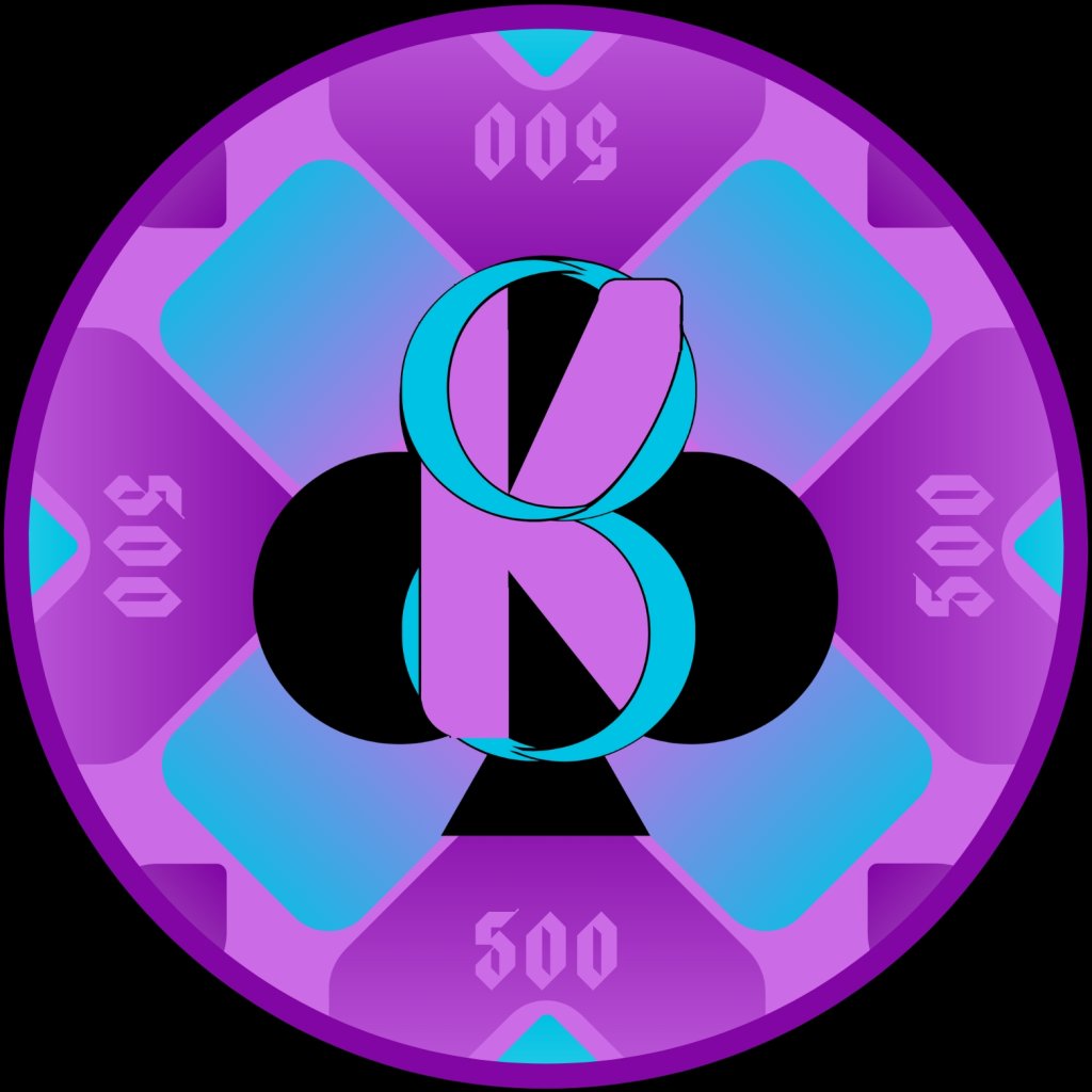
So these ceramic designs iv been working on are branded around the 8 Kings Club logo. These are where I am at with my tournament denominations.

I decided to mark my denoms without the $ sign. Wanting to keep my font size consistent through the 5 denominations I have the 1,000 and 5,000 chips labeled as 1K and 5K which I find to be an interesting and unique look you don't see as much on many other sets.

Working through the different color options for the chips was probably the hardest part.
Some things I am still unsure about with the chips is:
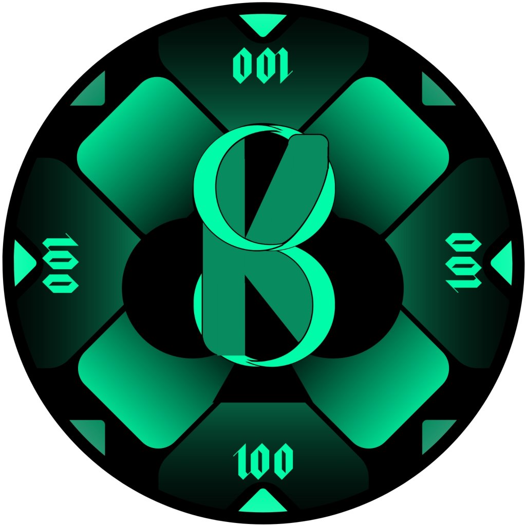
- my doubling down on the green aesthetic on both the 25 and 100.
-Also the yellow boarder marks on the 1K (not sure if they are blending in to much)

Other than that I am very happy with how these have turned out looking. After over a month of design. My favorite of the 5 is definitely the red 5K chip design.

Please let me know what you guys think!

8KC Yellow.jpg
8KC Purple.jpg
8KC Green.jpg
8KC Black.jpg
8KC Red.jpg
 
I think you are safe from dirty stacks between the 25s and 100s from the side with the black vs green edges, but man those are tough from the face and I think people, especially those with some colorblindness will have a hard time with those chips. I would suggest replacing the green on the 100 chip with white, making it a black and white with greyscale shading. That would set that chip apart from all the other color schemes and would look great. Just my 2 cents.
 
Although, I like that darker and brighter green better than the green you used on the 25.. I would use the darker/brighter green on the 25.
 
I think you are safe from dirty stacks between the 25s and 100s from the side with the black vs green edges, but man those are tough from the face and I think people, especially those with some colorblindness will have a hard time with those chips. I would suggest replacing the green on the 100 chip with white, making it a black and white with greyscale shading. That would set that chip apart from all the other color schemes and would look great. Just my 2 cents.
I think this is a good idea. Take a look at the changes. Definitely sets them apart better.
8KC Black 2.0 (1).jpg
 
I, personally, do not like using "1K" and "5K" as abbreviations on chips. Much prefer "1000", "5000".

By all means, keep the green esthetic for the T25 and T100 if you want, but I would at least change the denom colour on the T100 to something with much more contrast, perhaps an orange shade.

What are you doing for the rolling edge?
Here is what it looks like with the "5000". Personally, I feel like it takes up too much space. Having the abbreviated version as the "5K" allows a more narrow look that space on the chip, solidifying a more cross(+) effect on the chip.
8KC Red 5000.jpg

As for my rolling edge I will upload my designs for those. Different for each chip. I am going kind of crazy on the 25 edge so you will have to let me know what you think of that.
 
Here are the edges for each of the chips.
Not too sure how they are going to turn out yet. Especially the 25. Very crazy design on that one.
Black Edge  2.0.jpg
Green Edge 2.jpg
Purple Edge.jpg
Red Edge.jpg
Yellow Edge.jpg
 
Here is what it looks like with the "5000". Personally, I feel like it takes up too much space. Having the abbreviated version as the "5K" allows a more narrow look that space on the chip, solidifying a more cross(+) effect on the chip.
View attachment 1124195
As for my rolling edge I will upload my designs for those. Different for each chip. I am going kind of crazy on the 25 edge so you will have to let me know what you think of that.

They are your chips but I think the full numbers are a lot easier to pick up on and read at first glance than the 1k and 5k versions.

Obviously once your players play with them for a while, they will play based by color, but new players will be reading denoms and the easier to read, the better.
 
They are your chips but I think the full numbers are a lot easier to pick up on and read at first glance than the 1k and 5k versions.

Obviously once your players play with them for a while, they will play based by color, but new players will be reading denoms and the easier to read, the better.
That is a good point. I'll consider this and play around with the design some more. Thanks!
 
Agree with the above, like your 100 revision. I’ll add that I spent a good few seconds looking at that first chip trying to understand what it was. The 8K center design and the 1K outer denom really messed with me. I think a 5K chip would be really hard.

If you have a strong group of regulars, they figure it out eventually. I just worry it will be a problem for a bit and then any new players will be at a disadvantage.

You don’t want art to get in the way of the experience; good design should decrease brain cycles, not add them. Putting the whole number on there would be the right move.
 
Cool design.

+1 for 1000/5000 rather than 1k/5k. I think it not only works better play wise, but also looks better
 
Really really love these chips. Fantastic logo, and great color combos.

I agree with the revision of the 100. I am a big fan of green-and-black and gray-and-black color combos, but having two successive denominations with color schemes so similar is just asking for trouble. If black-and-white is too plain, you could consider a bright blue as the accent color for the 100. May conflict a bit with the 1K chip, but the similarity will be far less than the original 100 vs. 25. That being said, the black-and-white looks nice too.

As for the 1K/5K versus 1000/5000 debate, I think I may agree with the crowd here, but I’ll make counterpoint as devil’s advocate. I think the abbreviation is most problematic when you are looking at the chips for the first time and don’t know where to look for the denomination. This was highlighted by your showing the 1K chip as the first image in the post. That may have added to @warma’s difficulty.

However, in actual play, the 1K chip will be the fourth chip that the player sees; hopefully, by the time the first 1K chip is tossed in the pot, the players are used to looking at the edge area for the denomination, not the center design that arguably conflicts.

All that being said, I slightly lean in favor of the 1000/5000, even though I see the art rationale for the 1K/5K abbreviation. Take all that for what it is worth.
Fair point on the order of things, I hadn’t considered that perspective.
 

Create an account or login to comment

You must be a member in order to leave a comment

Create account

Create an account and join our community. It's easy!

Log in

Already have an account? Log in here.

Back
Top Bottom