On samples (2 Viewers)

I assume it is way more difficult for CPC than Matsui to produce these kind of cut samples swatches… but that would be so great! One can dream…
Yeah, I was thinking about that. Not possible from my knowledge.

But I’m just a guy without the proper tools trying something to see if it works. I bet with the right tool and time, it could be done well. But it would be $$$ to produce the kind of smooth fitting interchangeable set I imagine.

Alternatively, it might be possible to produce something in another material that had the same coloring. May not feel like a chip, but might look like one (DG colors are the possible exception).
 
I would assume it should be possible to match CPC and Pantone colours, or honestly even a calibrated offset CMYK sheet, and print chips on thick paper with a ton of colours combos.
 
I would assume it should be possible to match CPC and Pantone colours, or honestly even a calibrated offset CMYK sheet, and print chips on thick paper with a ton of colours combos.
Sounds like you're somewhat familiar? I'm in for a group buy if you can find a local print shop to do the color matching.

On paper, @warma's method of overlapping cut blanks will be even better.
 
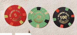
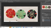
I had similar ideas... But we still won’t get that color contrast at the border, since the joints and shadows are still visible and the human eye sees them. I took a slightly different path and got chips of photographic authenticity and any level of complexity. Of course you won't be able to hold them in your hands, but they give quite realistic representations if your monitor is properly calibrated and you have a good camera. I didn't have much time, but a quick try gave the following result. It took me Photoshop and an hour or two to line up a few colors perfectly. (It was just an attempt.)
It's all very raw and I just wanted to see if it's real. I didn't take into account the shadow matches.
 

Attachments

  • 5-25-100.jpg
    5-25-100.jpg
    114.4 KB · Views: 50
  • test.jpg
    test.jpg
    101 KB · Views: 54
I had similar ideas... But we still won’t get that color contrast at the border, since the joints and shadows are still visible and the human eye sees them. I took a slightly different path and got chips of photographic authenticity and any level of complexity. Of course you won't be able to hold them in your hands, but they give quite realistic representations if your monitor is properly calibrated and you have a good camera. I didn't have much time, but a quick try gave the following result. It took me Photoshop and an hour or two to line up a few colors perfectly. (It was just an attempt.)
It's all very raw and I just wanted to see if it's real. I didn't take into account the shadow matches.
I had some similar photoshop support, and it was very helpful, but the color difference between the chips and my screen was still there and the DG colors don’t pop the same.

I had been eyeing a few color combos for year and had written off one that seemed great, but was a bit off. In person, my favorites flipped. Imperial blue with DG pink, for example, won me over in person.
I totally agree "imperial blue" is a stunning color when you look at it in person. (the whole problem is in monitor calibration and color adjustment and it gives decent results, but of course cannot be compared with live samples)
 
I had some similar photoshop support, and it was very helpful, but the color difference between the chips and my screen was still there and the DG colors don’t pop the same.

I had been eyeing a few color combos for year and had written off one that seemed great, but was a bit off. In person, my favorites flipped. Imperial blue with DG pink, for example, won me over in person.
YES to Imperial blue with DG Pink!

1696263187138.png
 
I had been eyeing a few color combos for year and had written off one that seemed great, but was a bit off. In person, my favorites flipped. Imperial blue with DG pink, for example, won me over in person.

Huh, super interesting how tastes work (might also be very dependent on screen colours calibration though…), Imperial Blue + DG Pink was a "must have" combo right from the start when I began playing with the CPC design tool.
 

Create an account or login to comment

You must be a member in order to leave a comment

Create account

Create an account and join our community. It's easy!

Log in

Already have an account? Log in here.

Back
Top Bottom